Make it Your Own:
Thanks to the Style Palettes in Keynote and Pages, it’s incredibly easy to transform one of our shape-based themes or templates from it’s stock, default state to a more unique blend of color, type or effects more suited to your own personal tastes.
If you have specific brand guidelines you need to match on a day-to-day basis, for instance, making a theme-wide change to fit defined color or typeface specifications is a straightforward process in modern versions of Keynote & Pages, provided your theme or template is built to take advantage of Styles.
Most of our modern themes & templates are great candidates for this treatment, but for this example, we'll be recoloring OM X, a print-inspired favorite. We're going to start with Keynote, but the same core principles apply to our Pages template systems at this level.
Set the Stage
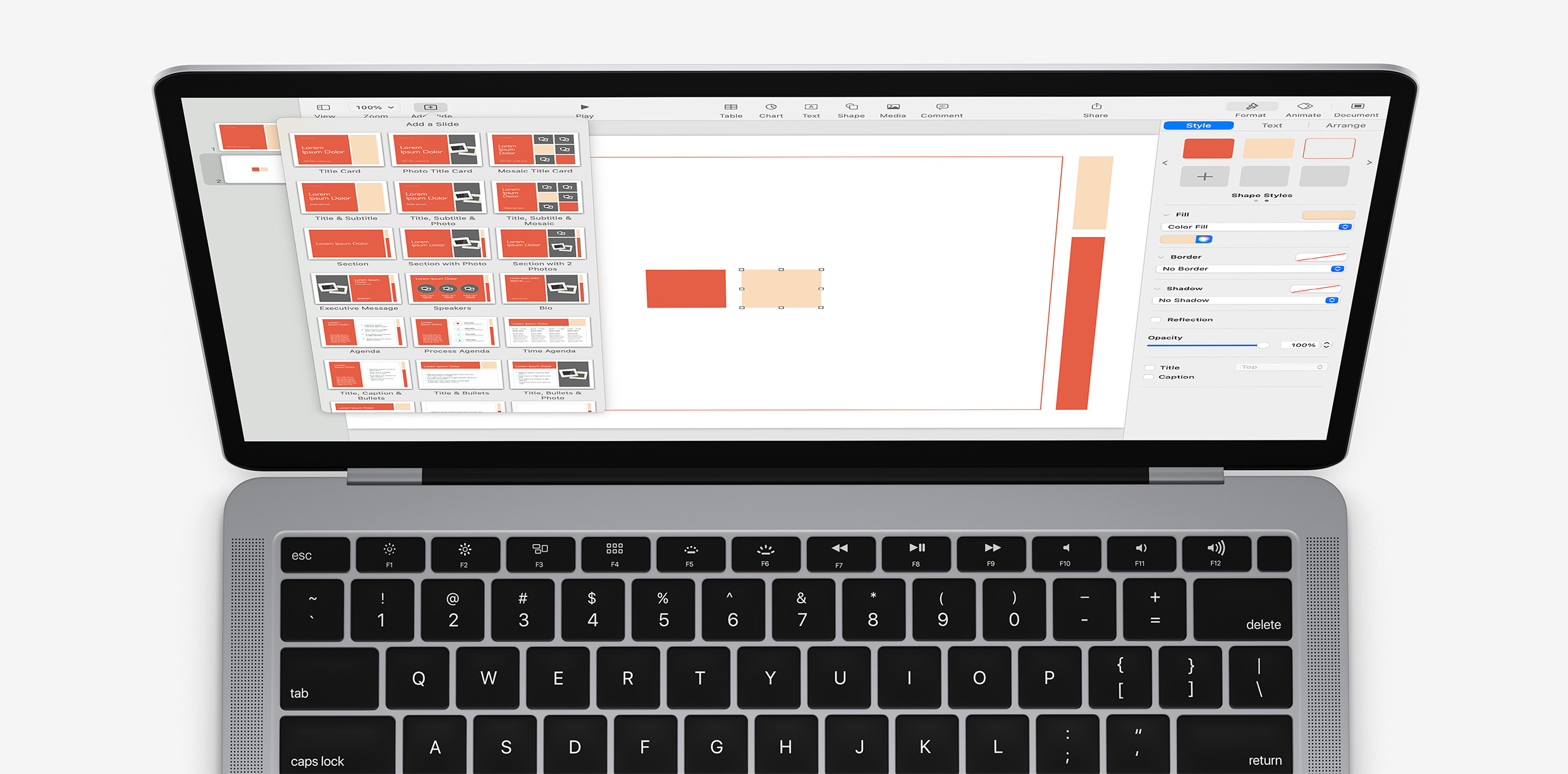
Start a new presentation with OM X, and add a new Blank slide to your presentation - this will allow you to clearly see the shapes we’ll use to make our changes with. If you don't have the OM X themes in your library, you can download a free slide-limited Trial Edition here to follow along with: Free Keynote Themes - OM X Limited Edition
Select Shape from the toolbar: you’ll see a selection of shapes to insert, which will automatically default to the first Shape Style once they're added to the slide. Add a square to the slide, which will behave as our "proxy" object for the first style change.
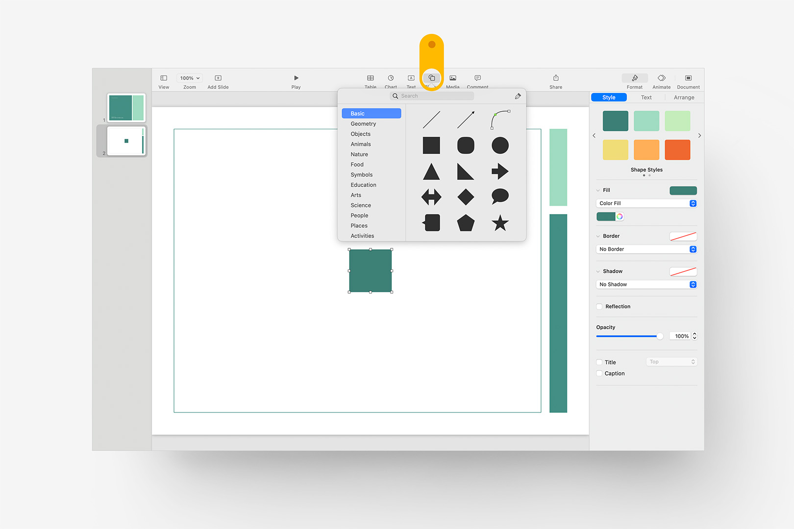
Add a Blank working slide, and add a new Square shape to the stage to act as a proxy.
Typically, the first 6 shape styles in our systems reflect the default chart palette, the first of which is generally slightly different than the theme's framework colors (so that there's some level of contrast between a default shape sitting against a full-color background – more on that later). We push foundation-level, "theme-reserved" styles to the end of the Shape Styles list – in this case, OM's reserved colors are in the second panel of styles, which you can scroll to when the square is selected. Apply the dark Comfrey style to your square as shown, and we'll be ready to start modification:
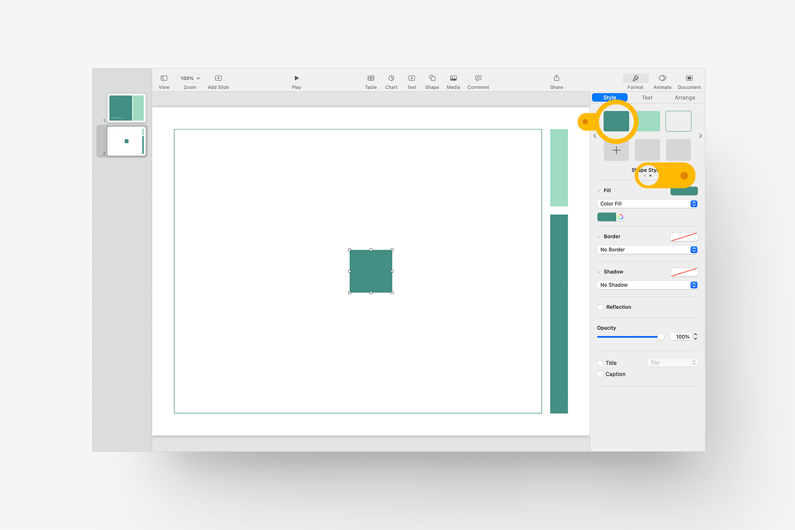
Apply the first "reserved" Shape Style (from the second panel of styles) to our proxy square.
Redefine a Shape Style
The style we've just applied is a framework "root" color – that is, all of the Comfrey green shapes used throughout the Slide Layouts have this same Shape Style applied. This will allow us to change every shape using this style throughout the file all at once when the style is redefined.
We’ll start by changing the Comfrey to another color on our proxy shape. With the proxy square you inserted still selected, click on the rainbow color wheel in the Fill section, directly beneath the Shape Styles section on the Format > Style panel: this will open the Color window. Select the second tab in the Colors window to choose Sliders, select RGB sliders, and enter the color you’d like to use: in this case, we’re going to use a vibrant, contemporary Persimmon base: 229,95,69. Close the Colors window, and you should be left with your re-colored square still selected on the stage.
Now, we’ll simply redefine the Shape Style we started with to replace the original color with our revised color throughout the theme. With our proxy square selected, Right-click or Control-click on the original Shape Style in the Style panel - still currently the darker Comfrey green - and select Redefine Style from Selection:
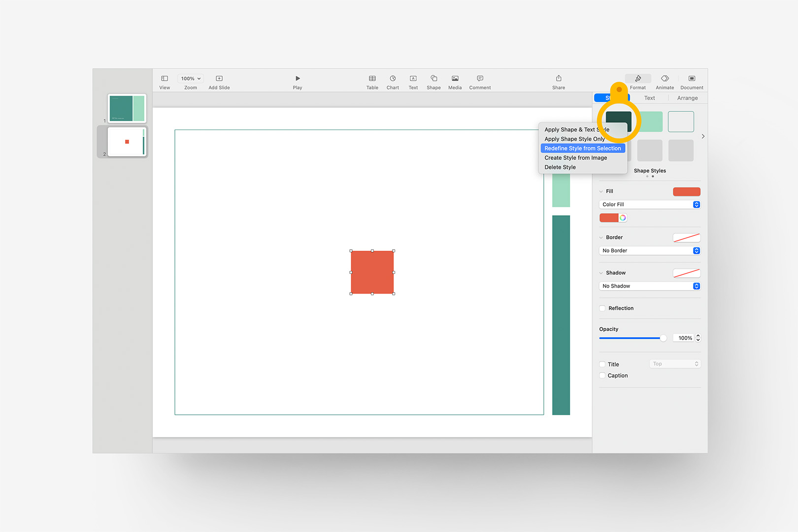
Change the color of the proxy shape, and redefine the original Shape Style.
Keynote will prompt you with a confirmation dialogue ("91 Objects use this Style" in this case): be sure "Update all Objects" is selected, and click OK to continue.
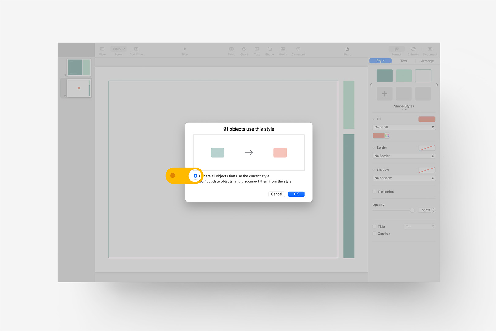
Ensure "Update all Objects" is selected, and click OK to redefine the style.
Once you’ve clicked OK, Keynote may take a moment to make the change throughout the file - but once it’s done, you’ll notice this has changed the Comfrey green to our revised Persimmon on the Blank slide we’re working on, as well as the original Title slide above it in the slide navigator. If you click the Add Slide button, you’ll notice it’s changed it for you on all of the presentation’s slide layouts: you’re well on your way to a custom OM X build.
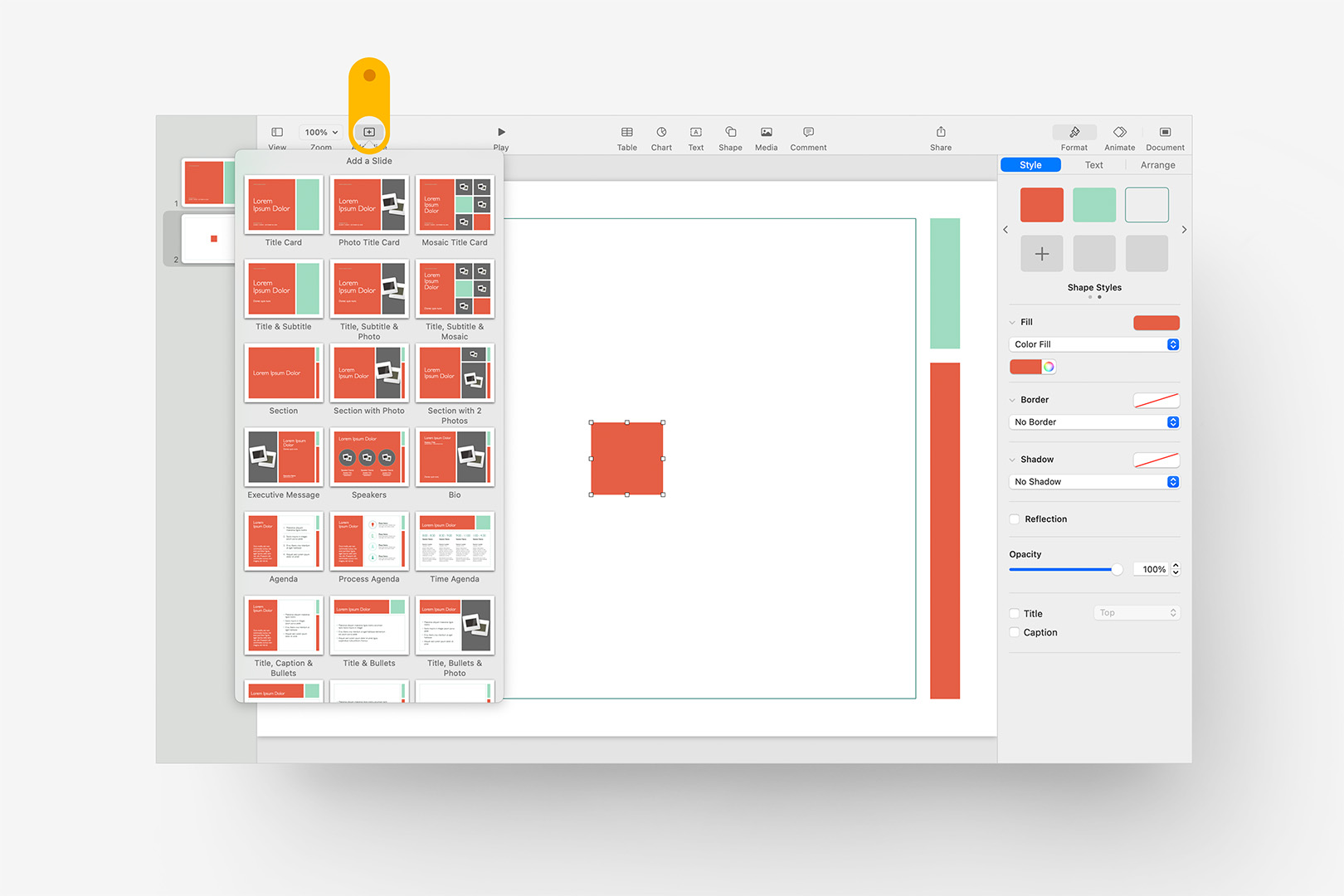
Click Add Slide to inspect the effects on the file's Slide Layouts and verify the change.
Additional Shape Styles
Next, we’ll redefine the additional Shape Styles used to set the secondary accent color and outline color on the OM X slide layouts. Add another square to the stage, and apply the second reserved Shape Style, which defines the lighter Accent Green. Change the Color Fill to 249,220,188 to select a pale accent that coordinates with the Persimmon we’ve already defined, Right-click or Control-Click on the Second Shape Style, and once again select Redefine Style from Selection – select Update all Objects and click OK: the primary Accent Color is now redefined throughout your entire presentation.
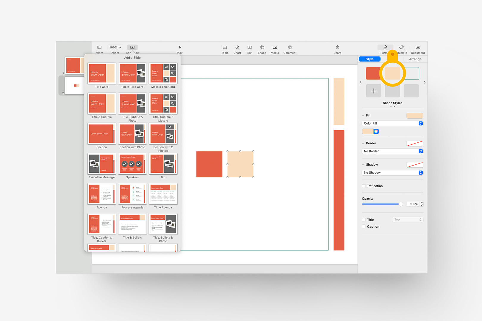
Redefine the secondary Accent color using a second proxy shape.
You’ll notice that the stroke outlining the Blank layout still remains green at this point - we have one additional style to redefine to complete our basic changes. Add a third square to the slide, and with the shape selected, click on the third reserved style (outlined) to apply it to the rectangle. You’ll notice the Fill setting changes to No Fill, while the Border changes to a Comfrey green Line style. Click the rainbow icon to bring up the Color window, and change this color to our original Persimmon - 229,95,69 (or use the eyedropper to sample the first square). As before, with that third shape selected Right-click or Control-click the third Shape Style and select Redefine Style from Selection, selecting Update all Objects and OK.
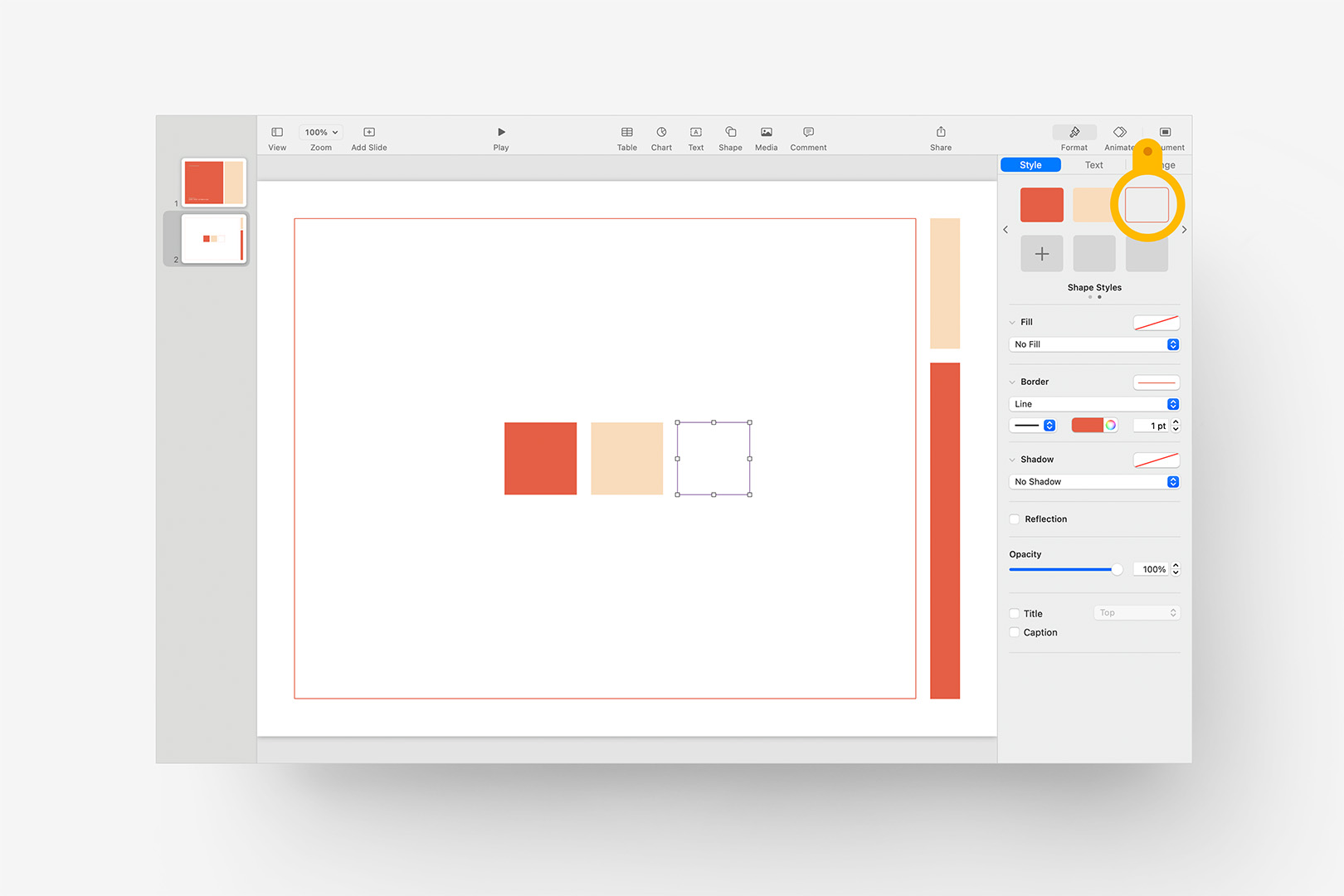
Redefine the third Shape Style using a third proxy shape.
At this point, you’ve successfully redefined the basic shape styles which drive the primary coloration on the OM X slide layouts. There are a few additional text and shape styles we’ll want to adjust to be sure everything’s synced throughout the file, but you’ve already got the basics of the process if you’ve been following along to here.
While we're still looking at our Reserved Styles, though, let's take a quick look at a non-obvious secondary definition we should also account for: Lines. Line Styles are actually defined separately in Keynote & Pages than the closed-shape styles we've been redefining thusfar. Click the Shape button, and add a basic Line to the slide: again, it's defaulting to the first style, which we key to the primary chart palette. As before, scroll to the second panel of Line Styles to show the Reserved styles that would be applied on the underlying Slide Layouts, and apply the first reserved style. Set to our new Persimmon color (229,95,69), and Right or Control-click to select Redefine from Selection as we did before:
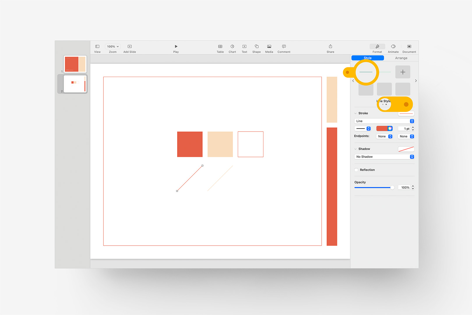
Redefine the reserved Line Styles using proxy Line shapes, just as before.
Nothing new here – we'll repeat those steps with the second Reserved Line Style, just as we did with the previous shapes (be sure Update is checked, in both cases) – but it's important to note that Line Styles are their own defintion, separate from the closed-shape defintions. There's still the matter of the six default styles / colors to account for, but we'll revisit those a little further on: let's move on to Text Styles.
Updating Text Styles
If you click on Add Slide at this point and scroll through the Slide Layouts, you'll see we've made good progress: the Comfrey green and secondary accents have been reassigned throughout the file (excepting the plain "Color" background – we'll get into that below), though when you make it down to layouts like Big Fact or Then vs Now, we have a few obvious remnants of the light green accent set on some of the titles.
Let's add a Big Fact slide to the presentation to make it easier to access and examine the applied styles. Click to select the large "85%" factoid, and click on the Format > Text inspector to expose the basic settings. You'll notice this object is set to the "Fact" style, with the original pale accent green assigned to the text color. Click the color wheel icon in the Text Color row, and assign our revised accent color again: 249,220,188. You'll notice a blue "Update" button appears next to the style name back up at the top of the inspector:
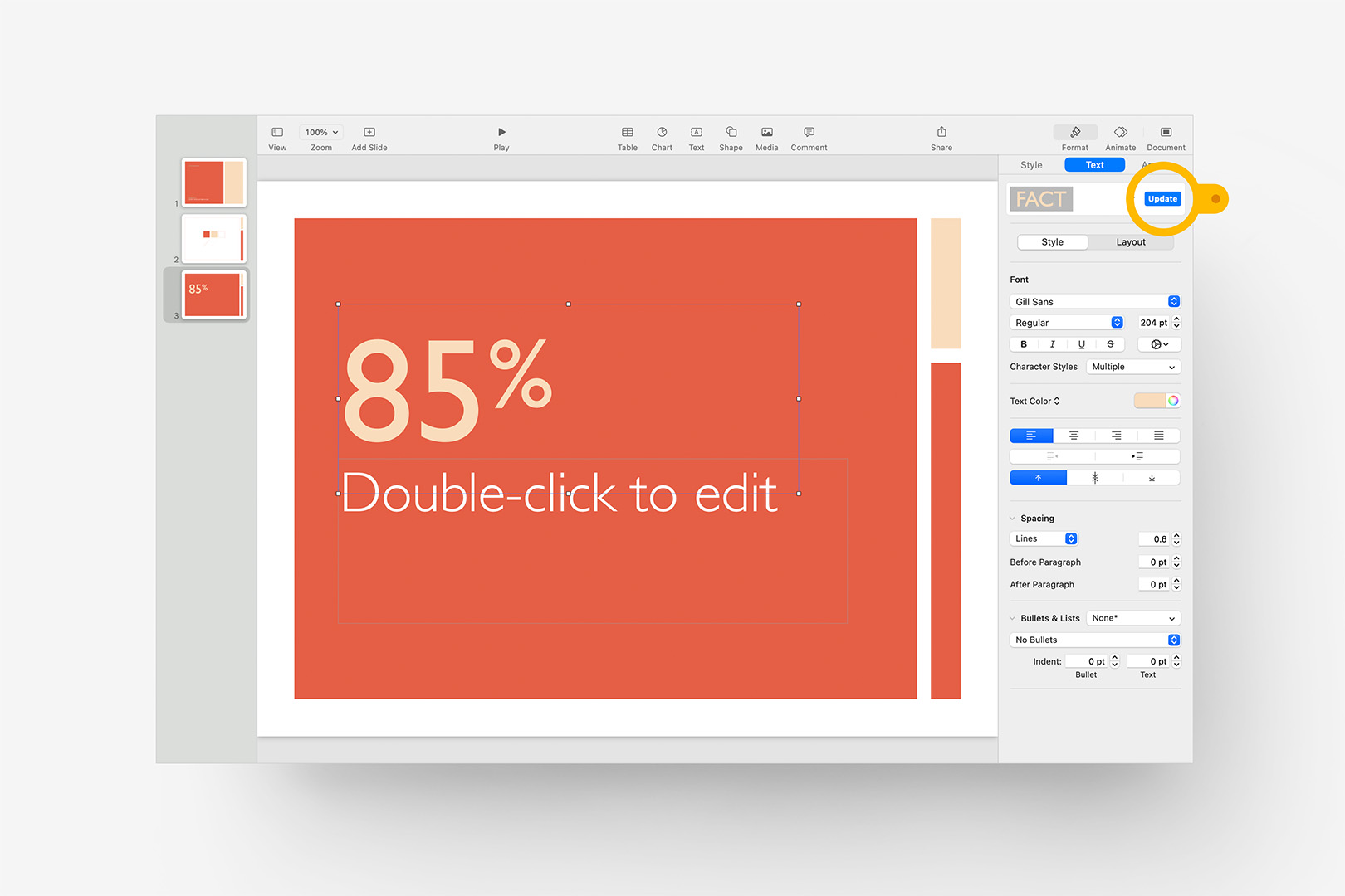
Redefine the "Fact" Text Style to begin applying the revised palette to the titles.
Click Update to redefine the style in the underlying Style Sheet, just as we did with the shapes before: the Update button will disappear once it’s complete. Since we're dealing with colored Text against a colored background, we should be mindful of Contrast here: if you're applying your own palette, adjust the specific color you'll apply to accent text if you need a bit more contrast between your revised Primary & Accent colors for text legibility.
If you click the toggle arrow to expose the file's other Paragraph Styles, you'll see we have quite a few more green style instances to handle. There are a few ways we can approach these en masse – for now, let's add another Blank slide to our presentation so it's easy to focus, and click the Text button to add a text object to the slide. You’ll notice this defaults to the "Caption" style, which is a slightly darker version of the original Comfrey green (again, to offer some level of contrast if it's placed against a solid-color background).
To help us dial in a slightly darker / lighter variation for the new caption, let's also bring in a copy of the original proxy square we used to redefine our primary Persimmon color for contrast. Select the text object, and change the Text Color to our primary RGB (229,95,69): this will, of course, make the text effectively invisible against the square. One of the easiest ways to approach this is to change color spaces on the Color Sliders to HSB (Hue, Saturation, Brightness), which will allow us to make simple adjustments to the Brightness of the color without impacting its essential Hue. Here, I've switched to HSB and brought the Brightness down by 20%, which is a good starting point for this:
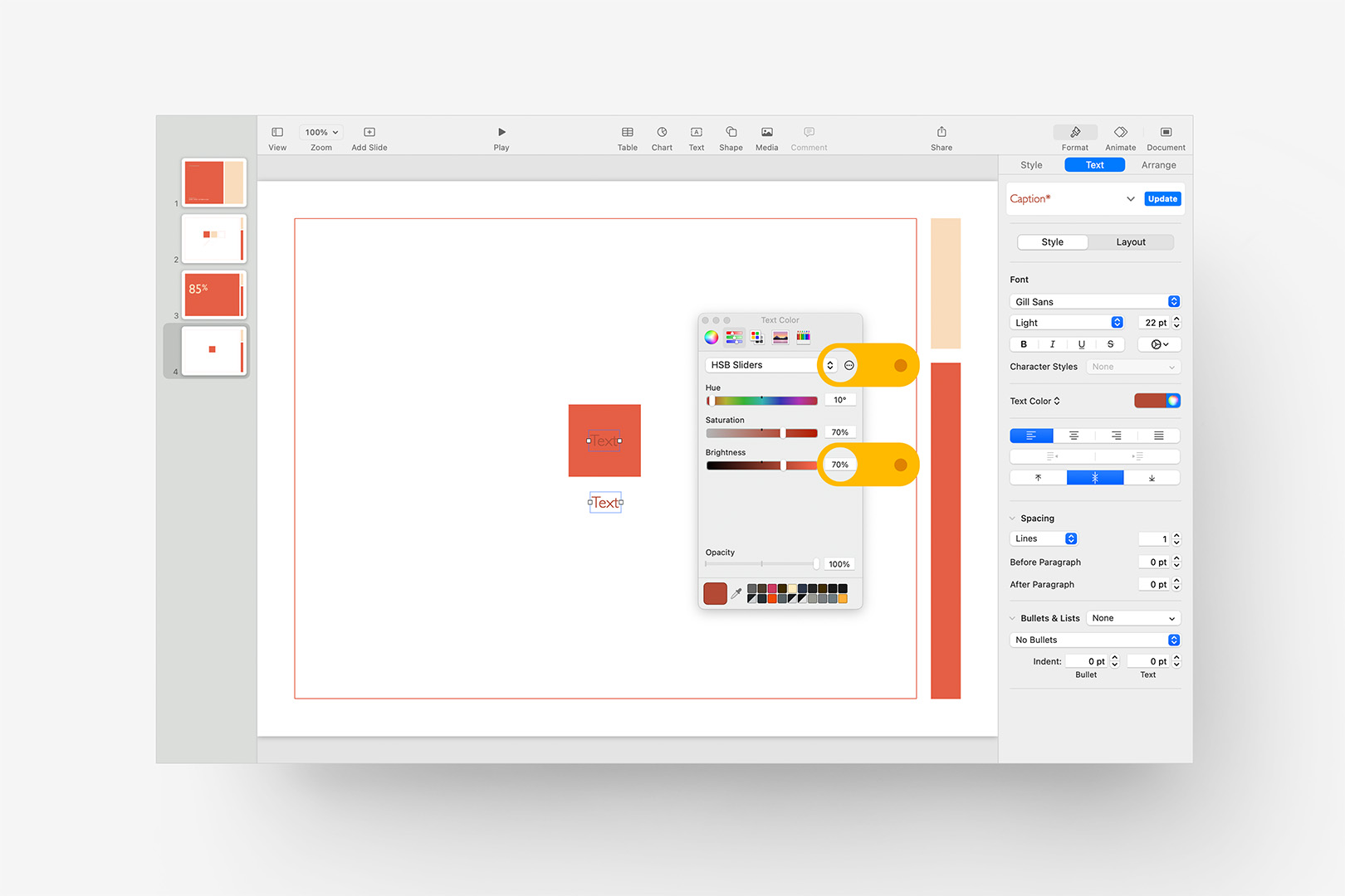
Adjust the Brightness for the default Caption text style before capturing the update.
The idea here isn't to make this a high-contrast object or to conform to a particular accessability standard – we simply want to ensure the default text object isn't going to be invisible if it's added to a full-color slide: it should pass for our primary accent on casual examination, and 15-20% darker or brighter is a safe bet for what boils down to a guardrail mechanism. We can click on Update at this point to capture the revised Caption style.
We don't need to be especially concerned about this sort of thing with the remaining text styles, as they're assigned styles rather than a default application like Caption. From here, we can simply redefine each instance of dark / light green in the Paragraph Styles list to the appropriate revised Primary or Accent color and update the definitions. Select one of the text objects on your slide, apply one of the remaining green paragraph styles, update the color to the appropriate shade, and click Update – move to the next until the Paragraph Styles inspector no longer includes any of our original green text. When you've made it through the list, your Paragraph Styles inspector should look like the one below:
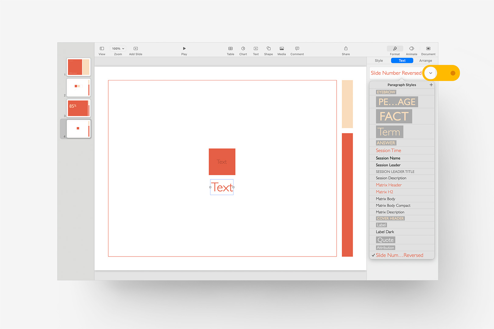
Assign the appropriate Primary / Accent color to the remaining tinted Paragraph Styles.
We've made great progress, but there are a few quirks and specialty settings to be aware of before we're ready to move on from Text Styles.
If you click on the default Title Card slide – Slide 1 in this presentation – you'll see a bit of the original accent green still remains in the provisional "Presented To:" object at the bottom of the slide, while the "Cover Header Element" eyebrow up top has already been updated as a result of our Paragraph Style edits. The "Presented To:" text isn't using a dedicated Paragraph Style – it's a spot-placement on the layout. If we edit it here, though, it will only update it on Slide 1: we need to instead move under-the-hood to the Slide Layout itself to be sure our change will carry forward to all instances of the Title Card layout.
Click the Edit Slide Layout button in the bottom right corner (or via the View menu) to switch to the slide's underlying layout: you'll notice a blue bar will appear beneath the layout to indicate you're now editing a layout instead of an individual slide. Be sure to exercise additional caution when you're in Edit Layout mode, as your changes here will translate to every slide using the layout you're editing: if you accidently nudge an accent square on a layout, it will be out-of-place on every slide using that layout, so be mindful of exactly what you're selecting as you move through the layouts.
Here, we're simply going to highlight the errant green and change the color to our updated Accent color (249,220,188): we aren't updating the assigned style (which in this case is totally unrelated), we're simply updating the spot application of color and moving on to the next:
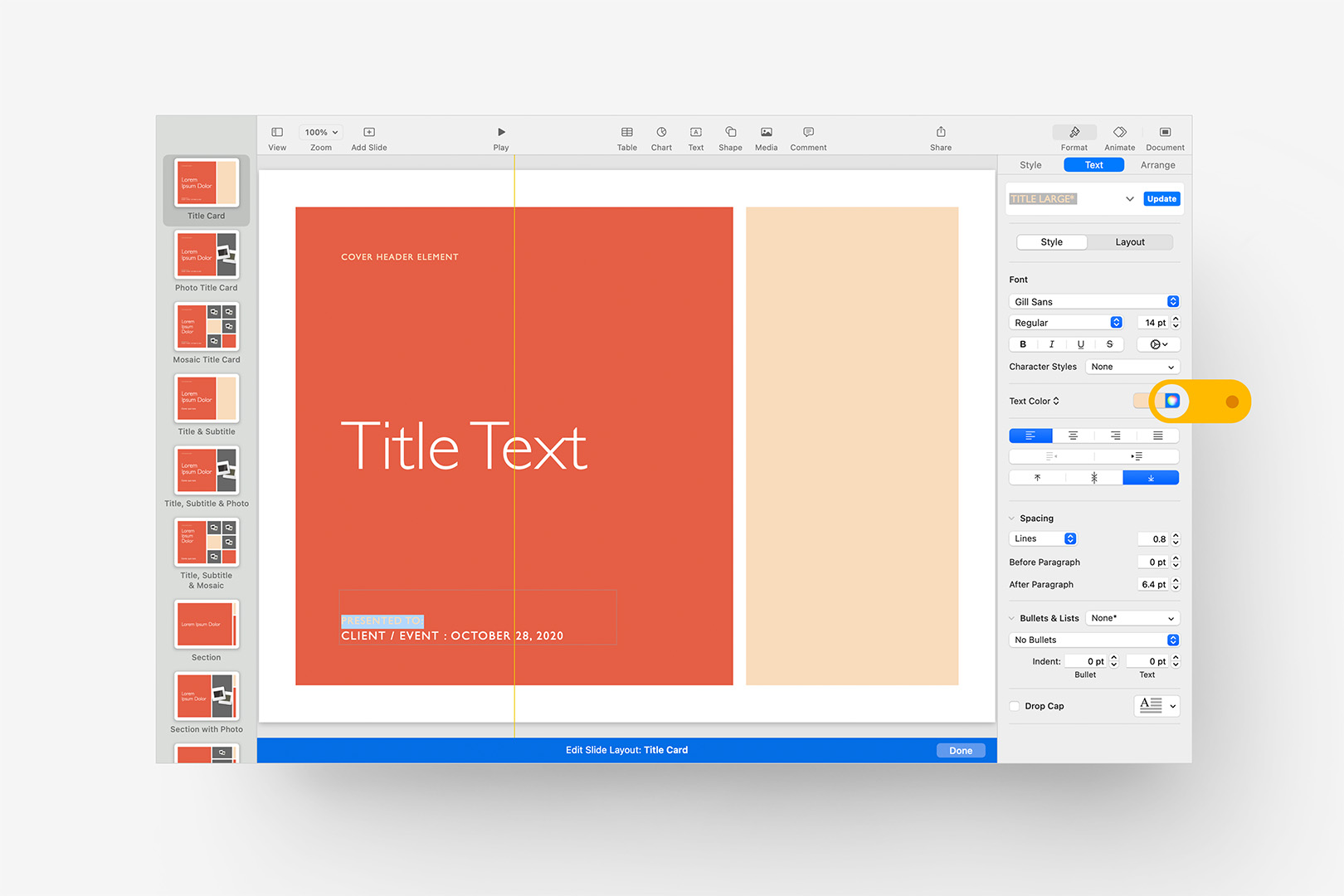
Move into the Slide Layouts and adjust any Spot Placements that aren't mapped to a dedicated Paragraph Style.
We'll want to scan through the remaining Slide Layouts to look for additional spot placements: the next two Layouts in OM X are variations on the basic Title Card setup, for example, and should be updated exactly the same way as the first. Depending on the particular theme system, there may be more (or fewer) instances to look for – it ultimately comes down to how much of the system is "captured" for widespread style application vs one-off instances, like the Title Card provisional statement, where a custom implementation comes into play on just a single layout or two and doesn't warrant promotion into the stylesheet.
Likewise, there may still be some non-obvious color applications in the dedicated Paragraph Styles that won't jump out until you examine or apply a paticular layout. The Agenda layout, for instance, uses the "Ruled Body Large" style, which applies color via paragraph borders instead of the text color itself, so it doesn't really stand out when you scan the Paragraph Styles list.
To update the Paragraph Borders, select the Body element on the Agenda layout, and switch from the default Style tab to Layout: you may need to scroll down to see the Paragraph Borders section, but as before, it's just a matter of changing the Comfrey green to our updated Persimmon color. In this case, we do want to Update the paragraph style – the color is a part of the root style definition:
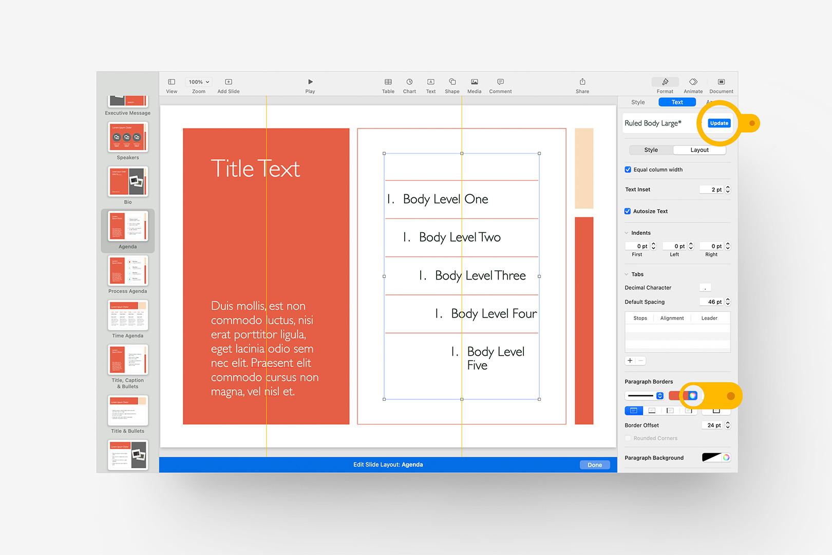
Update non-obvious color applications, like the Paragraph Borders on the Agenda slide.
The Then vs Now layout, further down the list, applies both of these last two principles on one slide: the Year headers are spot color/weight overrides (accent color + Regular weight vs Light) – simply update the color of the two years on the layout, but don't apply the style update to the root style. Below the Years, the Summary Points employ Paragraph Borders via the "Ruled Body Small Reversed" style: we'll update these borders to the updated Accent color, and like the Agenda border, we do want to Update the root paragraph style.
Before we move on from Text Styles, we have one more important accessory-level definition to hit: Bullets. Like Lines, Bullets resolve to their own definitions seaparte from the Paragraph Styles which they can be applied to. Let's jump down to the Compare & Contrast layout a couple of slides below Then vs Now to start, where you'll notice another remanant of our original Accent green. Keynote and Pages files contain multiple definitions for bullets – in this case the "Bullet Light" style is applied to the text columns, which you can see by scrolling to the bottom of the Style panel with one of them selected. For the Light bullet, we'll want to redefine that to our updated Accent color by setting the updated color, then clicking the style name on the dropdown control to expose the List Styles where the Update button will appear:
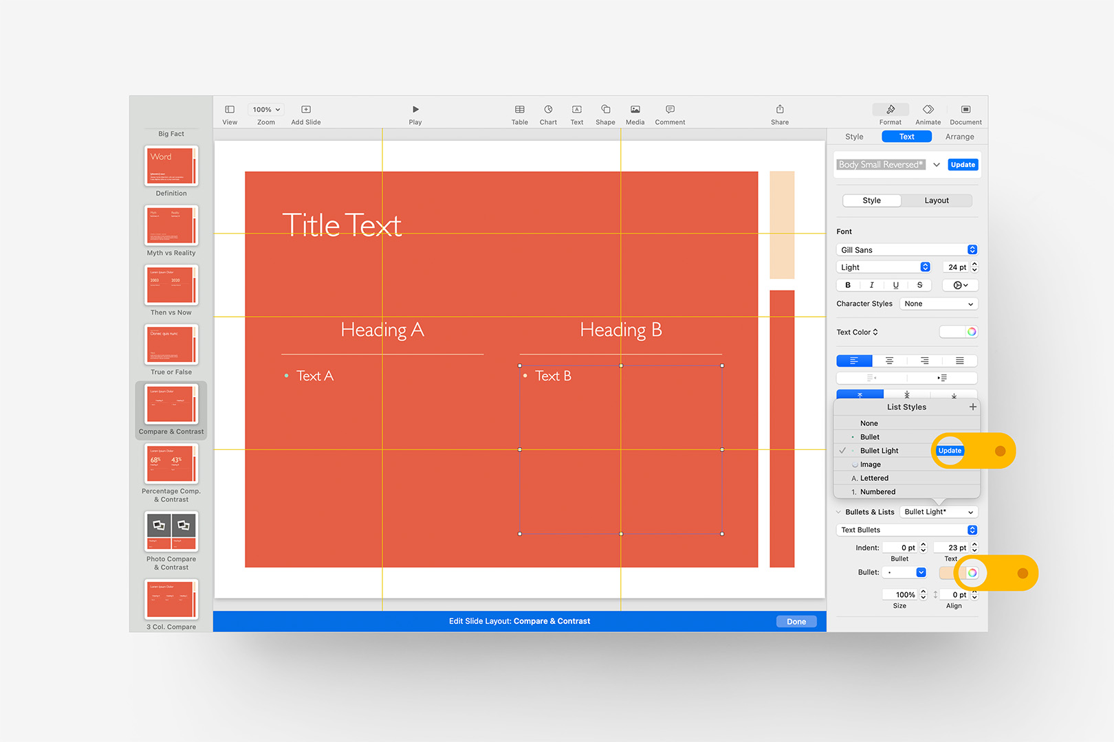
Update the applied Bullet styles by exposing the List Styles inspector.
We'll need to do the same for the regular "Bullet" style: it's easiest to see on the plain Title & Bullets layout further up the Slide Layouts list, but if you'd like to add a bit of safety contrast in case this style gets applied on a full-color background, use the same ±15-20% color adjustment you applied to the default Caption style earlier for good measure.
The Extra Mile
We're into the proverbial Endgame here: if you’ve followed along to this point, you’ve already mastered the fundamentals, though there are a few additional concepts and definitions you'll want to be aware of before we start wrapping up.
While we're still in the Slide Layouts, let's scroll down to the Color slide we'd noted earlier to examine an important caveat to Styles in Keynote and Pages. You'll notice there's a color fill applied to the background, though no obvious Style panel or selector anywhere nearby. While we can redefine Shapes, Lines, Paragraph, and List Styles, there's no such mechanism for doing so with Standard Backgrounds (though the functionality is available for the Dynamic Backgrounds in Keynote). So for this Layout, all we can really do is change the original Comfrey green to our updated Persimmon color:
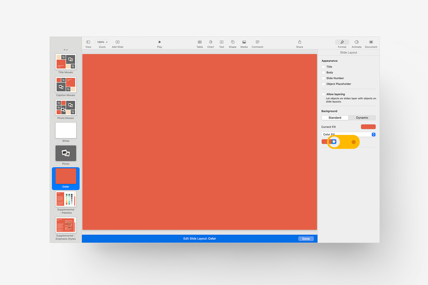
Update the Background Color via the Fill: there are no Style definitions for Standard Backgrounds.
You can, of course, work around this by using shapes in front of the background if you need to tie backgrounds into your own system, but there are a few caveats. Authoring-wise, background changes on slide level will be obscured by the shape, and you'll also want to disable any instances of "Allow Layering" on the impacted Slide Layouts to be sure Send to Back doesn't layer objects behind the false background. Playback-wise, the false background will be treated as an Object on the stage (and thus become part of any Object Transition applied to the slide) rather than remaining stationary like the actual background, which will break the illusion in an instant. But if those caveats don't impact your workflow or presentation structure, it's a perfectly serviceable workaround to the lack of Styles on the Standard Backgrounds in Keynote in some cases.
In OM X, the next slide down is the Supplemental - Palettes layout, which is a good place to circle back to those default Shape Styles we'd brushed past earlier. The left column (or top row, if you're working in the HD theme) is an effective proxy for the first six Shape Styles – we tie these to the colors used in the charts to keep things tidy from a thematic perspective (though they don't derive from the Chart Styles, or vice-versa – more on that below). The first Shape Style is the default style applied whenever you add a shape to the stage, so like the "Caption" style applied to default text, you'll want to adjust your default with a ±5-10% adjustment to the HSB values for a visibility guardrail – you can get away with less contrast on shapes than text, and a little goes a long way towards our purpose here:
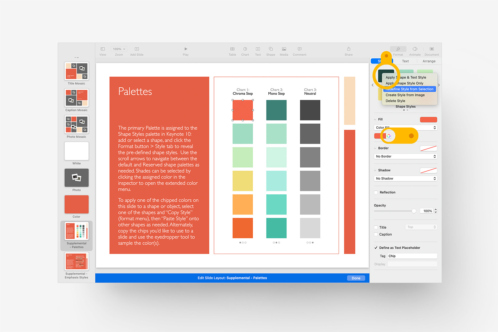
Update the default (first) Shape Style via the Fill from the selected proxy, as we did before, with a ±5-10% adjustment for safety contrast.
Just a +5% adjustment here, and we redefine the first Shape Style exactly as we did earlier. The remaining five color chips in that left column coordinate with the Shape Styles in order, so you can model out a full 6-step palette in context if you're creating a new palette. If you're building around a pre-specified palette and the color used as the main Accent Color on the Slide Layouts is included, you may want to apply a similar ±5-10% adjustment to its corresponding Shape Style (though only the first style is ever applied as a default, so you have more leeway around the remaining colors).
The middle column of shapes on the Palettes layout don't correlate to Shape Styles in this case and are completely optional to our purposes here: generally speaking, the "Mono Step" used here is a monotone / shades palette of the default color, and can be modeled fairly easily using the sort of HSB adjustments we've used elsewhere, with some additional bumps to Hue/Saturation to create a wider "zone" around the original hue. Or keep it simple, and just re-assign the default style to each successive shape and ramp down the Opacity of the shape itself to create quick-shades – totally up to you, the slide itself is authoring-assitive and entirely optional, so you could likewise delete it before we Save the custom theme.
The last Slide Layout in OM X is the Supplemental - Emphasis Styles layout, which will allow us to examine a thusfar unmentioned dimension to Text Styles: Character Styles. In more recent themes, we've been adding "shortcut" styles for color application as Character Styles to make these easier to apply: we could have used the "Accent Emphasis" style to affect the spot-overrides we keyed in earlier from a single definition, but OM X was produced before we closed that particular gap in the production process, so we'll quietly make a note of that for a future update and move blithely along.
Nevertheless, the Supplemental - Emphasis Styles layout gives us a good proxy element to examine how and where you can define multiple types of Character Styles. Click into the placeholder on the right to select the first non-bolded word that has a color applied to expose the root Character Style applied, shown here with the color changed but not yet updated on the sub-control, which maps to "Accent Emphasis":
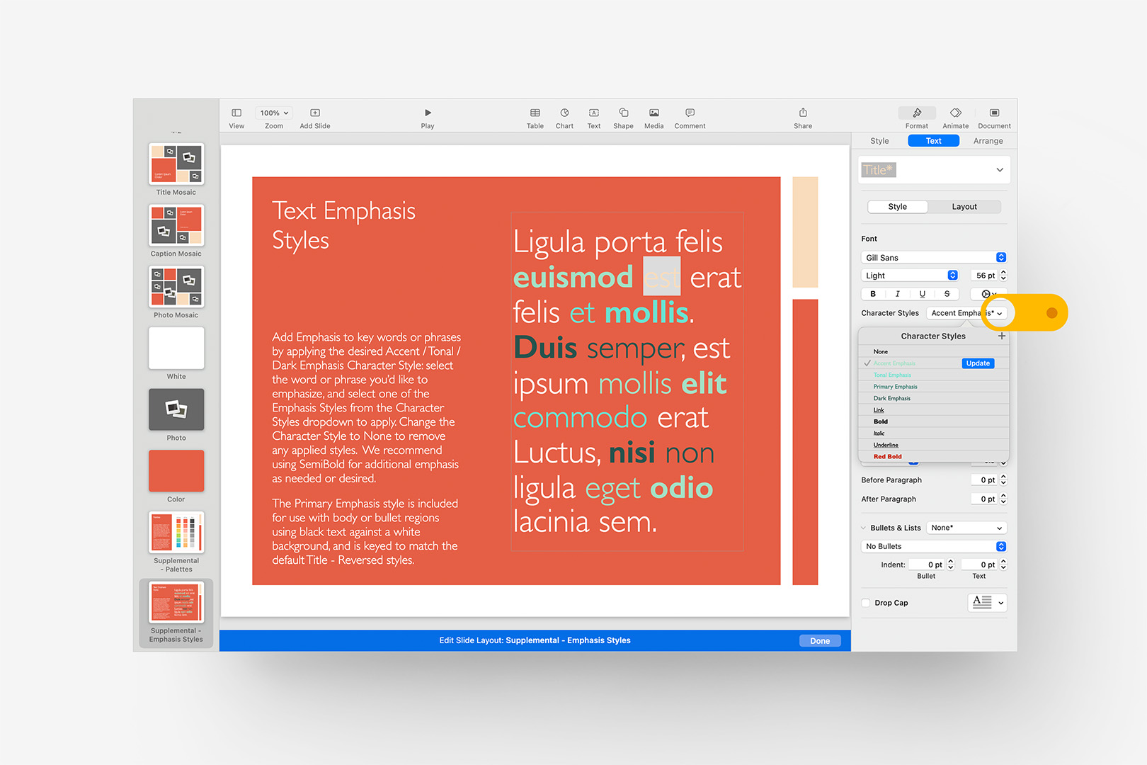
Character Styles can be created or redefined by opening the subview, just like List Styles.
As before with the List Styles, Characters Styles are Updated via the sub-control that displays when you click the style name selector, so when you're ready to define the updated Accent Emphasis style, click the blue Update button: you'll notice the bolded word next to your selection adopts the color change, though retains the weight difference. There actually is a "Bold" character style included by default, but it's distinct from what happens when you press the Bold button: if you want to capture color + bold (or semi-bold, in this case) as a style, that would be a separate, distinct definition. Here, the Accent Emphasis style is applied to both words, with semi-bold applied as a simple override to the alternate word (for Copy Style convenience).
In OM X, rather than cluttering these styles with weight variations, we've kept focus on the key color variations that allow you to quickly apply the appropriate highlight or accent for both on-white and on-color application. Accent Emphasis keys to our revised Accent color, as we just applied, and is meant for use against color – "Primary Emphasis" will key to our revised Persimmon color, and is meant for use on white backgrounds.
The "Dark Emphasis" style is intended for use against color, though it can obviously be applied to either background type. Of the two remaining Character Styles we're focusing on, this is the easiest to dial in: select one of the dark, non-bolded words and set the initial color values to our primary Persimmon color. Then, using the HSB sliders again, run the brightness down to 35-40% – this will give us a solid, readable contrast against the Persimmon while retaining its essential hue. Update the Dark Emphasis style from your selection, just as before.
The "Tonal Emphasis" style is a bit more esoteric: it's intended to provide an additional level of color variation alongside either the Primary or Accent Emphasis patterns, so it should work well both against white and against our primary color, in a shade that complements the other accents we've defined so that they work in tandem application. A bright orange is a good candidate in this case, as it will provide a nice pop of color against our Persimmon base, while remaining in the general "proximity" of color between our Primary and Accent colors. We've captured the style here to make it a bit more apparent:
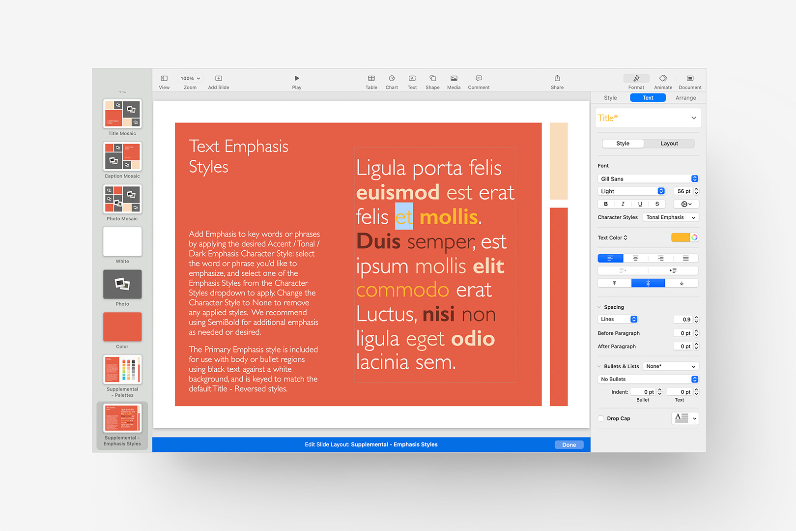
All of the theme-specific Character Styles have been updated, with the "Tonal" style highlighted.
In practice, you'll want to test the appliction of both Primary and Tonal against a white background as well (a-la the Title & Bullets layout) to dial in your specific Tonal accent: not every color works well against both color and white, so it may take a bit of experimentation if you're creating your own.
From here, we'd generally recommend making your way back up through the Slide Layouts one by one to look for any remaining instances of color that haven't been caught by our changes thusfar to the Shape, Text, or accessory styles. While the icons on Process Agenda, for instance, changed color after we updated our primary Shape Styles, the circles surrounding them didn't: they're 1pt heavier than our default Line Styles, and will need to be keyed to the appropriate color. Likewise, the color border on the images on the Speakers slide is a custom application: shift-select the image placeholders, and key in our revised Accent color:
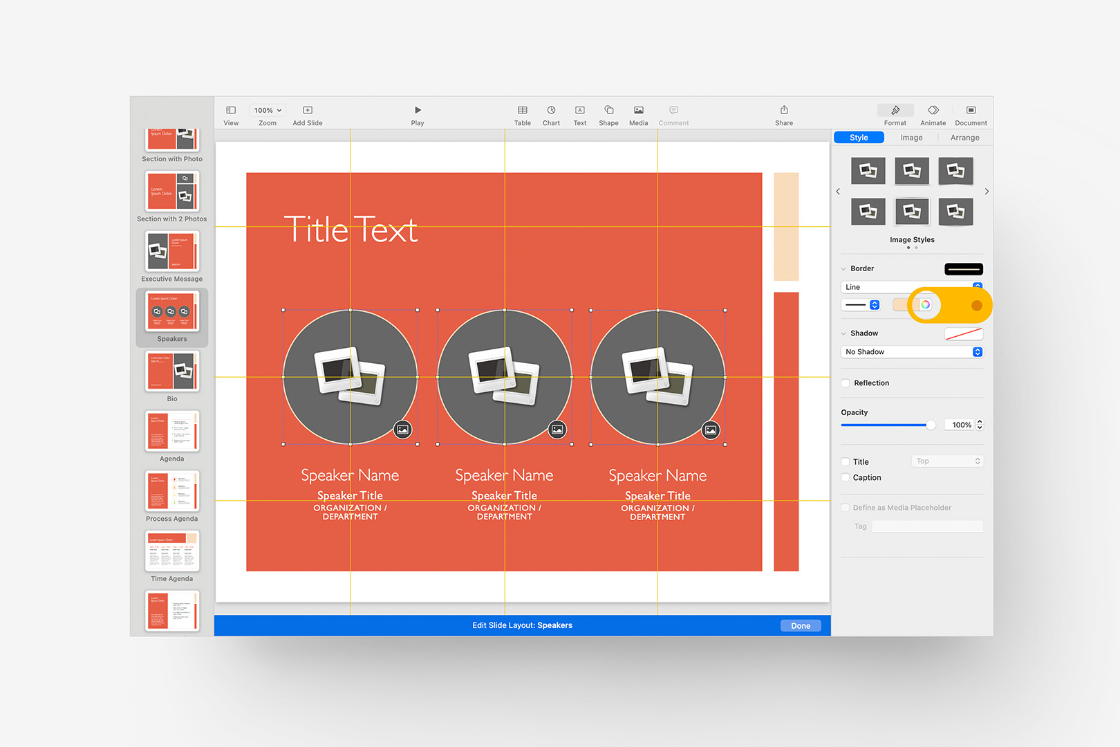
Key in any remaining color applications that jump out on a final review of the Slide Layouts.
We aren't covering Image Styles in this tutorial, though you could create one from the selected images if it's something you'll need to make use of frequently. Here, we're using it to provide a "buffer" for color photography used against a uniform field of color, so it's fairly narrow in application and not the sort of thing we'd add to the dedicated Image Styles – the default Image Style in OM X is non-shadowed, non-bordered, so there's really nothing to cover here beyond the spot application.
Once you've made your way back up to the first Slide Layout – the Title Card layout we began our initial diversion into the layouts with – you can click the Done button in the blue bar at the bottom to exit the Slide Layouts and return to standard Navigator view.
At this point, we've made our way through all of the basic settings we'll need to hit for most purposes, and could move into Saving the theme. There are a few more not-so-basic categories remaining in a full coversion, though: Table Styles, Chart Styles, and the Color, Gradient and textured Image fills in the Fills Palette. These are all a bit more complex than what we've covered thusfar – Chart Styles in particular are a bit of a Dark Art in terms of being tricky to capture well, even for seasoned theme builders. We have plans to work up more detailed looks at all of these processes for the ambitious among you, and will update this page with links once we have them: for now, we'll refer you to Apple's instructions for both Table Styles and Chart Styles as a good authoritative reference on the basics – there's quite a bit left unsaid in terms of the iterative definition process for Charts, but we'll eventually get to that here.
The Fills Palette is set independently of the Styles settings we've covered thusfar, and provides a way to define the root Accent Colors and derivative Tints & Shades, Gradient Fills, and Image Fills that appear in the quick-select Fill menus in the Inspector panel. This is a great way to ensure color-use consistency throughout your files, and is easy to customize once you understand the palette's structure and how to make your edits. We've pushed this into its own tutorial – including a downloadable Color Provisioning Starter file – available here: Transforming the Fills Palette
Save Your Theme
If you've made it to this point, pat yourself on the back: you've customized a presentation with your own palette, hitting all of the most common touch-points for Shapes, Lines, Paragraph Styles and common accessories like Bullets and Character Styles.
All of these changes, though, are only within the scope of this particular file (or Save As... derivatives): to re-use these changes again and again, you'll need to save a Custom Theme to create your own custom starting point. From the File menu, select Save Theme, and you'll get a dialogue like the one below:
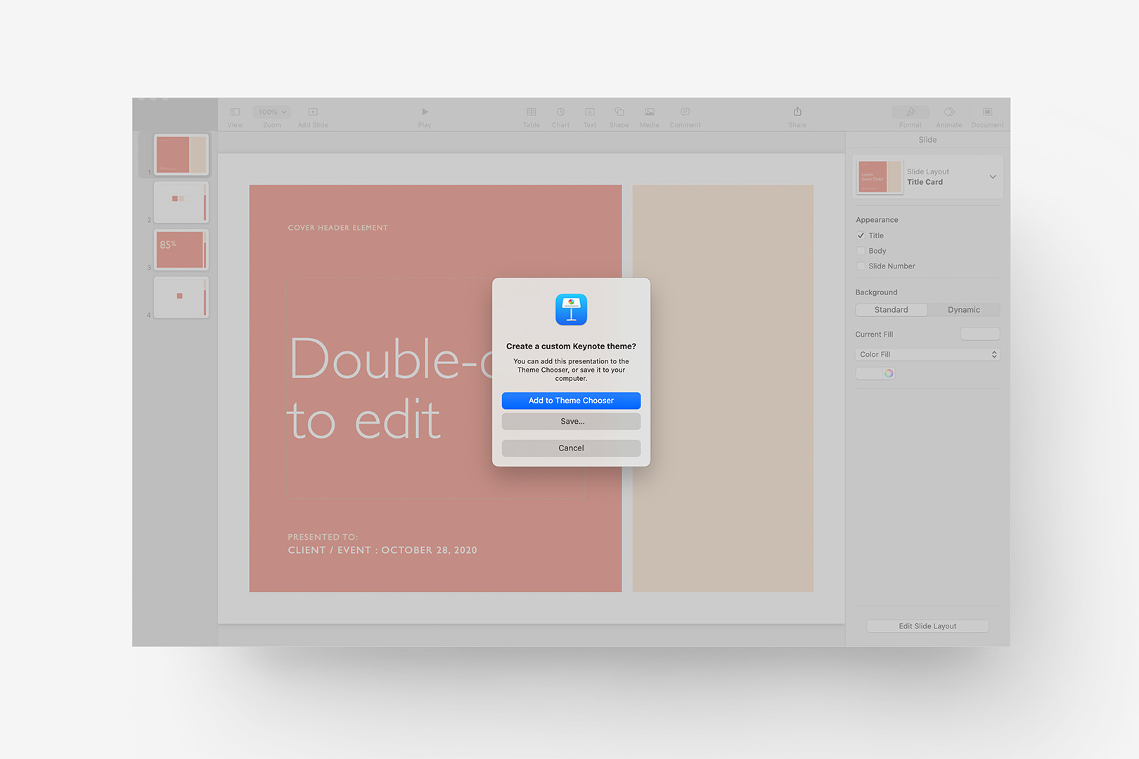
Select Save Theme from the File menu to trigger the Create Theme dialogue.
While you can simply select "Add to Theme Chooser" from here, you're going to be left with a fairly rudimentary icon in Keynote's Theme Chooser window, even if you doctor up a working icon on your first slide (which would have made a lot of sense, yes?). If that's not a big deal for your purposes, Add to Theme Chooser will push your theme to Keynote directly & you're good to go: from the File menu, select New... to bring up the Theme Chooser, and you'll find your theme in the My Themes section like any other 3rd-party theme you may have installed.
If you'd like to add something a bit more bespoke to your new custom theme, though, we'll need to prepare an icon image and manually replace a few of the auto-generated files in our theme file. Click Save..., and select a good working folder: this will export a .kth file, which is Keynote's Theme File format. We'll come back to this file in a moment.
On your first slide, work up a "hero" slide to serve as an icon for your custom theme – changing the Zoom to 25% will give you a quick sense of how it will look at scale and give you the opportunity to scale the text to something more readable if needed. Once you're happy with your icon, we'll go to the File menu and select Export To > Images: the default PNG option is a good starting point, and we want to save it to the same folder our .kth file was saved to.
Hide Keynote for now, and go to the working folder where you saved your Theme file and PNG image. Here, we're going to work a bit of non-obvious file-system magic: Keynote (and Pages) files are actually compressed / ZIP folders on the outer layer, so we can rename our .kth to .zip and decompress the contents to see the internal structure. Right-click the file to select "Get Info" (alternately command-i with the file selected), uncheck Hide Extension, and change the .kth extension to .zip: Finder will prompt you with a comfirmation, click on the "Use .zip" button to confirm. Now, double-click the .zip to extract it, and you'll see the raw folder structure of your new Keynote Theme:
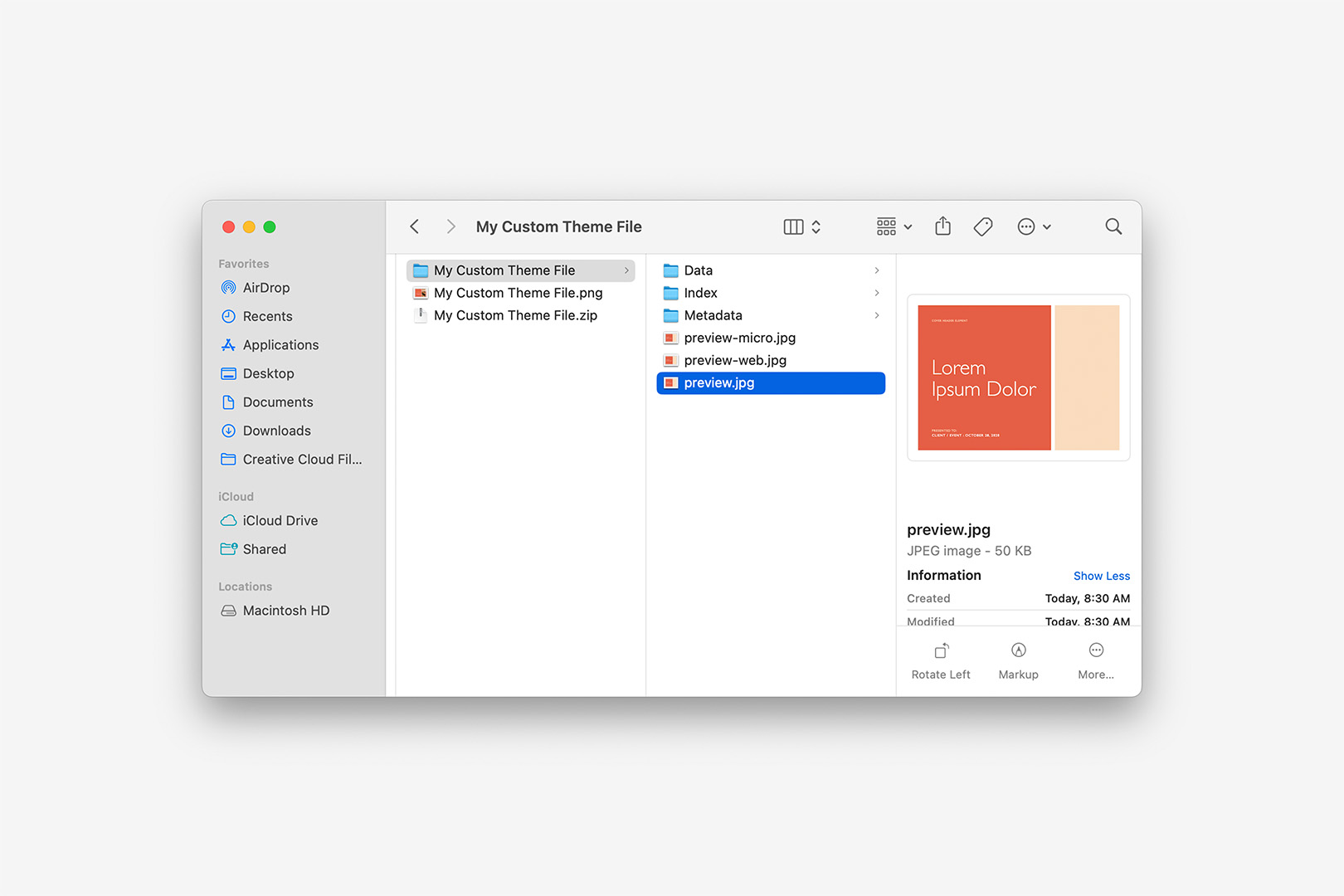
Rename the exported .kth file to .zip, and extract to a folder.
The "preview.jpg" image selected there reflects the default Keynote generates regardless of what's on the first slide (it defaults to the first Slide Layout with "Lorem Ipsum" greeking in the title object). And as you can see, we have three files named preview: "preview.jpg", which is the largest, along with smaller "preview-web.jpg" and "preview-micro.jpg" derivatives. We're going to replace all three of these with the new hero icon you created a moment ago.
Open the PNG we exported in your favorite image editor: we're going to export JPEG files for each of these three preview images at the corresponding target size. These are slightly different for Standard (4:3) and Wide (16:9) formats, noted here for convenience:
| Standard (4:3) | Wide (16:9) | |
|---|---|---|
| preview.jpg | 1024x768 | 1024x576 |
| preview-web.jpg | 186x140 | 186x105 |
| preview-micro.jpg | 45x34 | 45x25 |
Export your JPEGs at the appropriate size, replacing the original in your extracted theme folder. Once you've replaced all three files, we're ready to "re-pack" the theme.
Move the original, pre-extracted .zip file to the Trash: we no longer need it. Right-click the extracted theme folder we've been making our changes in, and select Compress to make a new .zip file from the updated contents. Then, it's just the reverse of our initial rename: change the .zip extension back to .kth, and confirm the change. You're left with an updated .kth file, which will give you the option to install the theme when you open it in Keynote. The theme will appear in the My Themes section, as shown here:
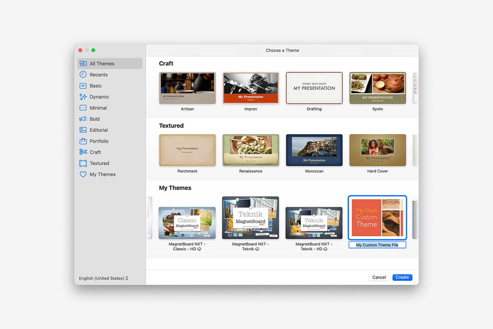
Open your updated .kth in Keynote: installed themes appear in the My Themes section.
Like any other Keynote theme, once it's installed you can right-click the preview in the Theme Chooser to rename or remove it whenever you like. If you're using your new theme as a new all-purpose starter, you can set it to be your default theme in Settings: on the General tab, look for For New Presentations at the very top, tick "Use Theme", and click the Change Theme button to display the Chooser.
Additional Notes
Updating Your Theme
Save your working .key file as an ongoing Export Source: you can make revisions and re-export your theme as needed to address additional changes or modifications moving forward. As long as you use the same root name for your re-exported theme, Keynote will offer to Update the theme file when you open the newer version.
Alternately, you can save a new .key file generated from your latest theme file to pick up with your prior changes in a new file. Likewise, simply alter the revised theme name if you'd like to keep a second, alternate version of your theme in the Theme Chooser.