The Upgrade Report


Known Issues, Current Theme / Template Library:
Keynote v15.1.1: Selecting an image placeholder in some themes can trigger a repeatable Crash in Keynote v15. Impacting: Calais, Geneva, Hyperion, OM X, Palo Alto NXT. Testing indicates this is a Keynote bug vs Theme-initiated: stick to Keynote 14.5 for the time being when using any of the impacted themes. *Alternately: opening the Helix theme prior to one of the impacted themes appears to have an inoculant effect, allowing normal use until Keynote is restarted.
Known Issues, Composer Interops:
Keynote v15.1.1: The premium themes included with an Apple Creator Studio subscription use several non-standard Layout names which don't appear in the Global Standard Routes matrix: use Target Layout tags to specify the Layout name when targeting any of these themes.
Topline Notes (Cumulative)
New versions of Keynote, Pages, and Numbers arrived in January as part of the Apple Creator Studio launch, with final updates to the v14 MacOS apps appearing alongside the new v15 apps. You'll need MacOS 15.6 (Sequoia) or higher to run the new v15.x apps.
The root theme/template architecture remains stable between the two major branches: the "Classic" 14.x apps on MacOS co-exist alongside the new 15.x apps, and testing suggests that files created in the 15.x apps appear to work interchangeably in v14.5 (though v14.x users appear to be excluded from Collaboration once one or more collaborators have migrated to 15.x, fwiw).
Excepting any tracked bugs noted above, all of our currently-shipping themes and templates should perform as expected in the latest apps without version-specific updates required: if you're already fully up-to-date on one of our theme/template systems and upgrading from a relatively recent version of Keynote or Pages, the update to the latest versions should be more or less transparent from a theme application/usage standpoint.
v15.x (2026)
- Updated Liquid Glass UI in MacOS Tahoe / iOS'26 (v15.0)
- Updated Shape Palette (v15.0)
- Premium Content & Intellegence modules via Apple Creator Studio subscription (v15.0)
The v15.x apps are now part of the Apple Creator Studio collection, with new premium content and features available via subscription.
We'd initially expected to see the new v15.x apps last Spring on their usual cadence – and then again, surely, as part of the OS'26 launch back in the Fall. The extended cycle for v14.x suggested some sort of major change was in the works, and in January we were finally introduced to the new Apple Creator Studio, which included all-new versions of Apple's signature Productivity Apps alongside other creative apps like Final Cut, Pixelmator, and Logic in a new subscription-based Collection.
Keynote, Pages, and Numbers remain Free to use, and are broadly feature-complete compared to the v14.x apps: under the hood, there's been a bundle identifier change ("com.apple.iWork.Keynote" in v14 vs "com.apple.Keynote" in v15, for instance), with the new Mac apps adopting the identifiers used for the iOS + VisionOS apps. The iWork naming appears to have been retired in the transition (beyond the root ".iwa" extension still figuring into the structure under-the-hood).
While the v15.x apps remain Free, they've also effectively migrated to something more akin to a Freemium model, with the vast majority of new features in this cycle (beyond the UI updates for OS'26 themselves) being unlocked with an Apple Creator Studio subscription.
UI Updates & Globals
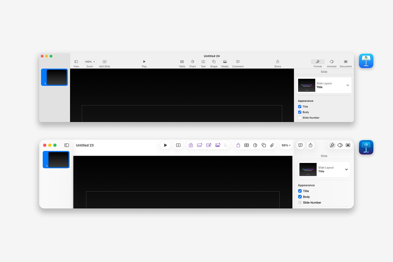
If you're not a subscriber, you're generally looking at a UI refresh for the OS'26 cycle – along with quite a few new elements to promote the Creator Studio and some of the new Themes available with a subscription. Keynote's Theme Chooser adopts the floating Liquid Glass sidebar, with a prominent promotional banner:
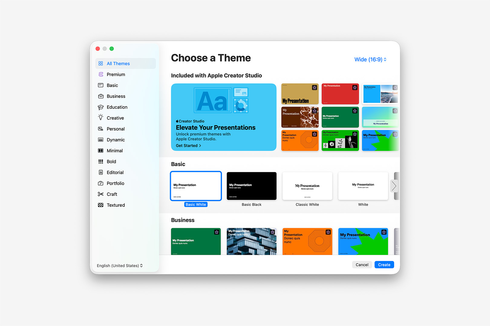
The 15.x Update brings an updated Theme Chooser to Keynote, including a large Promo section for Apple Creator Studio up top.
Beyond the "Included with Apple Creator Studio" banner section at the top, you'll notice several new and expanded Categories featuring a number of new Themes, many of which are tagged with a Purple Ribbon-Star glyph indicating their Subscription-Only status. This intermix of Free + Premium options will feel very familiar if you've ever used Canva in the last several years, who use a similar Crown icon to denote subscriber-only templates and features alongside their free options.
Clicking into the Premium category will give you a good overview of the new themes in one view – if you'd like to get a better view of one prior to subscription, you can click Create to open a preview modal:
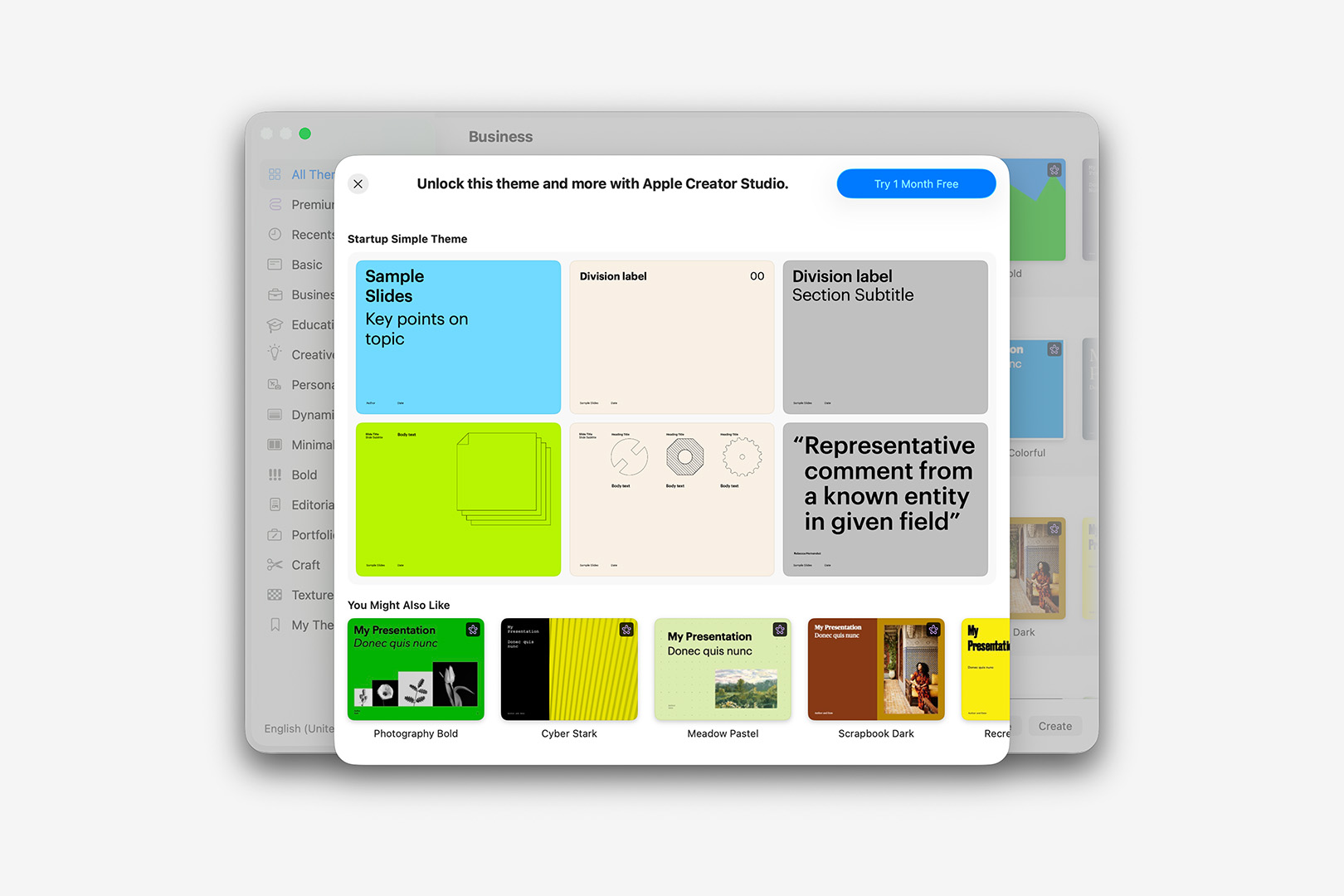
Click Create in the Theme Chooser to open a preview of any of the new Premium Themes prior to subscription.
Pages-side, the Template Chooser has seen similar updates, with all-new Categories like Organizers, Brochures, and Business joining the list. Cards have been promoted to their own category, with quite a few new sub-categories available:
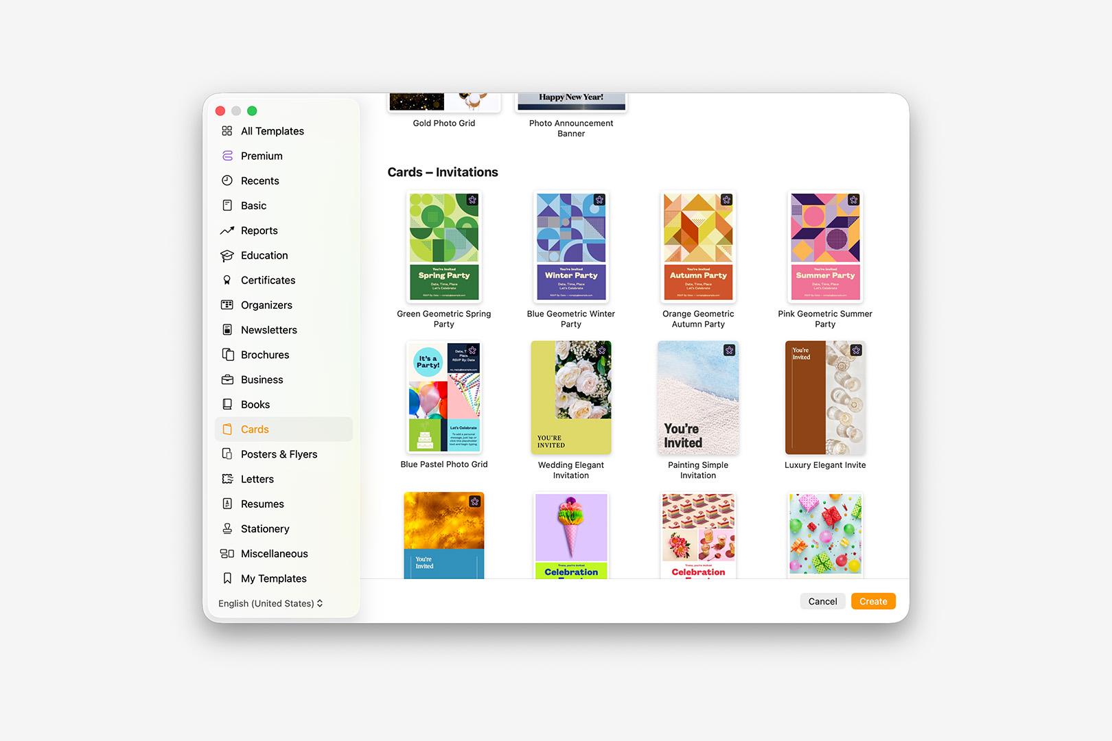
In Pages, Cards have been promoted to their own category, with quite a few new sub-categories available.
Turning to the apps themselves, v15 is the most significant UI overhaul these apps have seen since the Keynote 6.x/Pages 5.x transition. The Toolbar is reorganized and compacted, with a new set of AI-assisted and subscriber-only modules highlighted prominently in Purple:
The Keynote 15.x Toolbar is completely redesigned, with subscriber-only features highlighted in Purple.
In practice, it's definitely a muscle-memory exercise – the Play and New Slide flip in particular, let alone Zoom migrating to the opposite end of the toolbar. But the end result is far more streamlined and color-normalized all around, Purple Icons aside: the normalized contrast on the Navigator sidebar definitely helps the selected slide stand out a bit more prominently when the sidebar loses focus, which has been a personal pet-peeve the last several cycles (especially in large, sectioned decks). And the new default Zoom levels – 95% for HD themes, 90% for SD – are another nice polish, feeling far more deliberate than the 99% default of the last several versions.
If you find yourself missing the Text button in day-to-day use – it's an option in the Shapes palette now (shown below) – it's easy to add back: Control or Right-click on the Toolbar to select Customize Toolbar (which will also allow you to remove the Purple Premium buttons altogether if you don't intend to subscribe to Apple Creator Studio).
Alongside the overall UI updates, Apple has highlighted updates to the Shape Palette as one of the stand-out enhancements in v15 – and it's another key contrast between the v14.x and v15.x philosophies, encapsulating a core shift in the form of a single popover control:
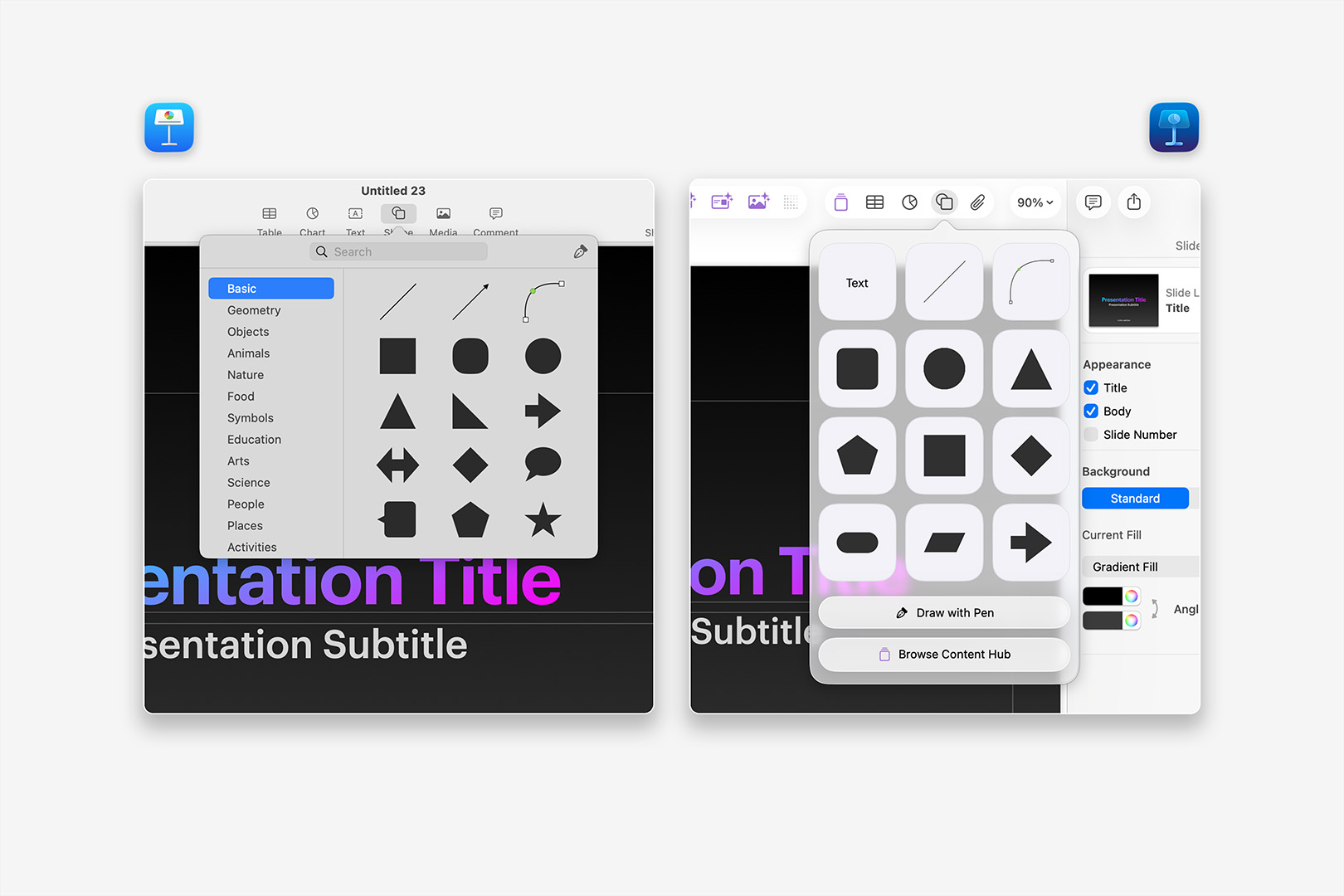
The Keynote 15.x Shape Palette is redesigned, with an updating grid of Suggested shapes and a button for Content Hub view to access others.
The updated palette is certainly cleaner overall, a bit easier to scan – but the other subtle difference between those two views, beyond the changes to some of the basic shapes initially shown, is that there's no scroll beyond this initial view in v15.1: the library of shapes from v14 are all still available, but they're now tucked away on the Shapes tab in the Content Hub view. Many folks A) might not think to click on that Content Hub button if they're not a subscriber (given we've clearly established Purple = Premium in v15), but those who do also B) default to the Discover tab before it's clear that shapes are their own (free) category in that view:
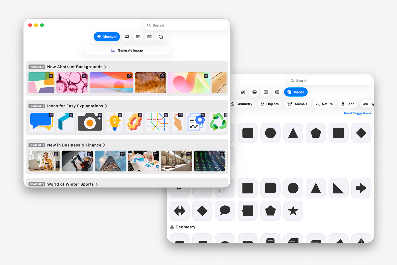
The Content Hub view defaults to the Discover tab, with the Shapes library tucked away on a Sub-Tab (another click away).
While this makes a lot of sense structurally – particularly if the idea is that we might see a bit more ongoing variety in the Shapes library moving forward alongside the premium content (and there are a number of new shapes in v15) – as currently implemented it has a bit of an Exit Through the Gift Shop vibe, adding more steps to basic controls with additional upsells along the way. Making the Content Hub button in the Shapes palette default to the Shapes tab would go a long way toward making this feel less artificial (which it does to a degree, if Shapes is the last tab you viewed in Content Hub), but wouldn't address the root Purple Problem of discoverability.
I'm hopeful these are effectively growing pains of the initial transition, and they'll look to refine the experience for both Free & Premium users alike as this new generation iterates forward: for now, Shapes is left feeling tacked-on to the Content Hub experience and needlessly hidden behind promos.
Premium Content & Features
All that said, and setting aside any predisposition you may have toward yet another subscription (my own subscription fatigue already being well-documented at this point), Apple offers a 30-Day trial for Apple Creator Studio, which provides ample time to explore the new premium content and functionality to see if it's a good fit for you. Now that Keynote, Pages, and Numbers are en Suite with additional Pro apps like Final Cut and Logic, the value proposition of a subscription is largely dependent upon how much utility the entire suite offers you: if you're just here for the core Productivity apps, it's obviously less of a deal than if you need or want the full kit.
Once Subscribed, the upsell chrome recedes from view in the Theme/Template Chooser and Inspectors beyond the Purple Ribbon-Star icon used to denote standard vs subscriber-only Themes, Templates, or Objects. Several of the new Themes & Templates are eye-catching + nicely balanced – with a few interesting uses of illustration or transparent images being used in placed of the usual photo placeholders:
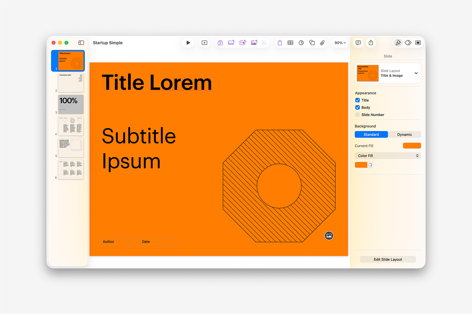
The new (subscriber-only) "Startup Simple" theme uses transparent, illustrated placeholder images.
A few things jump out working with a few of these new Themes – the first being that many of these are far more Pitch-Book weighted than many of the new themes introduced over the last several cycles, a notable shift from the single Statement or Big Number trend we'd seen through v14. Also great to see that they're moving into a few new (contextually-relevant) contemporary Layout conventions like Summary Grids and Columns, though the "Title & Text Alt"-style naming doesn't do much to help promote structural discoverability or coherence from theme to theme.
That said, you'll also notice in the "Startup Simple" example shown above, the Cover slide is using the "Title & Image" Layout instead of the Keynote-traditional "Title & Photo": all of the new subscriber-only themes have adopted a change in nomenclature for many of the traditional layouts, which means that Composer's Global Standard Routes are currently no longer Global in v15. We're still evaluating if this is something we can address in the GSR matrix – in some cases, standard variants (like the "Title & Image" above) aren't present at all, making it difficult to map the topology from a "universal" POV. For the time being, we're recommending applying Target Layout tags throughout your script if you're using one of these new themes as a Build Target.
Speaking of Build – let's turn our attention to the new Intelligence Features introduced with v15, which comprise the lion's share of new features this round. The new capsule of Purple Buttons in Keynote each launch a different Intelligence feature – including Generate Slides, Generate Presenter Notes, and Generate Image, along with a new Slide Cleanup module and the easy-to-miss Increase Resolution button. Each of these new modules are ChatGPT-powered, which in the case of Image Generation is a marked shift from the Image Playground integration headlining v14.3. Keynote receives the bulk of the functionality here, but Image Generation and Increase Resolution figure prominently in Pages and Numbers in a similar fashion (when the window is wide enough).
Generate Slides from Text is, of course, a built-in corollary to our own Composer Engine: draft out the show as text, let the machine handle the build. It's similar in many ways to a number of the other GPT-wrapped solutions we mentioned when we launched Composer last year, with your outline being pushed to OpenAI for processing and – in this case – being built in-app slide-by-slide as a response stream from your input. You can shortcut straight to Generate mode from the Theme Chooser, making it easy to jump right in, where you can enter a brief Overview of your presentation and a list of Key Points to include:
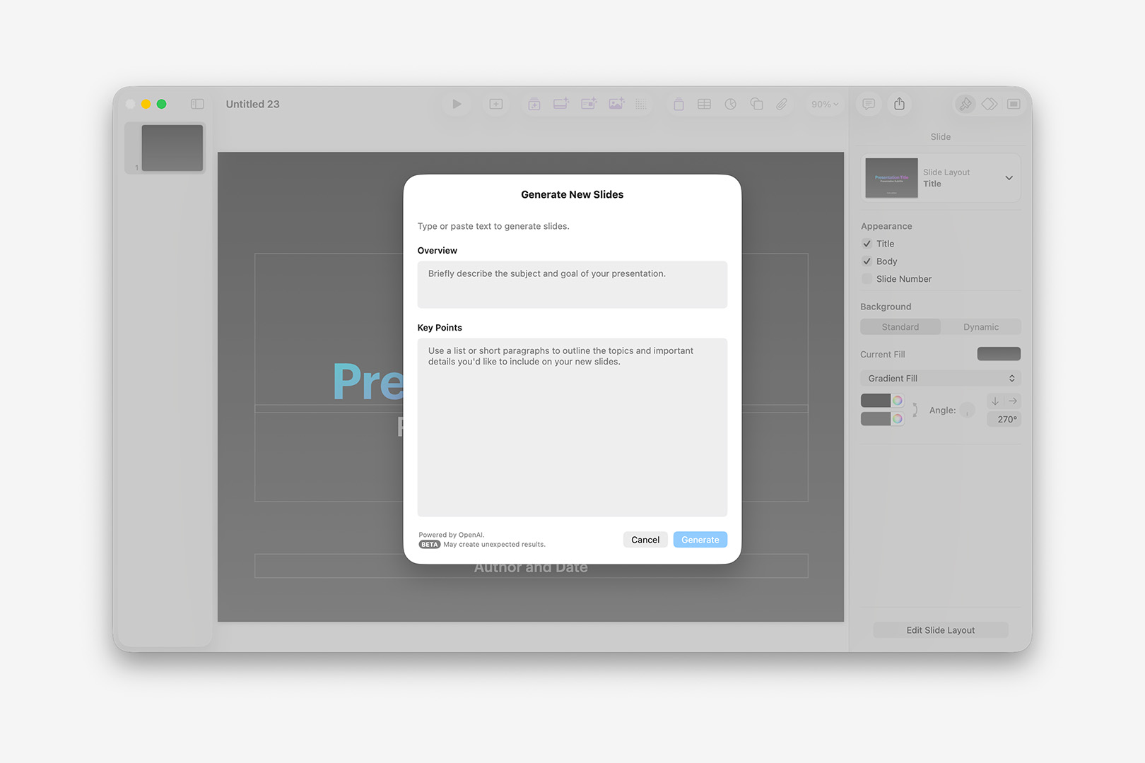
The Generate Slides function is a GPT-wrapper that takes an Overview and Key Points as Text input.
Because these fields expose traditional Content controls when you control or right-click them, you can actually Inception the process if you like by selecting Show Writing Tools and then clicking the Compose button: the Writing Tools-generated outline (itself using ChatGPT) appears more concise than an outline generated from the same prompt by ChatGPT on its own, which is interesting – likewise, the Writing Tools output doesn't appear to include the Markdown formatting that ChatGPT includes by default when you include "slides" in the prompt. We've observed that implying structure with Markdown matters less here than your Key Points being more List-like in nature than Narrative: if you receive a "Couldn't Generate Slides" pop up, it may help to edit your input to make it more clearly List-patterned (other potential exclusions aside).
So, for an example: in the clip below, I'm starting with a ChatGPT-generated outline for a 5-slide presentation about the life of Woody Guthrie. It includes Markdown formatting indicating Titles, End-of-Slide rules, etc. – as this would give us a 1:1 basis for comparing how this would behave in Composer vs Generate Slides. Also, be forewarned: the vast majority of this clip involves watching the toast-like Generating Slides indicator spin, so give it a moment (or ten) to see the build out:
Using the Generate Slides function with a 5-slide Markdown outline (real-time).
There's a bit to unpack here, beyond that it definitely takes a few moments to engage. Because this is a ChatGPT wrapper, you'll see a few differences every time you run it – even when you run the exact same input. I ran this sequence nearly a dozen times trying to get the Light + Dark mode captures as similar as possible, and it behaved a bit differently every time (they're still ~10s out of sync and off by a slide). In most of those runs it added a Title slide, which hadn't been specified in the Key Points submitted, but generally inherited from the Overview field with minor variations in phrasing (also of note that your Author Name is usually inserted to the accessory field on Titles, but not always). In many of those runs – like the one shown above – it's taking a bullet item from the first slide's markdown ("- Famous motto: _"This machine kills fascists"_ (on his guitar)") and promoting it to a Quote slide of its own, often on the next slide though sometimes further in. Indented bullets on the 3rd slide's Markdown were generally pushed to their own slide, with the parent bullet becoming the Title of the new slide. All of which is to say you should expect a bit of editorial liberty being taken each time you invoke this functionality.
Likewise, it's currently limited to text-centric operations: you can't, for instance, specify that it find a Photo of Woody Guthrie for one of those slides (or use one from a known URL). According to ChatGPT, the current integration is scoped to "Text generation (titles, bullets, speaker notes), Slide structure and layout selection, and Use of existing slide layouts" with explicit Architectural Limitations around Image Fetch/Generation/Selection in accordance with Apple's Privacy/Sandbox model.
That said, you can always take it from there and apply a Photo Layout in post: unlike many of these GPT-based builders (or Claude, etc.), the Generated Slides produced adhere to the selected Theme's built-in Layouts and Styles, so you can continue to edit as if you'd set the text yourself, and switch to any familiar Layout you like. Once you've applied an Image Layout, you can invoke another new Intelligence Feature: with an image selected, tap the Generate an Image button to bring up the interface, which takes a Text prompt, along with optional selections for Style, View and Aspect:
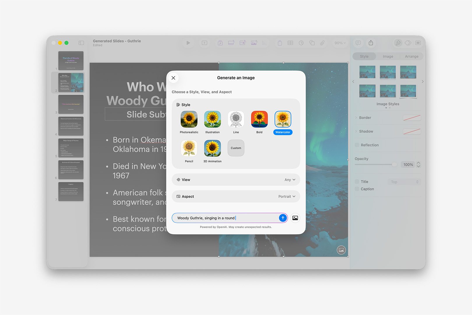
The Generate Image function allows you to offer guidance on Style, View, or Aspect ratio, in addition to your Text prompt.
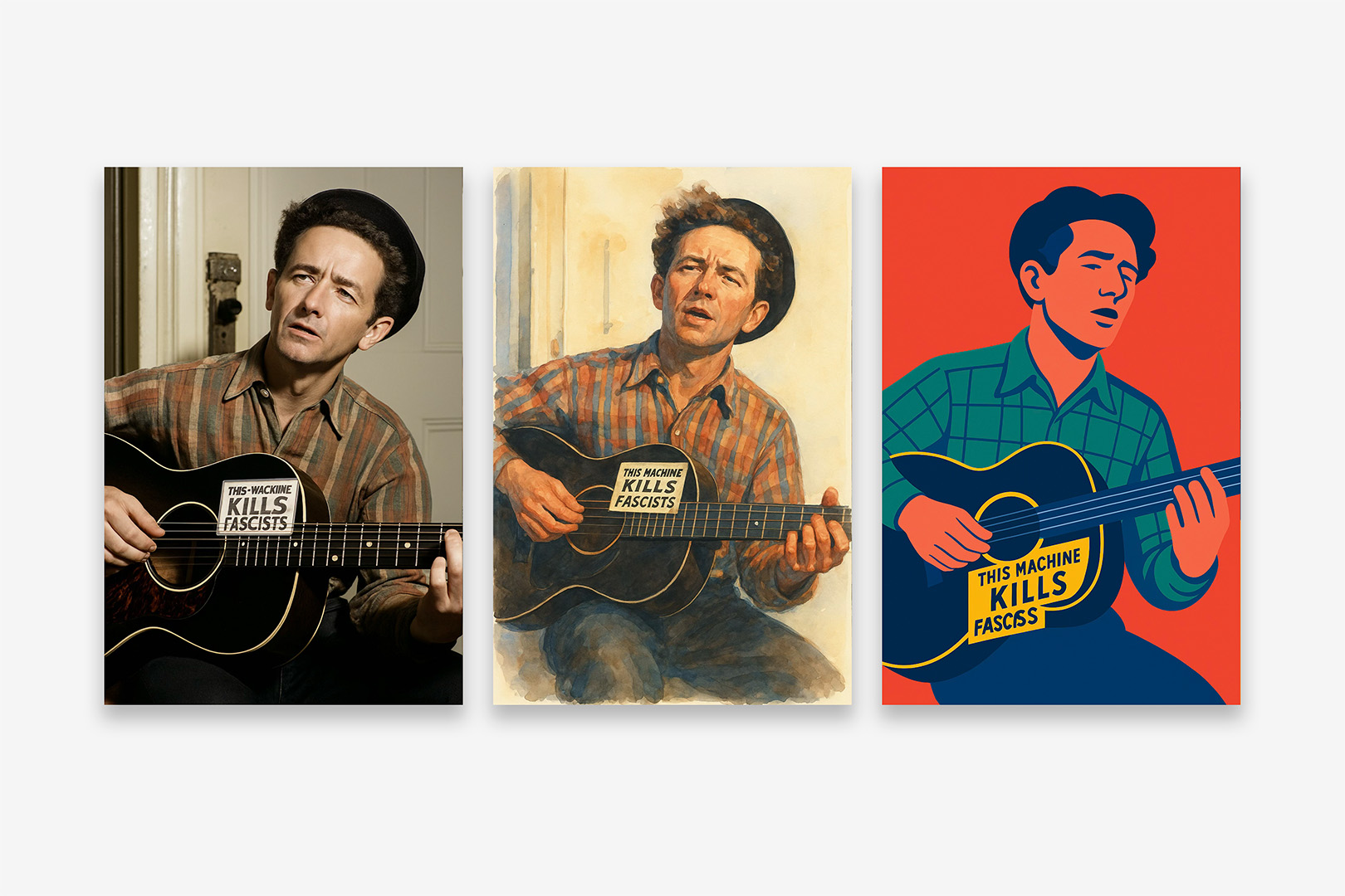
Overall, this is a solid improvement on the Image Playground integration featured in v14 – both in terms of flow and the overall output quality: the Style, View, and Aspect modifiers make it easy to narrow in on what you're going for right up front, and OpenAI's Image-4o model produces reasonably high-quality output across a wide range subjects and styles (occasional image-generation weirdness aside, more-so around text these days than finger count). If you're happy with the generated output, you can download the image for easy use elsewhere before it's Inserted, or edit it further with text-based prompts or revisions to your initial options. For example, here are 3 takes on Woody Guthrie singing in a round, using the Photorealistic, Watercolor, and Bold modifiers (Portrait):
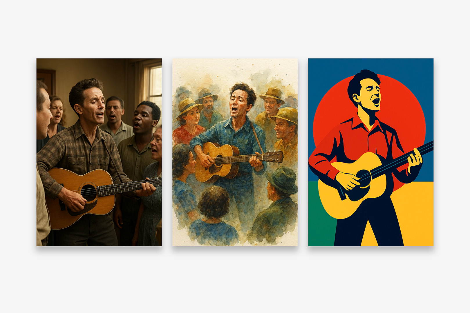
Woody Guthrie, 3 ways: sample Generate Image output using an identical prompt with the Photorealistic, Watercolor, and Bold styles. (v15.1.1)
There's also an interesting variant on this functionality in the Image Inspector: select an image and click Generate from Image to bring up an alternate pathway using the source image as a point of reference. The Mood and Style modifiers from the main Generate Image pathway are available, along with the Text modifiers you get at the Edit stage of that primary path:
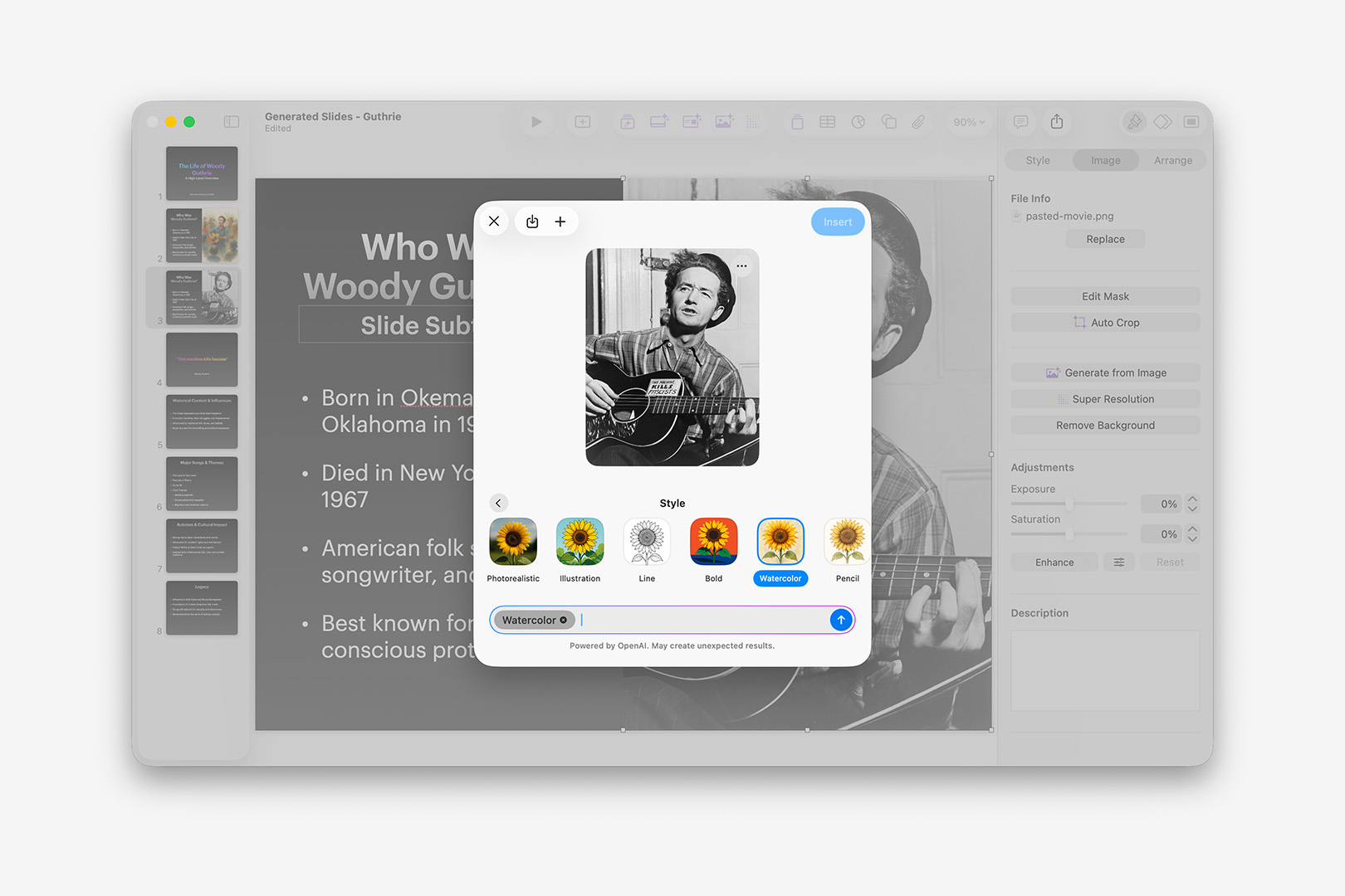
The Generate from Image option in the Image Inspector will run a similar function using the source image as a primary input. (v15.1.1)
In fairness to the generated output in this case, the source image is tricky in a few ways for Vision models: the guitar string needing to physically occupy space in the foreground vs the neck & face of the guitar (to which the label is applied) is a nuance that's difficult for Probability Machines to extrapolate; the Text on the label is hand-written, irregular. I wasn't able to generate an image from this source that got both right, though there were a few that got one or the other correct:
Using Generate from Image using a well-known photo of Woody Guthrie, with the Photorealistic, Watercolor, and Bold styles. (v15.1.1)
Like many of you in a professional setting, I generally can't make use of this sort of functionality or output in deliverables – but can see it being extremely useful for Moodboards or high-level Concepting. If you're in a setting that isn't policy or licensing restricted, this may be of more use to you: audience sentiment toward Generated Images varies pretty wildly between markets, so use your best judgement.
While we're in the Image Inspector, let's take a look at another new Intelligence feature: Auto Crop. While an image is selected, clicking Auto Crop will bring up a new pop-over offering different ways of framing the selected image within the crop. Keynote does a pretty good job of this automatically – particularly with human subjects like i'm using here – so the variations offered may only be very slight adjustments against that default, depending on your subject matter:
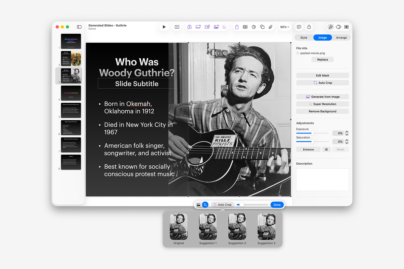
Auto Crop presents a pop-over modal offering alternate framing for the selected image. (v15.1.1)
In this case, it's easiest to see around the door frame or the edge of his hat – it can be a bit easier to see the dynamics at play in a multi-subject image. Results on images without human subjects are more mixed: it doesn't seem to catch color-highlighted objects standing out in a pattern of objects, for instance. Overall, though, this is a solid extension of Keynote's default crop handling, and seems to retain much of the subject-awareness that makes that work so well.
Super Resolution also appears in the Image Inspector – or via that easy-to-miss button in the new Purple Button group. As you might expect, the more resolution you have to work with up-front the better: if you're hoping this might turn thumbnails into full-bleed backgrounds, you'll want to temper expectations accordingly. By way of example, the following is a comparison of a low-resolution alternate (317x480) of the same Guthrie photo used above scaled into the same placeholder object, the resulting Super Resolution output, and the higher-resolution version used previously (960x1206) as a control (so roughly a 3x increase):
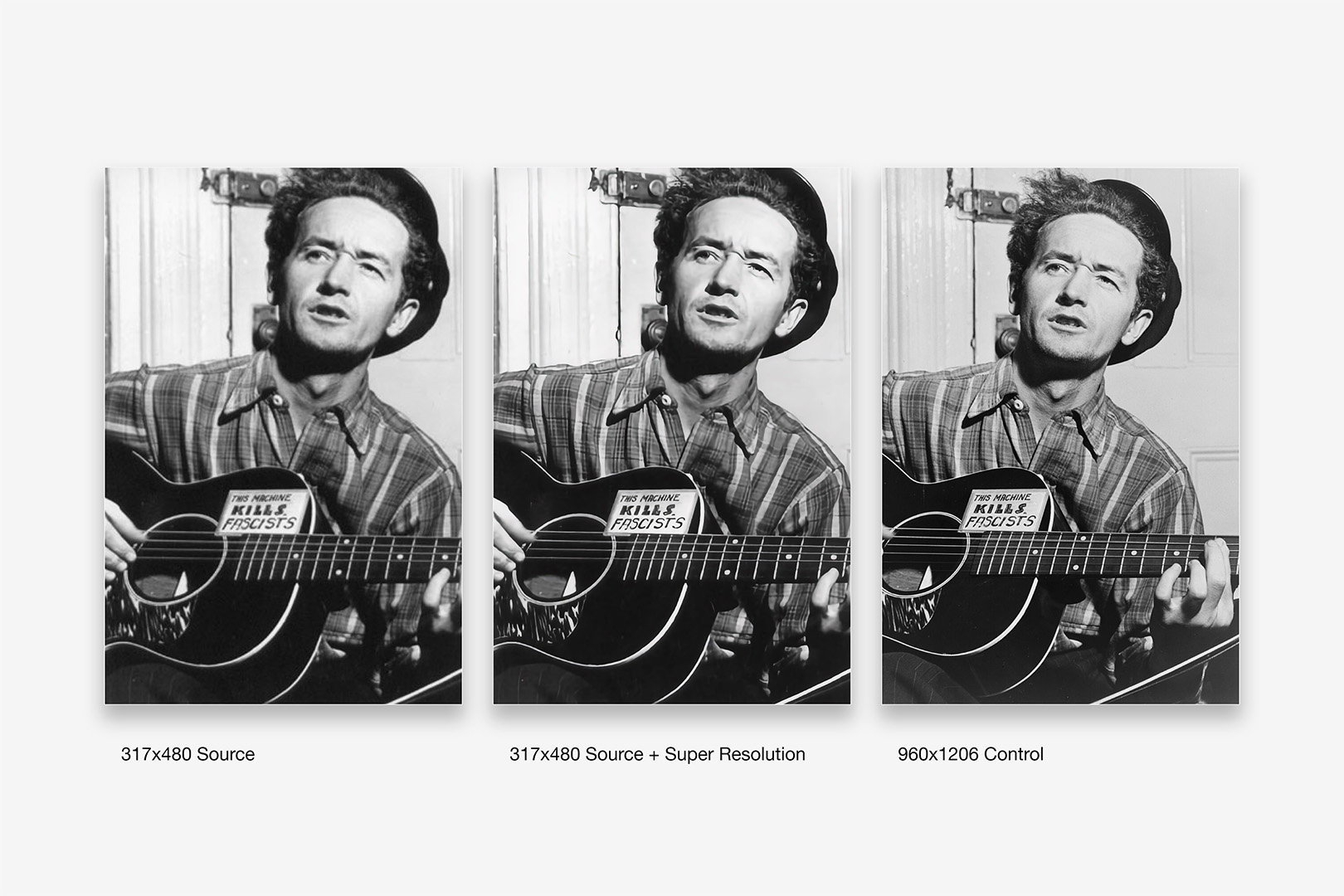
A comparison of an alternate low-resolution source, with Super Resolution applied, and a higher-resolution control. (v15.1.1)
It's managing pretty decent results here, source-resolution considered: the source images are slightly different crops, so we can't see how it would handle the hair in the control, for instance – but it has managed to bring in some of the missing detail on the pattern of his shirt, with definite improvements to the text on the label and the sharpness of the pattern on the Pick-guard. The hint of the E and B strings (mostly their shadow) in the lower-resolution source doesn't get picked up in the transition at all. Overall, I'd think this could be handy in a pinch – not so good that i'd skip looking for a higher-resolution source, but generally good at what it does if a larger source isn't available.
The new Slide Cleanup functionality is particularly interesting, though may seem elusive in practice depending on precisely what you're cleaning up. By way of comparison to the default Reapply Layout to Slide/Selection behavior, the two functions have considerable overlap but behave in very different ways, with Slide Cleanup behaving in more of a Contextual basis than the Literal of the Layout: i.e. not just the Layout as surfaced, rather how it's being used. That said, it's also Context that seems to trip it up – it's elusive in the sense that it may report "No fixes found" even when it's capable of returning a fix on a portion of the layout in a different, isolated context. For example, invoking Slide Cleanup on a Big Fact slide with a loosely-organized pattern to represent that percentage results in "no fixes," while reducing the problem to just the pattern itself produces the expected result for that construct:
Using the Slide Cleanup functionality in two different context windows. (v15.1.1)
Apple's footnote on this feature is that "Slides with lots of objects are not currently available for fixes, as this feature is still in beta" – but i've found that the object count itself seems to have less to do with it than basic structural cues that can (or can't) be inferred from the source Layout in context. If the objects on the slide still have a 1:1 correlation with the Layout's objects, it will generally get them back into order regardless of count – even when some changes or re-orderings are baked in. Once you've added a few objects that didn't originally exist on the layout to the mix – like the object pattern added to the default Big Fact above – it tends to defer to the No Fixes state. So if you're running into issues where it seems this should be working but isn't, it can be helpful to isolate specific portions of the layout to their own slide and let it approach the problem on its own vs the original slide's context.
The remaining Intelligence Feature for this launch – Generate Presenter Notes – is precisely what you might imagine: your slides are parsed by ChatGPT, and summary Speaker Notes are generated and inserted on each slide. Curiously, these are also generated when you use the Generate Slides functionality shown above (effectively a summary of the summary of your Key Points). I struggled to find a solid use-case for this feature initially, given the nature of Presenter Notes: even if you're handing off to a speaker less-familiar with the material, what are they getting from the Notes in this case that they can't get from the Slide itself? Turns out that it gives you more, the less you feed it (in a sense): a simple, single-sentence Statement slide will generally give you a few talking-point bullets, using your sentence as context, in business-friendly GPT-speak – so you can think of it like a multiplier. As shown here, if that Statement is the first slide, it's treated as a Title – so the generated Notes include Welcome Everyone-type phrases:
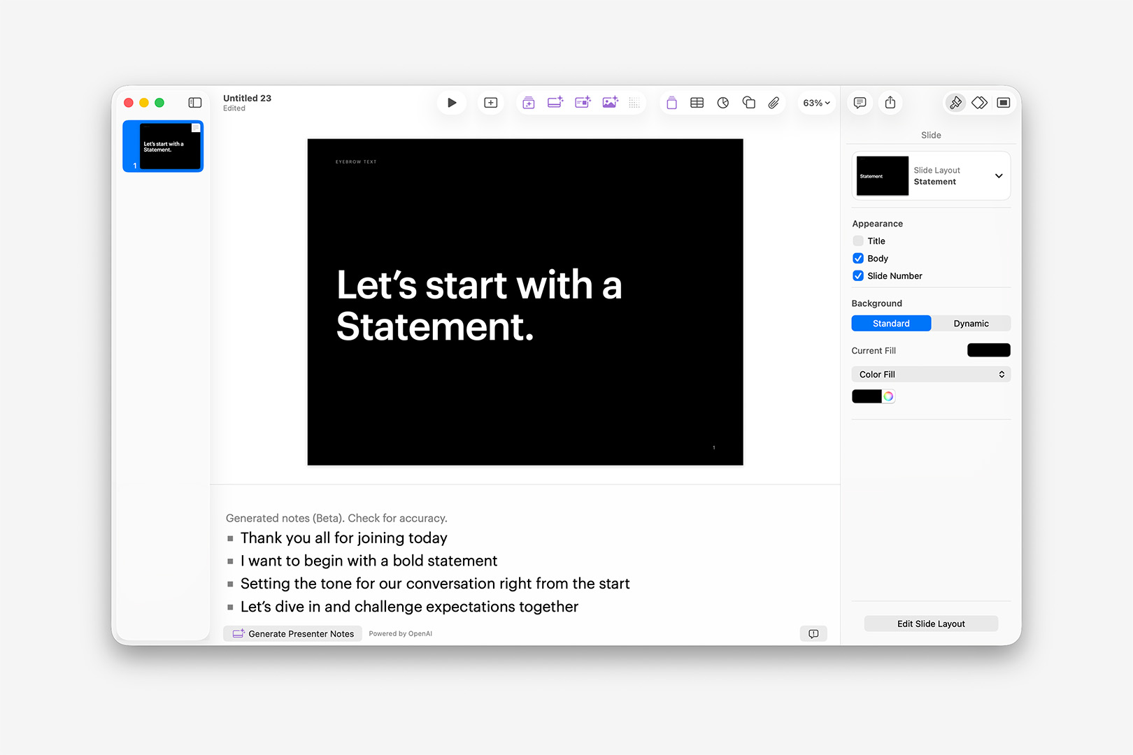
Generate Speaker Notes will generate bulleted Talking Points constructively from short, concise slides. (v15.1.1)
So if you're a speaker (or work with one) who struggles with drafting conversation points around some of your more concise slides, this could be pretty handy if you're using it Constructively (vs the Reductive nature of having it summarize dense, detailed bullets). A typical Executive Message Layout – with a title, a few sentences of body copy and a photo – tended to generate six bullet-point highlights, expanding on the tone and topic of the central paragraph (and no, it doesn't "see" the photo, so it can't surface details there). Multi-column layouts included Notes addressing the slide structure ("We're going to break things down"), as well as each column's topic summary, which included transitional awareness ("Finally, we take a look at"). Overall, quite handy for some speakers if viewed through the lens of author-assistive tech: I came around a bit on this one, aside from some of the language choices being glaring LLM-speak.
The Suite Life?
All together, this is obviously one of the more substantive Update cycles we've seen from these apps since the Keynote 6 transition – and on that front, it's great to see something a bit larger than the proof-of-life feel of the v14 cycle. And unlike that earlier second-era transition, we're not left working around gaps in functionality or major file-format changes in the process, so it's something of a win-win, comparatively speaking.
Yes, much of that comes at a cost – if ever Apple had an opportunity to make the case for a renewed focus on the Pro segment being possible by pushing these apps back under the Paid umbrella, it's certainly on the back of of a large, tent-pole update like this one.
If you do Subscribe, you'll want to be aware that some of these new features – Generate Slides or Generate Images, for instance – are subject to Usage Limits, which shouldn't come as a surprise if you're already used an LLM in another capacity. Having read a bit of earlier concern around these limits, I veered toward more surgical test patterns early on (if only to ensure we'd be able to cover everything), but found it wholly unnecessary over the course. (You can keep an eye on your usage via the Intelligence Features > Show Usage Status menu item.)
Likewise, if you make use of any of the Photos or Graphics from the Content Hub in your work, you'll want to be aware that there are relevant Licensing Restrictions restricting their use to Creator Studio apps – so no re-use of those with something your colleague's worked up in Canva, legally speaking.
Otherwise, as noted before, the value of a subscription will come down to how well the extended Apple Creator Studio suite works for you: if you've never spent time with Pixelmator Pro, for instance, you might enjoy what they're doing with their Mockups category on the whole, and the Trial period gives you a good bit of time to try it first-hand. If you're only interested in the Productivity apps, it will largely boil down to how much value the new Themes and Content Hub provide and how well this generation of Intelligence Features fit into your workflow – and in that respect, we have a better idea of where that's heading on the Keynote front for now than in Pages or Numbers, broadly speaking.
Moving Forward
There's no reason to avoid installing v15 or, for that matter, deleting the v14 apps at the moment – as we noted earlier, the apps co-exist perfectly well alongside each other for now, so it's just a matter of preference at the end of the day unless you encounter a breaking bug. We're aware the entire Internet has an opinion on Tahoe that will predicate a bit of where those preferences are coming from.
We are tracking the One Strange Bug at the moment (the Placeholder-induced crashes) – and the Even Stranger case of Helix somehow conferring a fix for it. Likewise, we've encountered a fair few UI quirks in the new apps during changeovers from Light to Dark mode, for instance, that make it clear these are still early days on the transition overall.
For now, we're holding to Keynote 14 as our build/update floor, and will actively assess updates as they arrive.
Additional Resources
v14.x (2024)
- Noncontiguous Text Selection (v14.0)
- Stability & Performance Improvements (v14.0)
- Writing Tools, Image Playground Integrations (*Requires Apple Intelligence) (v14.3-4)
The v14.0 updates (re)introuce Noncontiguous Text Selection on Mac, along with stability and performance improvements.
As with prior update cycles, the 14.0 updates are largely focused on stability and performance, with a notable top-line feature joining the ecosystem this year.
Noncontiguous Text Selection has returned to the iWork apps on the Mac, and is a very welcome addition of "classic" functionality to the newer, steamlined apps. On Mac, simply hold the Command key to add additional words, sentences, or entire paragraphs to your current selection, making it a snap to add Character Emphasis styles in one pass:
Noncontiguous Text Selection makes it a snap to apply emphasis styling.
The remainder of the v14 cycle has thusfar been focused on adding companion features to extend Apple Intelligence features into the apps, including deepening integration with Writing Tools and Image Playground.
v13.x (2023)
- 3D Object Support (v13.2)
- Chart Summary Labels (v13.1)
- SVG support (v13.1)
- Share Menu Updates (v13.0)
The v13.x updates make it easier to integrate SVG assets into your iWork workflow, and introduce a whole new dimension with 3D Object support.
The initial v13.0 updates, like the v12.0 cycle before, were largely quiet on the feature front, with bug fixes and Share Menu improvements headlining the release.
The v13.1 updates bring the long-awaited addition of SVG compatibility to the iWork apps, a very welcome addition to the mix on the usability front. With the near-ubiquity of SVG as the go-to format these days for exchanging vector assets such as logos, icons, and informatics, the addition of native compatibility removes a long-standing hurdle in the authoring pipeline, where workarounds like PDF conversion or specialized utilities – such as the excellent AI2Key & SVG2Key from Christian Holz – were required anytime you needed to include a vector sourced as SVG.
As you may expect, given the nature of SVG graphics under the hood, the implementation in Keynote, Pages and Numbers allows inserted SVGs to be broken apart into native shape groups for further customization to color or sub-object placement. The resulting native-shape groups can be saved to your Shapes Library for ongoing use, making it easy to keep those assets synced across your devices and always at-hand.
On the charting front, v13.1 also adds new Summary Labels for stacked column, stacked bar, and stacked area charts – enabling you to run a summary above each stack in your chart:
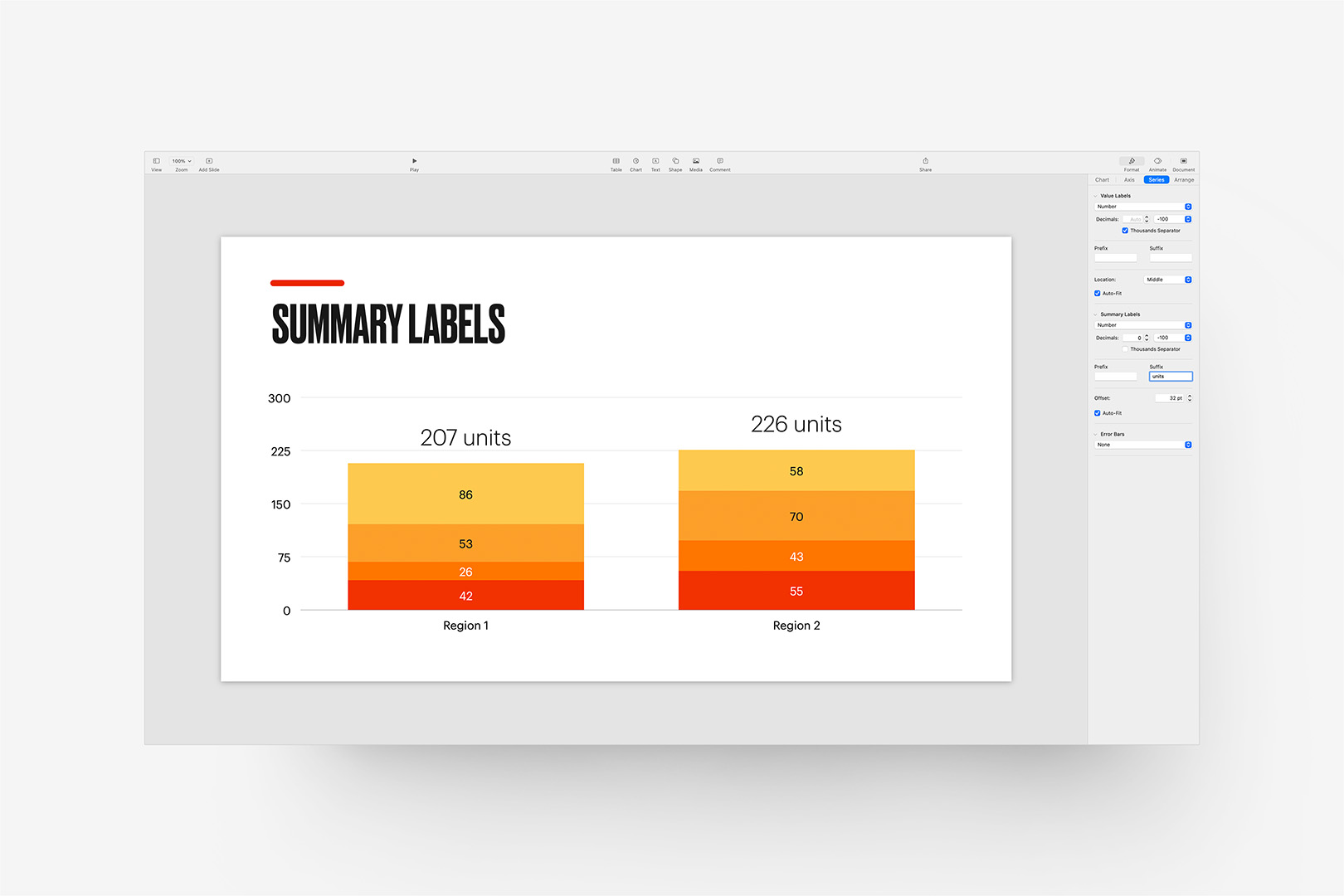
The 13.1 Update brings new Summary Label options for stacked charts.
They’re accessed via the Series tab in the Chart Inspector, and include the same formatting options and prefix/suffix capabilities of standard series labels, with an additional Offset setting allowing you to fine-tune placement in relation to the top of the relevant stack. They’re a nice addition to the data-viz toolkit, and much easier to standardize across a show than what are commonly floated text objects (which usually need to be placement-adjusted whenever the chart’s data is updated).
On the usability front, Pages 13.1 adds the ability to export your documents as image files via the Export To menu. The exports are reasonably sized (144dpi @ scale, or 1224px X 1584px for US Letter, for instance), making this a big timesaver when you need quick previews of a document for a website or a presentation. We’ve used an Automator workflow for this process for years (Pages > PDF > images), so it’s fantastic to be able to keep this in-app for a change (though you’re better off with PDF if you need anything approaching print-resolution, of course).
The v13.2 Updates bring a whole new dimension to the iWork apps, with the introduction of 3D Object support. You’ll need USDZ-formatted objects to make use of this feature: these are USD archives commonly used in ARKit implementations in the iOS ecosystem, and are derived from the Pixar-developed Universal Scene Description (USD) framework.
Like other media objects, these are object-transition capable, meaning it’s a snap to use Magic Move to transition between two states automatically. And because the USD format supports embedded animation, your model can be set into motion independently (though it should be noted the USDZ model has to be pre-animated for this, you can’t animate sub-objects once the model’s brought into Keynote or Pages):
The v13.2 updates bring 3D Object support (USDZ format) to the iWork apps.
That’s an Apple-provided model (via the AR Quick Look Gallery), set in our StudioOne theme (as this is precisely what StudioOne was designed for), with a simple Magic Move transition applied between the two views. There’s no method for adding or adjusting shadow settings on the object (though this *should* be defined, on at least some level, by the source USD) – in our example we’ve added the cast shadow via the supplemental object included with StudioOne, but you can mimic that pretty easily with a shape + advanced gradient if you need the extra kick of dimensionality.
It can be a very stand-out technique to use if you have a need + properly formatted assets: you can use Reality Converter from Apple’s Developer site to create USDZ files from other formats, such as .obj and .gtlf if that’s all you have available to start with.
Additional Resources
v12.x (2022)
- Collaboration Updates (v12.2)
- Dynamic Backgrounds (v12.1)
- Shortcuts Integration (v12.0)
The v12.x updates include new workflow and collaboration enhancements, along with new motion background options for Keynote and the return of Mail Merge functionality to Pages.
The initial v12.0 update was a quiet one, albeit functional: Shortcuts integration has made its way to the iWork apps on MacOS and iOS 15.4+, offering a few key integration handlers for creating or opening documents as part of a Shortcuts workflow. The integration actions are slightly different from those offered in the older Automator pipeline, allowing specific Theme or Template choices as part of the Create actions, though stop short of offering any new actions that would allow for slide or page-level manipulation from there (outside of Table manipulation in Numbers).
The v12.1 updates are more substantial, introducing new motion background options for Keynote, along with the return of Mail Merge functionality in Pages. The new Dynamic Backgrounds are the most eye-catching of these changes, adding a small library of new motion-enhanced backgrounds that bring your slides to life with subtle, continuous motion:
The 12.1 Update adds Dynamic Background options and themes to Keynote (looped 30s preview shown with "Sunset Dunes" background).
If you’ve been using our themes for a while, this might remind you of the technique used in our now-retired Brighton theme in the classic ’09 architecture (or even KeyStation: Eclipse if it’s been a *very* long while), though these new backgrounds offer some definite improvements over pre-rendered movie files: Dynamic Backgrounds can be customized for color and additional factors – such as speed or background-specific characteristics like height or object count, depending on the background selected – and are generative in nature, removing the associated weight of pre-rendered video files from the equation completely.
There’s a small library of backgrounds offered, all of which can be customized for color and other factors, as noted, and saved as a new selection in the Backgrounds menu for ongoing use. The backgrounds offered hub around a few common behavior types, such as gradient animation, waveform overlays, or 3d peaks (reminiscent of the new Monterrey screensaver), and vary by color or behavior-specific settings throughout the library.
That said, there’s not a mechanism for defining new generative behaviors from the outside: if you’re hoping to use this technique for something more complex than the few baseline behaviors included in the starter library, you’re out of luck here. Like the Picture Frame borders that came before, using one of these backgrounds is app-referential from a file standpoint (in this case, to a group of “TSDGL” fragments and shaders in the Keynote app itself), so we can’t introduce new variations from Theme or Template-level beyond the color or settings already noted. We’ve already been getting a number of questions about these, though, so we’ll keep an eye open for any future evolution that might make these a more viable theme-unique addition moving forward.
On the Pages front, v12.1 heralds the return of Mail Merge to the mix. This was one the last remaining MIA features from the Classic > Modern transition from Pages v4 > v5+, and is a welcome return to the lineup after all these years.
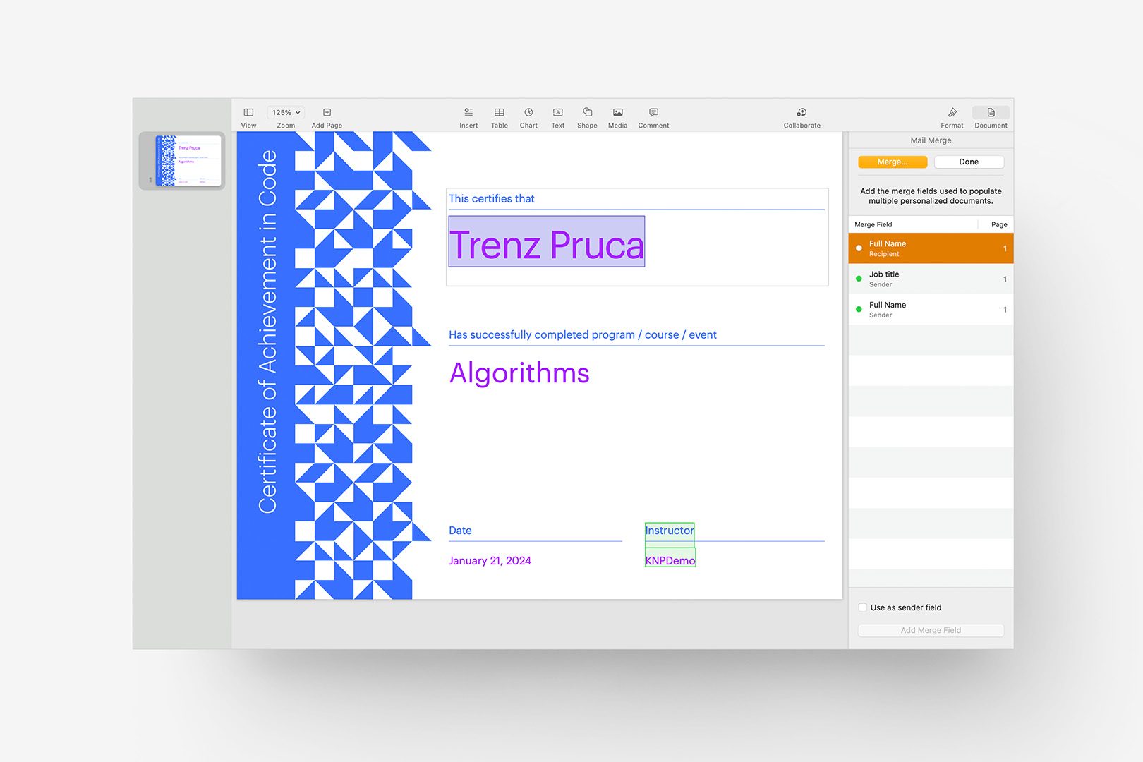
The 12.1 Update brings Mail Merge back to Pages (new Technical Certificate template shown with highlighted Recipient field).
Mail Merge is available from the File menu as a dedicated option for any template that’s been set up for Merge functionality – which is to say we’ll need to address default availability in our Pages Templates via updates rather than this feature working out-of-the-box on our currently-shipping Templates: keep an eye out for point updates, or touch base with Customer Support if you’re in a hurry to get started with a specific template.
The v12.2 updates largely focus on ecosystem-level Collaboration updates, adding new notifications when there’s activity, comments or edits in your shared presentations and documents.
If you’re on MacOS 13 Ventura or higher, Keynote v12.2 also adds a few additional improvements to the Live Video feature added in v11.2, allowing you to set background filters (or remove the background entirely) on your Live Video sources. If you’re using Live Video to add a literal narrator or speaker view in the foreground of your presentation, this makes it much easier to remove distractions in the environment around you, much like the filters you can apply to your Zoom/Teams calls – a definite improvement for professional users.
Additional Resources
The Time Machine
Keynote / Pages v11.x
Keynote / Pages v10.x
Keynote v9.x / Pages 8.x
Keynote v8.x / Pages 7.x
Keynote v7.x / Pages 6.x
Additional Resources