Need a QuickStart?
If you're just getting started with Composer, our Composer 101 Tutorial will get you up to speed on the basics of authoring presentations in Markdown and generating Build Scripts for Keynote on your Mac.
If you're just getting started with Composer, our Composer 101 Tutorial will get you up to speed on the basics of authoring presentations in Markdown and generating Build Scripts for Keynote on your Mac.
In this Guide, we'll take a deep-dive into the Markdown formatting Composer uses to understand your show and assemble the relevant Build Scripts for Keynote.
Composer uses a plain-text semantic mark-up format known as Markdown for its primary control surface. Markdown uses a few simple "shorthand" conventions for describing the hierarchal structure of a document and its formatting, as shown below, and is extremely easy to pick up (by design).
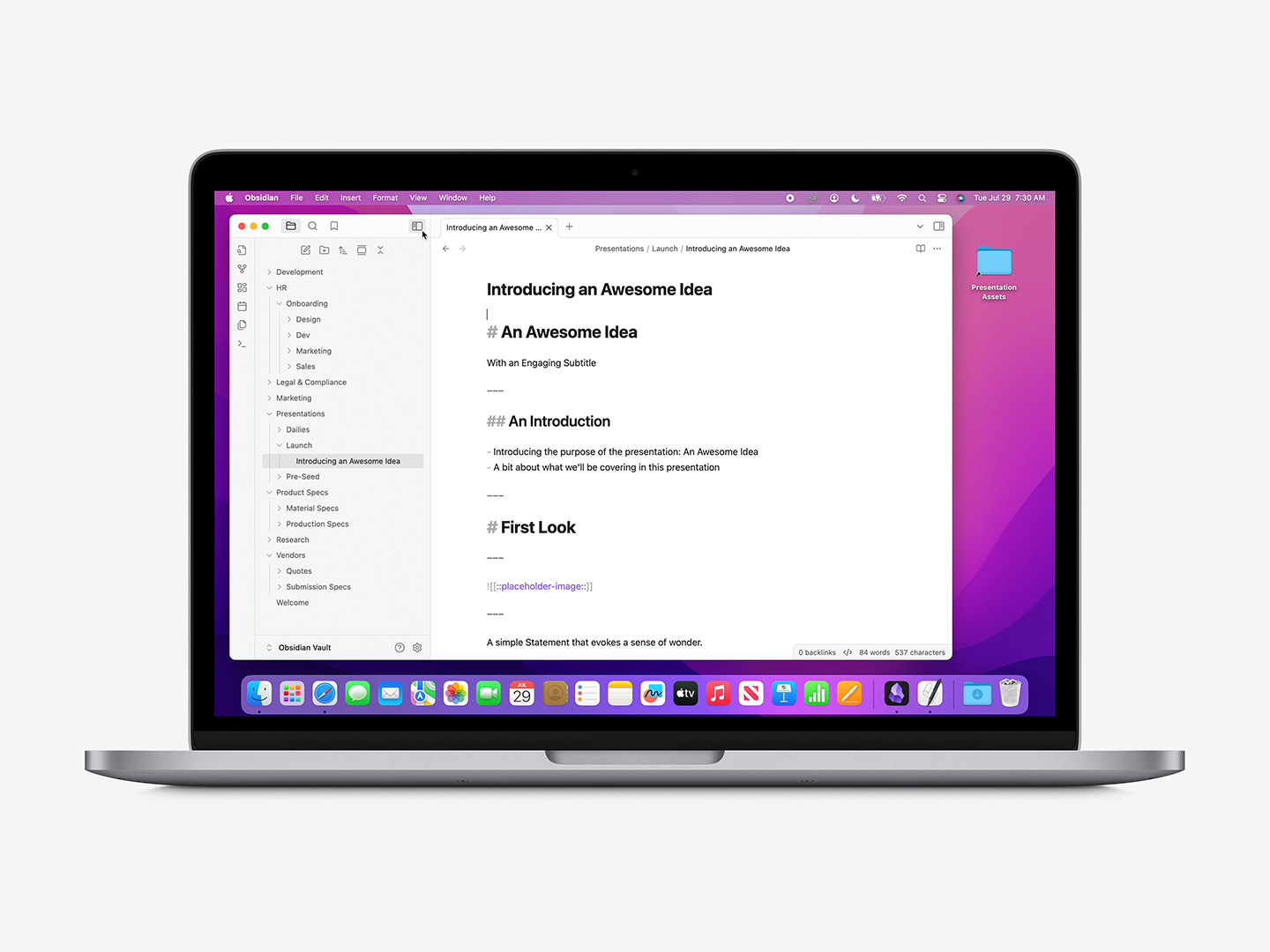
On MacOS, the Obsidian app has become something of a de-facto standard editor lately and is highly recommended, though many other apps such as Ulysses, IA Writer, Typora, or Mark Text are also tuned specifically for Markdown authoring and editing. That said, Markdown is explicitly Plain Text – so you can use any text editor you like once you know the formatting conventions.
"Presentation Markdown" is itself reasonably standardized these days: other Markdown > Presentation tools such as Deckset or Hyperdeck are available for the Mac – not to mention the venerable md2key, which has bridged Markdown & Keynote for years. Where possible, we stick to the same language conventions used by any of these tools, so authoring for Composer should be easy if you have any prior experience authoring shows this way, though you'll want to learn a few Tagging conventions that are unique to Composer-flavored scripting to unlock more advanced features and options.
## Slide Title

- A basic List: first item.
- The second item of the List.
- Another List item.

---
Markdown Slides, 101: a simple Title & Bullets layout.
We'll start with a basic Title & Bullets slide, as it lets us dial in around a few concepts at once in a familiar context. We have a Slide Title – prefaced by two Hash symbols and a space here – along with a short Bullet List for the Body of the slide (basic Dash + Space pattern), and a row of 3 dashes at the bottom which indicates the End of the Slide. This is all you need for Composer to understand that you want to build a Title & Bullets slide using that content in your target file.
There's an empty line in-between each major element type: Empty Lines are important in Markdown, as they let the parser know we're moving on – either onto the next paragraph, or onto another item completely. If you're ever in doubt, add extra (they'll get parsed out).
To build a complete presentation, we're simply adding additional slides to the Markdown, in their order of appearance, using a combination of basic slide elements to describe the show and its content. For instance, a simple 3-slide presentation is described here:
# The Presentation Title

The Subtitle of the Title Slide.

---

## Slide Title

- A basic List: first item.
- The second item of the List.
- Another List item.

---

## Third Slide Title

- A Second List: first item.
- The second item of the Second List.

![[product-image-1.png]]

---
Markdown Slides, 102: chain slides together, one after another, to describe the show.
Every presentation has a hierarchy: in simplest terms, there's usually a Title slide which gives us the title of the document itself (the H1), followed by slides with their own titles (H2s), subtitles (H3s), and so on. This is called a Semantic Hierarchy – and allows Composer to understand more about the role each slide plays in the show.
Markdown indicates Titles with the Hash / Number / Pound-Sign character (the Octothorpe) + a space: the number of Hashes used indicates where we are in the structural hierarchy:
# Presentation or Divider Title

## Content Slide Title

### Content Slide Subtitle
Title hierarchies: use Hash characters to indicate where we are in the hierarchy of the presentation to steer the appropriate layout response.
Using an H1 – the single Hash – tells Composer to use a Title or Divider-type layout. An H2 indicates what we think of as common Interior layouts – the gamut of "Title &" layout types such as Title & Bullets, Title, Bullets & Photo, Title Only, and so on. And if you're targeting a theme that includes Subtitles on the Content slides(Chicago, Umbra, many of Apple's newer themes), you can use the H3 to specify it in context:
## Slide Title
### Slide Subtitle Element

- A basic List: first item.
- The second item of the List.
- Another List item.

---
Title, Subtitle + Body builds: use an H3 to specify the Subtitle element in supporting Themes.
Stand-alone H3 Titles will eventually short-hand to "Caption &" routes when one of our themes are indicated as the build target – for now, they're interpreted the same as H2s (unless preceeded by an H2 on the slide), and you can route to the Caption-tier layouts via Named Routes.
As noted above, a basic Bullet List is defined by using a single Dash character + a space:
- A basic List: first item.
- The second item of the List.
- Another List item.

---
Bullet Basics: use a simple Dash character + a space to add a bullet.
As there's no Title element present on this slide, it will route to the default Bullets slide.
You can also use a Numbered List instead of the unordered Dash style – however this will not result in a Numbered List being produced on the slide unless the Layout defaults to a Numbered List style: the Layout's defaults take precedence here, and can't (currently) be changed via the resulting Build Script.
From a hierarchal standpoint, Bullets are a "Core Route" indicator (much like a Title), and take precedence – regardless of order-of-appearance – over any remaining paragraphs on the slide when evaluating the appropriate layout response. So the following variation on the Title & Bullets from above:
## Slide Title

A brief introductory paragraph:

- A basic List: first item.
- The second item of the List.
- Another List item.

---
Would result in the same output as the previous Title, Subtitle & Bullets example: the List takes precedence over the paragraph, which Composer will then map to an available Subtitle element if one is available on-slide (even if it comes after the List in the Markdown).
Nested Lists are supported: simply Tab-indent the sub-items under their parent item in your Markdown editor:
## Slide Title

- A basic List: first item.
	- Sub-Item 1 of the First Item
	- Sub-Item 2 of the First Item
- The second item of the main List.
- Another List item.

---
Nested Lists: toggle into a Nested List by indenting the sub-items in your editor.
Note that Nested Lists require Keystroke Support at run-time: you'll need to add or toggle the Script Editor item in the System Settings > Privacy & Security > Accessibility screen in MacOS to enable before your Build Script is run.
Paragraphs are the root / default element in a Markdown file: type a paragraph, and add an empty line to indicate we're moving on to the next:
Paragraph 1 Lorem Ipsum Aenean lacinia bibendum nulla sed consectetur. Lorem ipsum dolor sit amet, consectetur adipiscing elit mollis semper.

Paragraph 2 Lorem Ipsum sociis natoque penatibus et magnis dis parturient montes, nascetur ridiculus mus. Donec ullamcorper nulla non metus auctor fringilla.
Markdown uses the Asterisk character to denote basic Styling information, such as Italics, Bold, or Bold Italic settings:
*Italic Characters* are surrounded by a single Asterisk.

**Bold Characters** are surrounded by two Asterisks.

***Bold Italic Characters*** are surrounded by three Asterisks.

**Bold and *Italic* can be mixed** in cumulative order.
Indicate Styling: use Asterisk characters to indicate Bold or Italic formatting.
There are other patterns you might use to distinguish between those depending on the flavor of Markdown you prefer – Composer should understand any of the common variants allowed in the CommonMark standard, but fall back to Asterisks if you encounter runtime issues.
Pulling both of those together, we can define a basic Title slide with relevant Style information like so:
# The Presentation Title

The Presentation Subtitle with a **big, bold idea** emphasized for impact.

---
Markdown supports a few additional style & formatting definitions that we currently ignore: Strikethrough is ignored completely on the parse (as editorial residue). Likewise, Subscript and Superscript are currently unhandled (Keynote won't allow the character-level text selection needed to perform the key command via AppleScript, and unicode character substitution produces mediocre results), though will be included as unformatted text on the slide for further editing post-build.
We can add a Photograph to the slide to add additional impact: Markdown uses two different variations for Photos, depending on whether the file is Local (on Your Computer) or Remote (at a Web URL):
![[Wiki-link Style Local Image.png]]

At present, all Local images need to reside in a shared, common Assets folder: if Local Images are indicated, the Build Script that Composer outputs will prompt you for that folder before it builds the show.
Remote Images include the complete URL to the image, which must be web accessible without additional interaction (such as a sign-in or click event).
Re-visiting our prior Title Slide, then, to add a Photo simply involves adding a new line with the image file name wrapped in the appropriate tag style:
# The Presentation Title

The Presentation Subtitle with a **big, bold idea** emphasized for impact.

![[MyCoverImage.png]]

---
Photo Titles: here, we've added a Local-style image to the Title slide.
Or likewise with our prior Title & Bullets to make a simple Title, Bullets & Photo layout:
## Slide Title
- A basic List: first item.
- The second item of the List.
- Another List item.

---
Common Variants: here, we've added a Remote image to the previous Title & Bullets slide.
Initial Multi-Photo support is in place: at this time, the standard Photo - 3 Up layout is the only active target when using Generic theme routing – you'll otherwise need to specify a Target Layout that includes the correct amount of placeholders. You can target the standard Photo or Photo - 3 Up layouts by including only image elements on the slides:

---


---
If you're still in Draft mode but want to indicate a photo placeholder should be included in the Layout, you can include a Tagged variant of the Local-style image (we'll dig deeper into Tags below):
# The Presentation Title

The Presentation Subtitle with a **big, bold idea** emphasized for impact.

![[::placeholder-image::]]

---
Indicate Placeholders: here, we're using the "::placeholder-image::" tag in a Local Image wrapper: this will include an image on the layout manifest without specifying a target image.
Additional Media Types such as Video or Audio are not supported at this time (but will follow similar nomenclature once implemented).
Markdown supports Quotation Elements by starting the line with a Greater Than character + a space ahead of the text, like so:
> Quote element lorem ipsum dolor, sit amet. Nullam quis risus eget urna mollis ornare vel eu leo.

Attribution Name

---
Basic Quotes: use a Greater Than character + a space to indicate a Quotation.
Because of the way Quote layouts are defined in Keynote, the Quote will map to the Body element, and the remaining paragraph will map to the placeholder beneath (presumed to be the Attribution element, if we're unable to target by placeholder contents). Titles are contra-indicated, though you can add a Photo if you're targeting a theme that includes a Photo Quote layout (such as Chicago or Disruptor X).
We've handled Quote Slides differently over the years (as has Apple): in some cases, you'll want to include Quote characters at the begining or end of the quoted text, or avoid using them altogether on themes that include a graphical glyph on the layout.
Tables are supported, though take a bit of getting used to formatting-side: if you're using an app like Obsidian for authoring, there are a few plugins available that make it a bit easier to visualize the rows & columns, but if you're drafting on-the-fly it's straightforward if you follow a few simple principles.
To create a Table in Markdown, wrap the Columns in Pipe characters, with a Row of Three Dash Rules separating the Header Row from the Body, followed by wrapped cells. For example, a 3-Column, 2-Row Table:
| Header 1 | Header 2 | Header 3 |
| --- | --- | --- |
| Cell 1 | Cell 2 | Cell 3 |
| Cell 4 | Cell 5 | Cell 6 |

---
Basic Tables: wrap the columns in Pipe characters, with a row of 3-dash Rules separating the Header Row from the Body.
Tables in Keynote almost always default to center alignment within the cells – you can affect the Column alignments by adding Colon characters around the 3-Dash Rules to "weight" the alignment. Here, the Left Column (Header 1) is set to Left alignment, the Center Column (Header 2) is explicity set to Center, and the right-most Column (Header 3) is set to Right-alignment:
| Header 1 | Header 2 | Header 3 |
| :--- | :---: | ---: |
| Cell 1 | Cell 2 | Cell 3 |
| Cell 4 | Cell 5 | Cell 6 |

---
Table Alignment: add Colon characters around the 3-Dash rules to indicate Alignment for the column.
We break from standard Markdown here to add an additional condition: Row Headers. To indicate that you'd like to turn on Row Headers on your table, leave the first Header Column empty, and wrap the Row Headers in Bold:
|     | Header 1 | Header 2 | Header 3 |
| --- | --- | --- | --- |
| **Row Header 1** | Cell 1 | Cell 2 | Cell 3 |
| **Row Header 2** | Cell 4 | Cell 5 | Cell 6 |

---
Row Headers: leave the first Header Column Blank and Bold the first Column Cells to trigger Row Header styling.
If you only need Row Headers – i.e. no visible Column Headers at all – you can leave the Header Row blank: empty Piped fields still need to be present to define the column structure before the 3-Dash Rules, but they won't appear on-slide.
|     |     |     |     |
| --- | --- | --- | --- |
| **Row Header 1** | Cell 1 | Cell 2 | Cell 3 |
| **Row Header 2** | Cell 4 | Cell 5 | Cell 6 |

---
Row Headers Only: leave the Column Header Pipes empty to completely suppress the Header Row formatting.
And following the same principles, if you don't want Column or Row Headers present, you'll need empty Column headers to establish the structure, and the plain cells from the first example:
|     |     |     |
| --- | --- | --- |
| Cell 1 | Cell 2 | Cell 3 |
| Cell 4 | Cell 5 | Cell 6 |

---
Cells Only: leave the Header Columns empty to suppress Header Row styling.
Tables otherwise default to the first (default) Table style defined within the target theme, so you'll need to do some post-build tweaking if you need to apply an alternate style to the table itself or affect specific cell formatting beyond basic Bold/Italics.
We don't have Chart support in place yet: we'll end up in a similar space to Table nomenclature (since Charts are Tables underneath), but need to work up the additional indicators/triggers we'll standardize around. More to come.
While Markdown has a specific formatting for demarking Fenced Code Blocks, Composer does not support the tag at this time: we'll essentially need to re-invent Prism as an AppleScript function to handle it well, which will take a bit of planning. On the Back-burner, but more to come.
For the time being, we recommend a Title-Only slide and setting the Code block manually once the Build has finished.
You can add Presenter Notes to any slide by starting a new line with the Caret character + a space ahead of the text:
## Slide Title

- A basic List: first item.
- The second item of the List.
- Another List item.

^ A Presenter Note to add to this slide.

---
You can add Tags to further refine the Composer response to your script: Tags should be added below any standard slide elements present on the slide (unless they're inside another standard element, a-la the Placeholder Image tag). Unless otherwise noted, each tag type should start on its own blank line, wrapped in square brackets, and include an additional blank line before/after any text content associated with the tag.
For example, the following slide would ordinarily route to Title & Bullets, but we've specified the Agenda Layout instead via the Target Layout Tag:
## Agenda Title

- The first item of the agenda.
- The second item of the agenda.
- Another agenda item.

[target-layout: Agenda]

---
Dialing In: here, we've added a Target Layout Tag to re-route the default semantic response.
Composer uses Latent Intent to choose the appropriate Layout response, which is to say that a Layout is generally evidenced by the Content that's present on a slide without it having to be specified: a Title element + a List element = a Title & Bullets Layout, broadly speaking.
You can use the Target Layout Tag to override this response and steer to a specific Layout. We examined an Agenda above, here we're re-routing the standard Title & Photo response to the Title & Photo Alt Layout instead:
# The Presentation Title

The Presentation Subtitle with a **big, bold idea** emphasized for impact.

![[MyCoverImage.png]]

[target-layout: Title & Photo Alt]

---
Preferred Variations: here, we're indicating that the Title & Photo Alt Layout should be used instead of the default Title & Photo response.
The Layout specified must be an Exact Match to a target layout in your destination theme: while the standard Generic responses include fail-over routes to ensure they'll apply regardless of the Localization of your file, once the Target Layout Tag is included the Build will fail if Keynote can't find the Layout specified. If you're ever in doubt, View > Edit Slide Layouts in your destination theme and double-click the layout name to select it to Copy & Paste to your script. Even stray spaces can break the assignment, so be sure you're as exacting as possible.
Targeting breaks down around scope: Placeholder which targets the object itself (full text replacment), and Sub-Element which targets particular text items within the object (see below).
In compatible themes, the placeholders that make up non-Title/Body elements will have default placeholder text that indicates the item type and number. For example, let's look at the Topic Agenda Layout in Chicago:

Unique Targets: when placeholder objects include unique per-item text, we can target the individual placeholder object itself.
The Title element is the only root item present here (no Body), and is the only element on the slide using the Display property on the underlying Layout (hence the outline). Every other element is a Text Placeholder with unique per-object text set on the Layout (in the body of the object itself) and can be targeted by tag.
We'll set the stage by setting the Title & Route, then setting the Eyebrow via targeting:
## Today's Agenda
### The Agenda Subtitle, adding a bit of additional context:

[target-layout: Topic Agenda]

[target-placeholder: Eyebrow Text]

Topic Agenda Eyebrow

---
Setting the Stage: here, we're using Target Layout + Placeholder to establish the Topic Agenda.
We could have also targeted the Subtitle by targeting the "Subtitle (optional)" text – if a placeholder includes unique text, it's actually more precise/reliable to tag it, but we're sticking to basic hierarchal placement here.
We're also not going to change the Column Numbers here (the 01, 02, 03), so we can move right into the columns themselves. First, we'll define Topic Description 1 by adding it beneath our Eyebrow definition:
## Today's Agenda
### The Agenda Subtitle, adding a bit of additional context:

[target-layout: Topic Agenda]

[target-placeholder: Eyebrow Text]

Topic Agenda Eyebrow

[target-placeholder: Topic Description 1]

The first topic, being targeted by the contents of the placeholder text.

Add paragraphs as needed *until* the next Tag or End-of-Slide.

---
Target + Replacement Pattern: once the Tag is declared, the replacement flows until the next Tag or End-of-Slide.
Stick to Paragraphs for the replacement copy: the placeholder's settings on the Layout will determine if those are rendered as paragraphs or bullets. So we can round out the full slide definition by adding the copy replacements for our second and third columns:
## Today's Agenda
### The Agenda Subtitle, adding a bit of additional context:

[target-layout: Topic Agenda]

[target-placeholder: Eyebrow Text]

Topic Agenda Eyebrow

[target-placeholder: Topic Description 1]

The first topic, being targeted by the contents of the placeholder text.

Add paragraphs as needed until the next Tag or End-of-Slide.

[target-placeholder: Topic Description 2]

The second topic, targeted by the contents of the placeholder text as before.

An additional paragraph to balance the weight of the columns.

[target-placeholder: Topic Description 3]

The third topic, again targeted by the contents of the placeholder text.

An additional paragraph to balance the weight of the columns.

---
Full Replacement: the slide is now fully defined & ready for composition.
Which produces the fully-composed slide at run-time:

Finished Composition: the fully-composed slide at run-time.
You can Mute a Placeholder whenever you don't need it to appear on your finished slide. For example, if a theme includes Eyebrow text or a Subtitle element you'd like to effectively hide on your finished slide, you can clear the element using the "mute" variant on the regular target-placeholder tag:
## Slide Title

- Body Bullet 1
- Body Bullet 2
- Body Bullet 3

[mute-placeholder: Subtitle (optional)]

---
Muting a placeholder simply clears the placeholder text from the object: the object itself will remain on the slide should you ever wish to edit the contents afterwards.
Sub-Element Targeting is much narrower in focus than Placeholder Targeting: rather than replacing the entire contents of the placeholder, we're targeting a specific phrase or paragraph. It's designed to address setups like a Definition slide, where multiple paragraph styles are defined in the placeholder (so that they'll behave as a unit):

2 Styles, One Object: The Definition Layout includes multiple paragraph styles in the same placeholder object.
If we replace everything in the placeholder in one go, it will flatten the styles to the first style in the placeholder (Keynote's default handling for mixed placeholders – same as selecting the placeholder and selecting Format > Reapply Layout to Selection). But if we use Sub-Element Targeting, we can dial in on the specific text within the individual paragraphs and replace them without changing the paragraph's existing style.
We'll start by targeting the Definition Layout, and replacing the Eyebrow and Keyword elements – no Title or Body to define:
[target-layout: Definition]

[target-placeholder: Eyebrow Text]

Word of the Day

[target-placeholder: Keyword]

Awesome

---
Setting the Stage: here, we're setting the Target Layout, and the content of two Target Placeholders.
Dialing into the multi-style placeholder – we could theoretically replace the entire phonetic and noun line in one go since they share the same style – however, the replacement line would start with a square bracket, which would be interpreted as another tag during the parse. We'll need to add the Subtarget Text Tag to hit both the phonetics and part of speech separately, then a full-paragraph replacement on the summary:
[target-layout: Definition]

[target-placeholder: Eyebrow Text]

Word of the Day

[target-placeholder: Keyword]

Awesome

[subtarget-text: phonetic]

'ôsəm

[subtarget-text: noun]

adjective

[subtarget-text: Aenean eu leo quam. Pellentesque ornare sem lacinia quam venenatis vestibulum. Integer posuere erat a ante venenatis.]

Extremely impressive or daunting; inspiring great admiration, apprehension, or fear: *the awesome power of the atomic bomb*.

---
Full Definition: here, we're targeting individual items in the first summary paragraph (the summary header), and full-paragraph replacement on the summary body.
Which produces the fully-composed slide at run-time:

Finished Composition: the fully-composed slide at run-time.