A Haus for All Seasons:
We've received a few questions since the launch of our new Haus Neue system about whether or not it's possible to customize the colors in the Bauhaus patterns driving the visual accents throughout the theme. And the good news is Yes, it absolutely is – it's very much a playground for color exploration, provided you know where to set your changes.
In some of our previous tutorials, we've taken a look at how easy it is to affect theme-wide changes in our shape-based themes through simple style changes. If this is your first time delving into this sort of customization, you can find a bit of additional background information in the Calais Brush-Up tutorial, or the more in-depth (and now slightly out-dated – duly noted) Recoloring NXT-Generation Keynote Themes Tutorial – but they're not required reading for this example.
Haus Neue takes those style-based fundamentals to an entirely new level, building on a hybrid 4-spoke color foundation to define the root-color definitions that drive all of the Bauhaus-inspired patterns that act as accents throughout the theme. Once you understand the theory behind the color application and where they're set, it's incredibly easy to tint & recolor the entire system to essentially any color you desire.
Prep & Setup
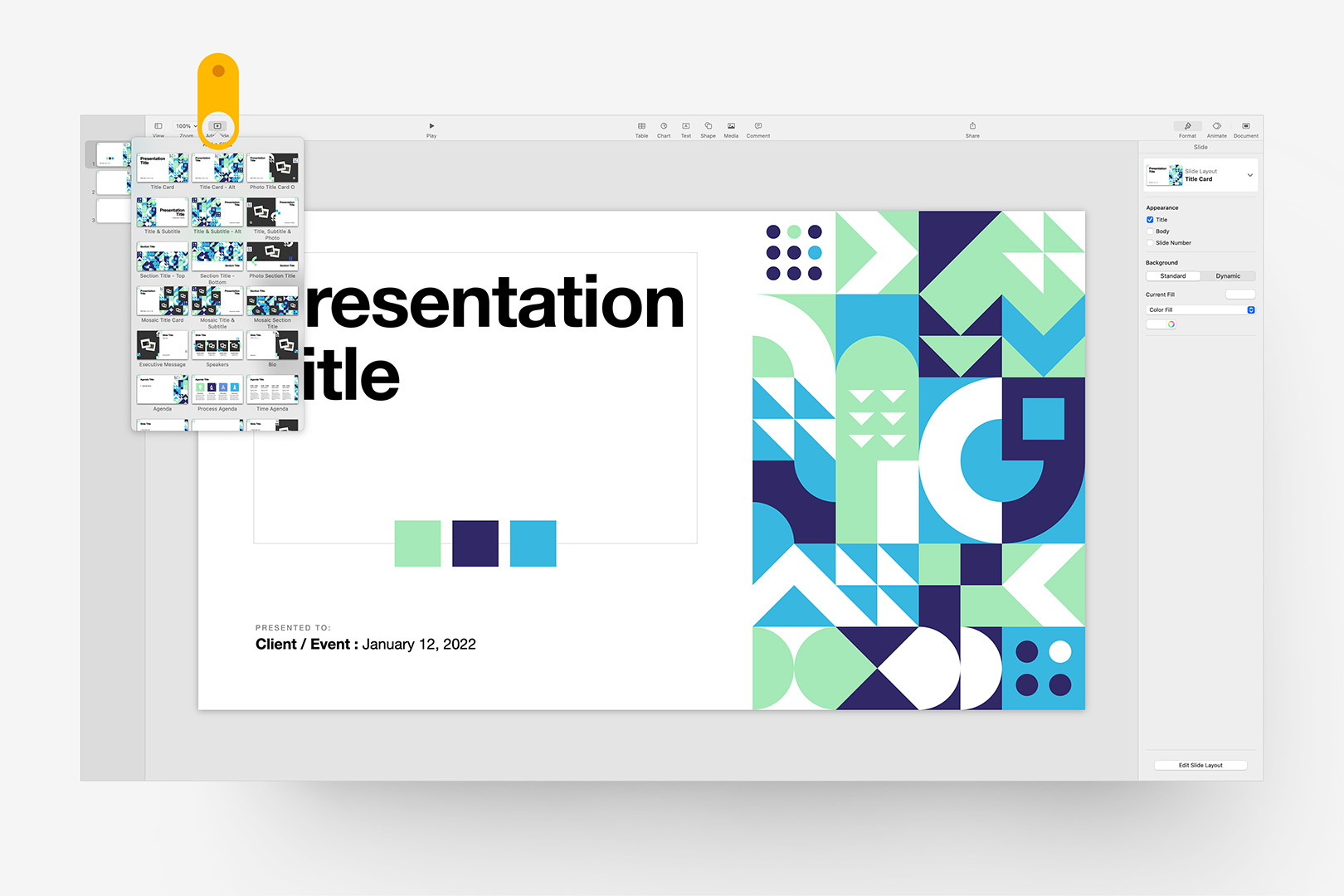
There are only a few setup steps involved in transforming the default Haus Neue style into your own coloration. Start a new presentation using Haus Neue, add a few slides you can use to reference your changes, and add 3 square shapes to the stage to get started – they'll default to the first Shape Style:
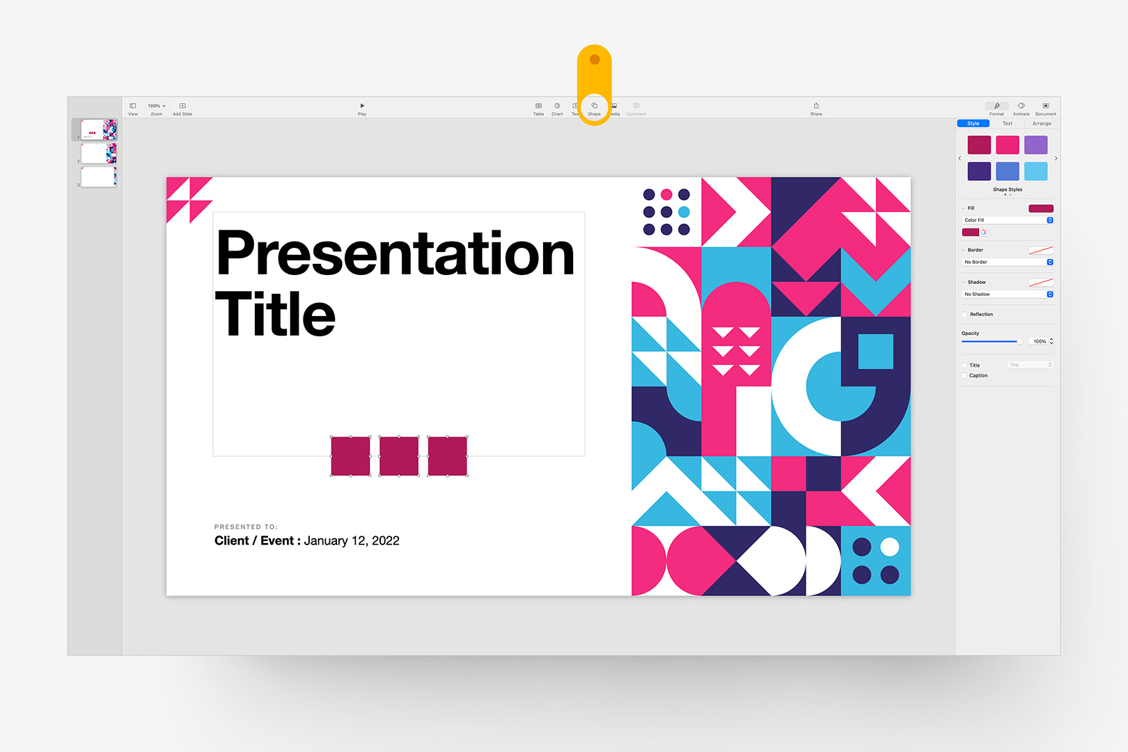
Step 1: Add a few slides for reference, and add 3 square shapes to the stage.
These shapes will act as our proxy shapes for the styles we're going to redefine. Select the first square, look to the Format > Style menu, and click over to the second panel of Shape Styles: this is where our Framework-Reserved styles are defined. Click the signature Fuchsia to apply this first style:
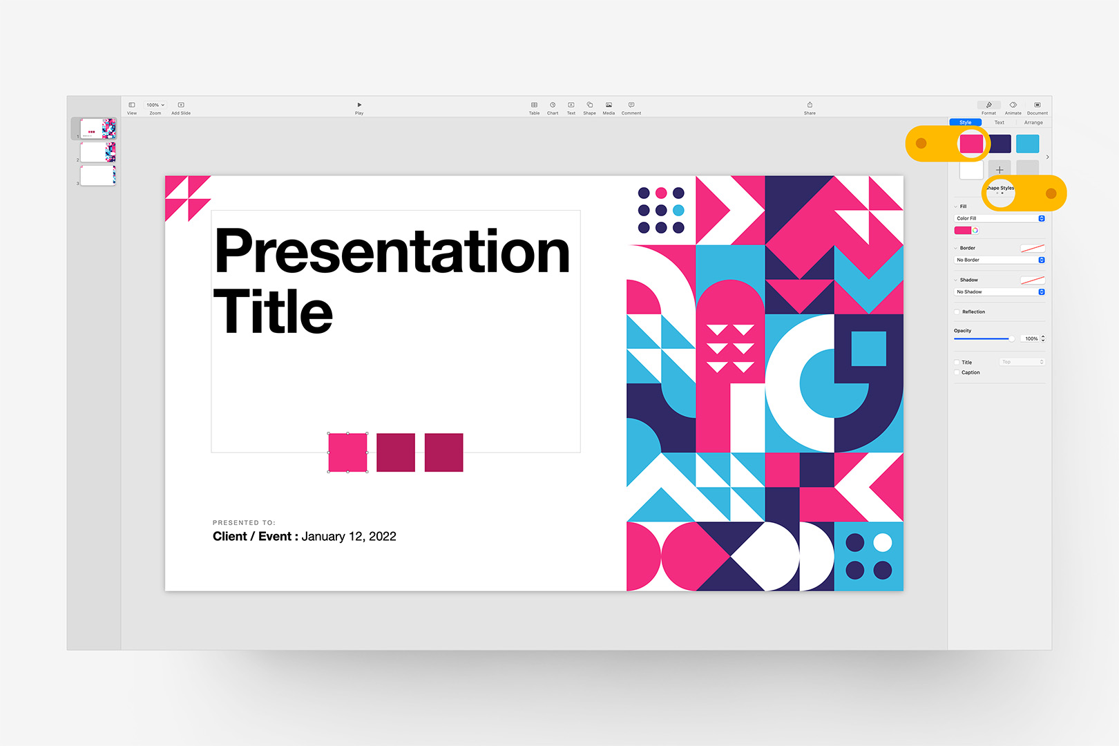
Step 2: Apply the first reserved Base Style we'll Re-Define later.
Repeat that step with the remaining 2 squares, selecting the Indigo and Light blue styles respectively, which will set all 3 proxies we'll focus on here. You'll notice there's a 4th, White Shape Style on the row below our 3 primaries: this is an optional "Surface" modifier, which you can use if you're transforming to a dark background (or otherwise pushing into a 4-color model) – we won't use that one in this tutorial, but it's good to know where it is if you're going for a non-white background and want to blend the white accents.
Once you're done with the 3 primaries, your slide should look this, and you're ready for next steps:
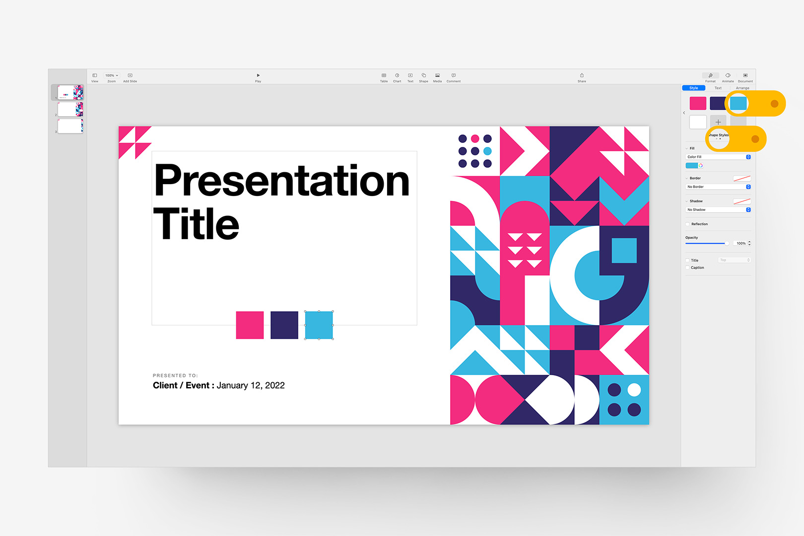
Step 3: Repeat that step for the remaining Indigo/Light Blue styles.
Redefine the Styles
Now we'll re-define each of those colors one-by-one, and let Keynote handle the application throughout the file. We're going to work up a nice Spring palette with a few near-neighbor Greens here as an example, but again, this process will apply to any palette you choose.
The Bauhaus pattern works around a highlight/contrast/highlight model – for best results, you'll generally want to key in your two key highlight colors, then define the darker contrast as a mid-point between the two highlights, or alternately a "reach" color that pushes into a neighboring color space. This can involve a bit of trial and error if you're not working with a pre-defined color or two, but as you'll see, it's easy to adjust on-the-fly from our proxy shapes.
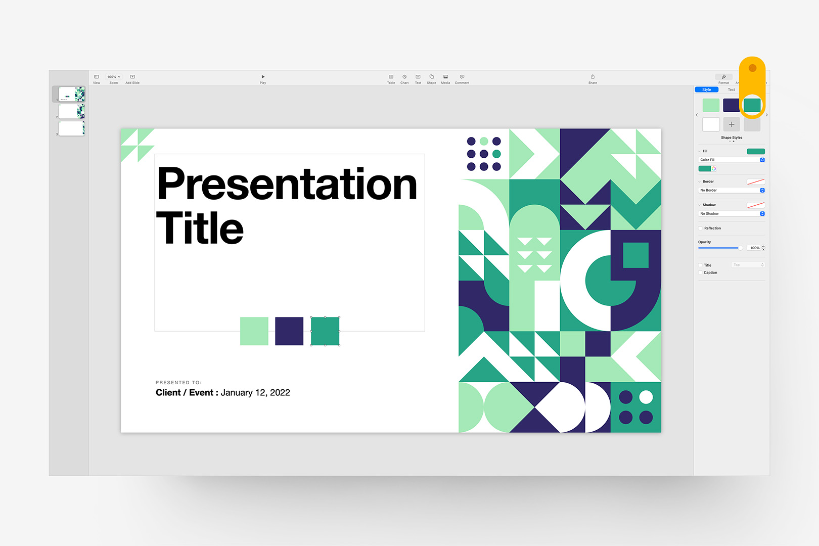
First, we'll replace the Fuchsia with a crisp, cucumber Green. Select the Fuchsia proxy square, and set it to a new color: I'm using RGB 164,233,183 here. Once you've changed the color, we'll redefine the base style by right-clicking the original Fuchsia style and selecting "Redefine Style from Selection" as shown:
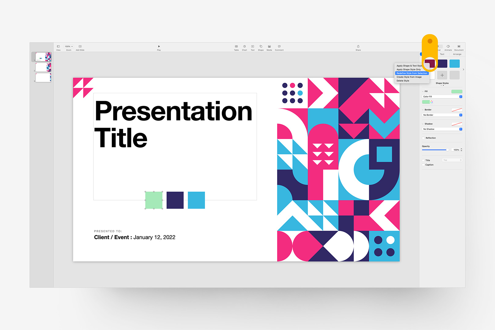
Step 4: Redefine the first reserved style using the modified proxy shape.
Keynote will prompt you with a choice to update all of the shapes referencing the style you're updating (or not): make sure "Update all objects" is selected, and click OK:
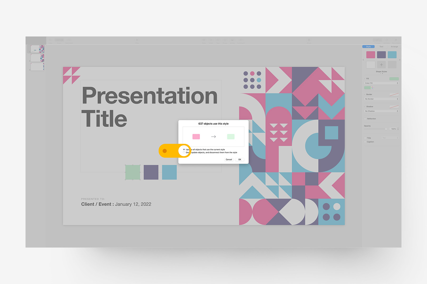
Step 4(b): Confirm that you want to apply the change throughout the presentation.
Keynote will re-define all linked instances of the Fuchsia squares and accents to our new cucumber Green, which should be immediately apparent on the active + reference slides we added at the beginning. For good measure, we can inspect the rest of the masters via the Add Slide button, which confirms the original Fuchsia is now Green throughout the file (excepting the special instances in the Supplemental masters):
Step 5: Confirm that the first change has been applied throughout the presentation.
We'll repeat that process for the remaining 2 proxy squares. If you don't have colors pre-selected, it's generally best to move to the 3rd shape to set the secondary highlight, then back to the second the balance the contrast color. Here, I'm setting the 3rd proxy square to another green (RGB 38,164,134 here) – a darker hue that plays against the spring contrast I'm going for, and re-defining the referenced Style from the selection again:
Step 6: Set the alternate Highlight color, and redefine the third root style.
We're nearly there. Now we'll redefine the Contrast color – since we're using a naturally contrasting pair of greens for our highlights, this is a good instance of where we'd use a "reach" color to push into a neighboring color to balance. I want to stick to the blue end of the spectrum for the reach, but pull it closer to the Green end of the range vs the violet default. After a bit of exploration, I'm going with RBG 10,59,84 here – closer to green, but still distinctly blue if we were to ramp luminance:
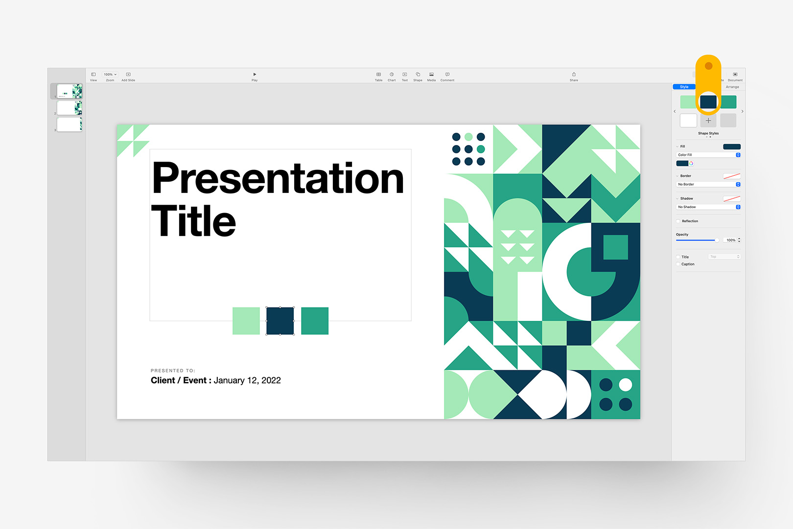
Step 7: Set the Contrast color, and redefine the second root style to finish up.
And we're done! There are a few additional steps to go through if we want to dial in charts, tables, or text Emphasis styles – but the "heavy lifting" of setting up our color conversion is largely finished for all intents & purposes. You can remove the proxy shapes, and start adding slides + building the show from here – simply use the eyedropper tool to sample your new colors wherever you want to dovetail inserted shapes, etc with your revised palette.
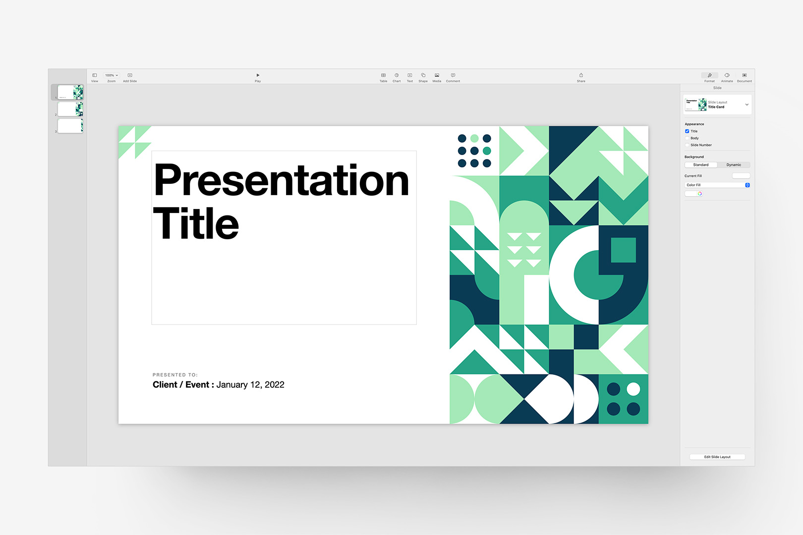
We're all set: remove the Proxy Shapes to finish up.
Wrapping Up
If you're going to make frequent use of your revised setup, it's worth spending a few minutes keying in the default Accent Shape Styles (the first panel of Shape Styles, vs the Reserved styles we redefined here) to align with your changes, along with the Text Emphasis styles (defined under the Character Styles drop-down when text is selected) if you tend to use those. It's generally easiest to treat Chart and Table colors as spot overrides vs going through the process of redefining all of the various tiers defined there – but if you're going the extra mile, those are the remaining styles you'll want to pay attention to.
You can otherwise save your changes as a new Theme file by selecting Save Theme from the File menu – choose Add to Theme Chooser to make your new theme appear in the My Themes section of the theme chooser, ready to start your next presentation with (and if you ever need to remove it, Right-click or Control-click the theme in My Themes and select Delete).
Additional Resources