Re-Mastered to Remix:
As we noted in our latest Upgrade Report, Pages 7 adopted a number of exciting new features this generation – and we're now pleased to announce the release of our first wave of updates tailored especially for the latest architectural & workflow revisions that came along with the Pages 7 release.
As we first hinted at in our Upgrade Report, the re-introduction of Page Masters is something of a seismic shift in the Template Architecture landscape, offering major improvements to authoring workflow & ease-of-use, particularly when it comes to mobile authoring & complex document types like Brochures or Newsletters. Longtime or even casual users of Keynote will find the process of constructing & editing a Page Layout document very familiar now, and Pages '09 authors will finally feel right at home in the transition back toward a more Constructive authoring paradigm.
In many ways, Pages 7 is the long-awaited true successor to Pages '09: the core workflow that made Pages such a joy to use in the first place is not just back – it's better than ever before. If you're new to Pages since version 5.x, you're going to be in for a real treat when you settle into the new workflow. But if you're one of the surprising number of Pages '09 holdouts we've heard from over the last year while we've worked to forge a way forward from the Classic-Era Pages model, Pages 7.x is the proverbial droid you've been looking for.
Today's updates include Page Layout Template updates for both Palo Alto NXT for Pages and Geneva for Pages, adopting the new Page Master model – updates to Tribeca NXT for Pages and Hyperion for Pages are underway & will be arriving in the coming weeks, with new systems adopting the model thereafter as our new default. Update: Hyperion & Tribeca NXT updates are now available, finishing up the initial transition.
Let's take a look at the changes and how we're adapting our template systems to take advantage of the underlying power of the Pages 7 approach.
A New Foundation
Pages 5.x-6.x adopted what we've previously referred to as a Flat Architecture - that is, a document created from a template included every possible page right up front, and it was up to an author to duplicate/delete from there to create something more unique or purpose-driven. It could rightly be thought of as a Destructive architecture, in that you had to chisel away the parts you didn't need to create the document containing the parts that you did - at least when it came to templates more complex than Apple's 2-page defaults.
A Pages 7.x Page Master-enhanced template, like the classic Pages '08/'09 architecture, is inherently more Constructive. That is, all of your layout options are included behind the scenes, leaving you as the author to focus on constructing your document as options are needed. It's a bit more like Keynote, now (again): you start with a default slide (or 2), and where you go from there is completely up to you - just click Add Page, and choose from a Template's available Masters:
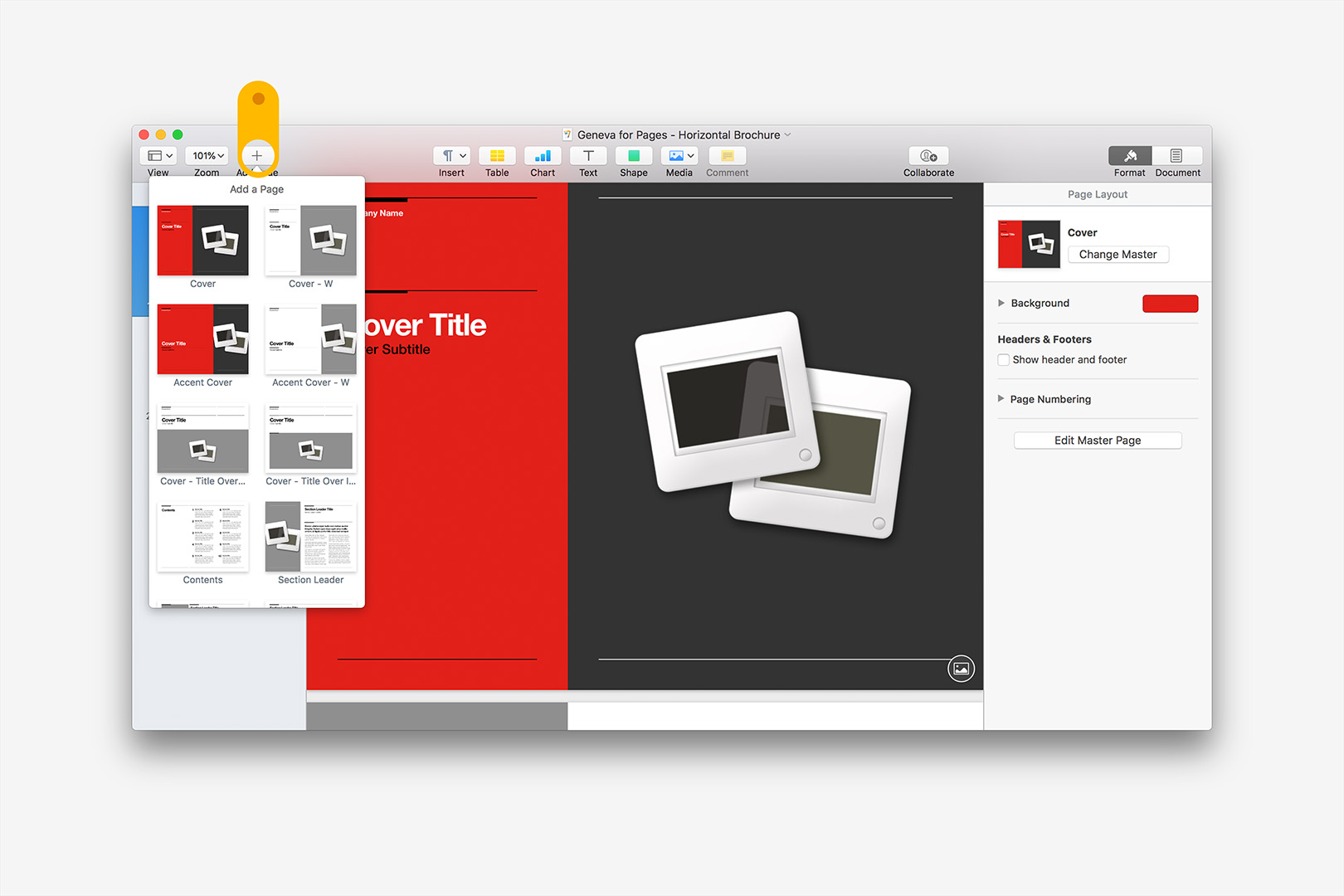
Click Add Page to expose additional layouts.
And just like Keynote - but quite unlike Pages '09 - you can now also click Change Master to apply a different layout altogether to an existing page:
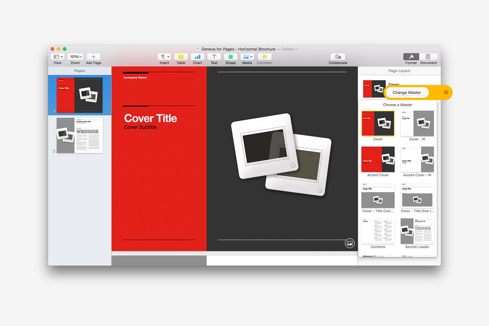
Click Change Master to swap an existing layout.
If you're just getting started with a new document, Change Master makes it much easier to dial in your document's style & structure right from the start: it's a breeze to swap the default layouts & get right to work.
If you've started to make changes or edits to a page, the Change Master functionality is best reserved for like-to-like changes, such as swapping between Cover variations or Left/Right variations of a certain style of text layout. If an object, such as Title block or Photo, is consistently tagged between two different Page Masters, all of your changes/edits will carry with the change. If an element exists on one layout but not another, however, the newly-applied Page Master takes precedent, meaning elements you've edited may disappear in the process if they're not mapped on the new layout's master - so use this functionality with care if you've already committed edits to a page, particularly on more complex Brochure or Newsletter layouts where there may be a greater diversity of individual objects present on any given page.
Curiously, Apple has thus-far implemented this functionality only on their new Book templates: none of the in-app Brochure or Newsletter templates, for instance, include additional Page Masters as of this writing. It remains to be seen how they might adapt this to model to other document archetypes throughout the broader template chooser.
For our own template systems, we've stuck with a model that should feel familiar to anyone using our Keynote systems or older Pages '09 Templates: major groupings - like Covers or Section Leaders - are organized together, with sub-groupings or variations organized within those major sections in a similar pattern. We've tried to make it as easy as possible to dial in to a page archetype > style selection, but will likely continue to evolve the meta-structure we're mapping against behind-the-scenes to better accommodate the pacing afforded by the 2-column layout selector called when you click Add Page or Change Master.
Constructive Authoring: 101
These fundamental changes come together to create what might be the easiest authoring flow ever available in Pages, far surpassing what was ever possible in the classic Pages '09 architecture. Let's look at an example, using the Trifold Brochure template from Geneva for Pages. In this case, we're starting with a single Exterior style - the default full-color Cover model:
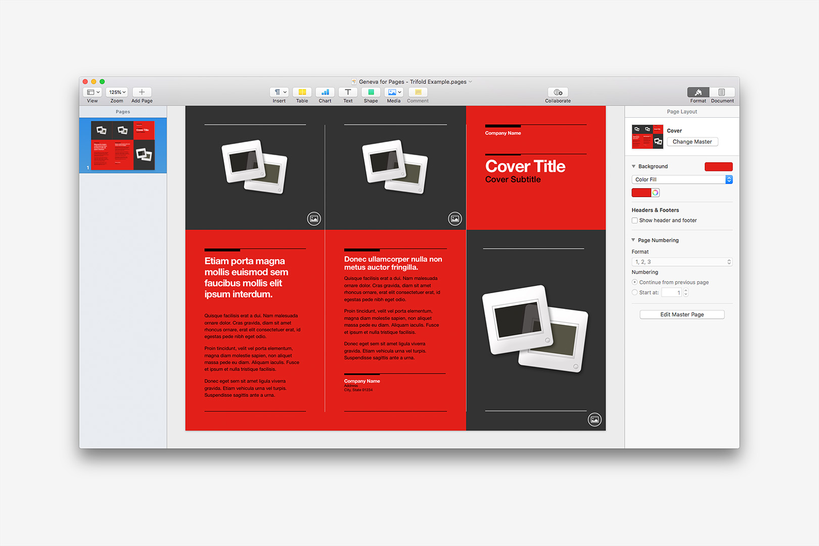
Default state for the Trifold Brochure Template.
Right up front, we can make some decisions about the document - are we going to use the full-color Exterior, or did we have something more ink-conscious in mind? We'll ultimately add a corresponding Interior page that best fits with those decisions, but as you'll see, it's pretty easy to change your mind along the way.
For our example, we're going to stick with the full-color cover for now, and jump straight into some edits. We're adding our initial picks for the pictures we'll use, and we'll update a few of the text elements so we can see some of the other changes in action. To keep the flow moving, we're going to next add the matching full-color Interior layout via the Add Page button:
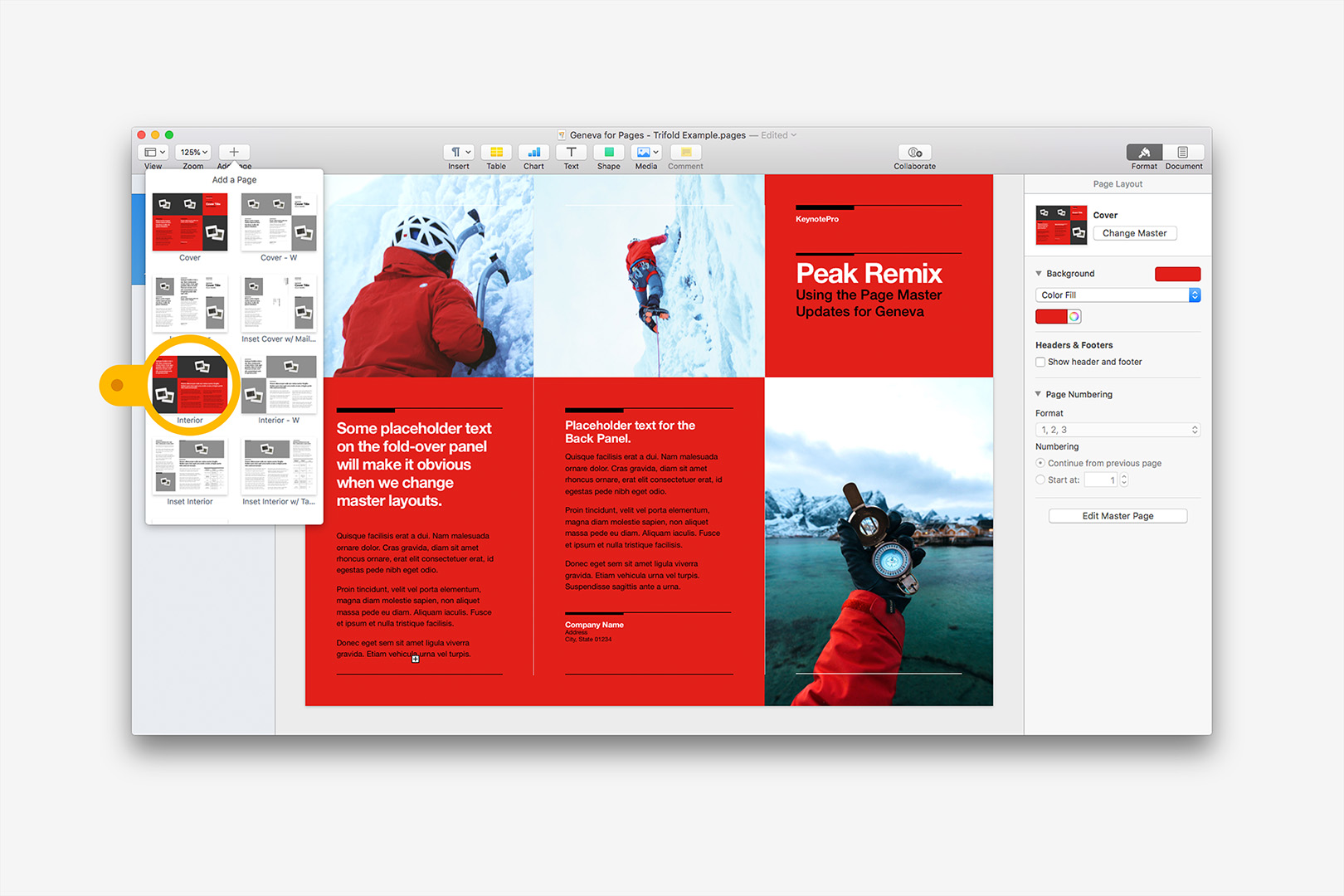
Photos and some Placeholder copy are added - next, we'll add a matching Interior.
We can stop here & simply fill out our placeholders if we want to stick with the default full-color style. But's let's say we're working with a printer that doesn't do edge-to-edge, so we'll want to switch to a more ink-conscious, inset style. We haven't edited any of the content on the Interior page yet, so we don't have to pay much attention to whether or not our content will map 1:1 at this point. With the Interior page selected, click Change Master, and we'll select the Interior - Inset layout option.
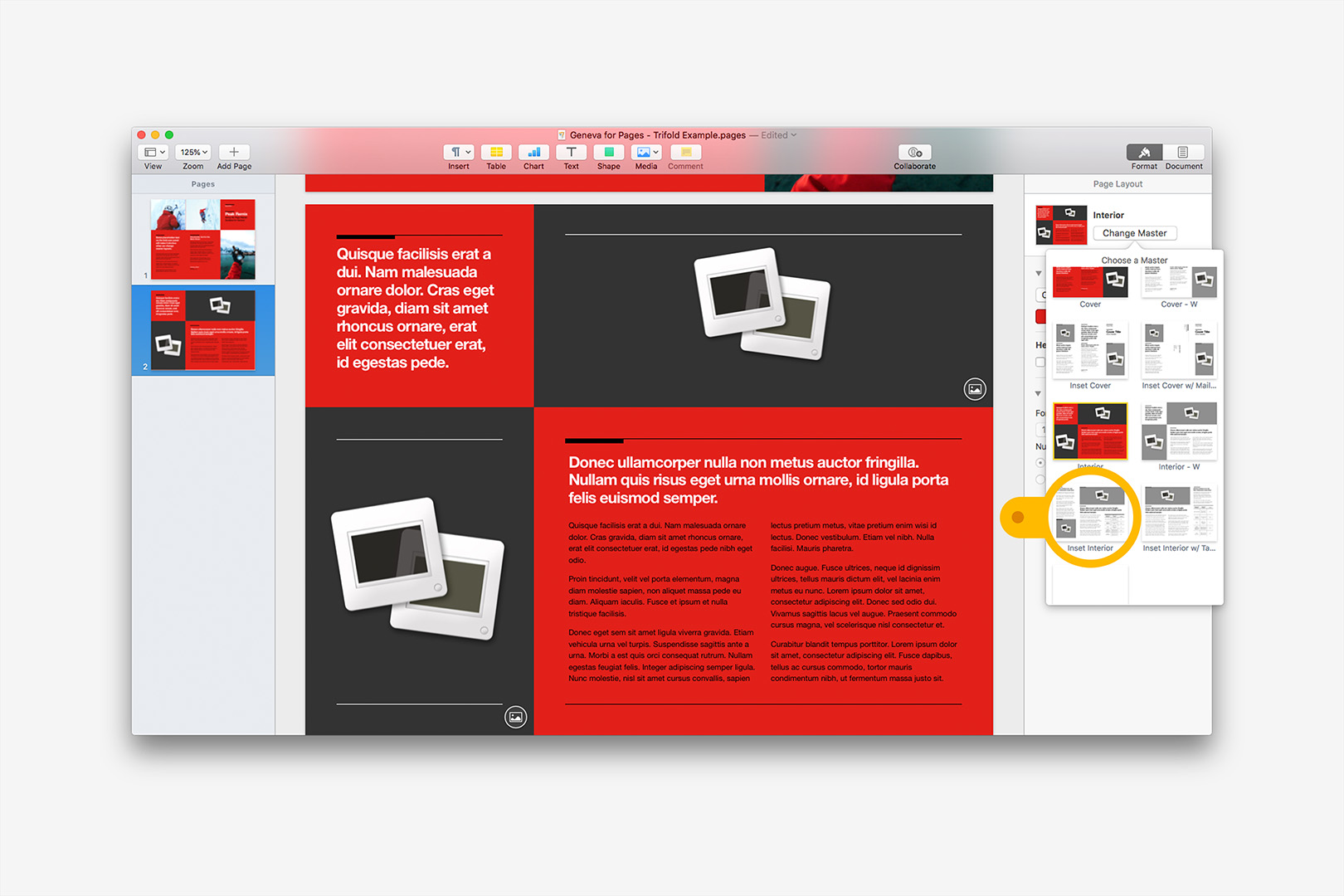
Next, we're going to switch our un-edited Interior to another page style - no changes or edits to watch at this stage.
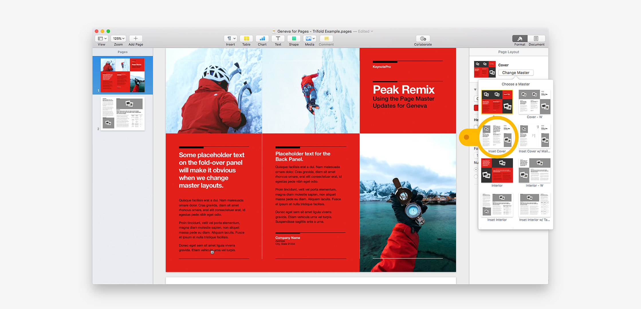
We can pick up with Interior edits from there, but we'll also want to change the Exterior to match our new low-ink style. Since we've made a few edits to the Exterior already, this provides a good example of the sorts of things we're watching for when we Change Master on edited pages. The "Cover - W" variation is our 1:1 change option - that is, every element on the basic Cover is also present on the White variation. But going low-ink alone won't solve our Edge-to-Edge quandary, so we're going to switch to the "Inset Cover" variation instead. Simply eye-balling the constituent elements of the different layouts, we can see that the back-panel image is replaced with Callout Text on the Inset style:
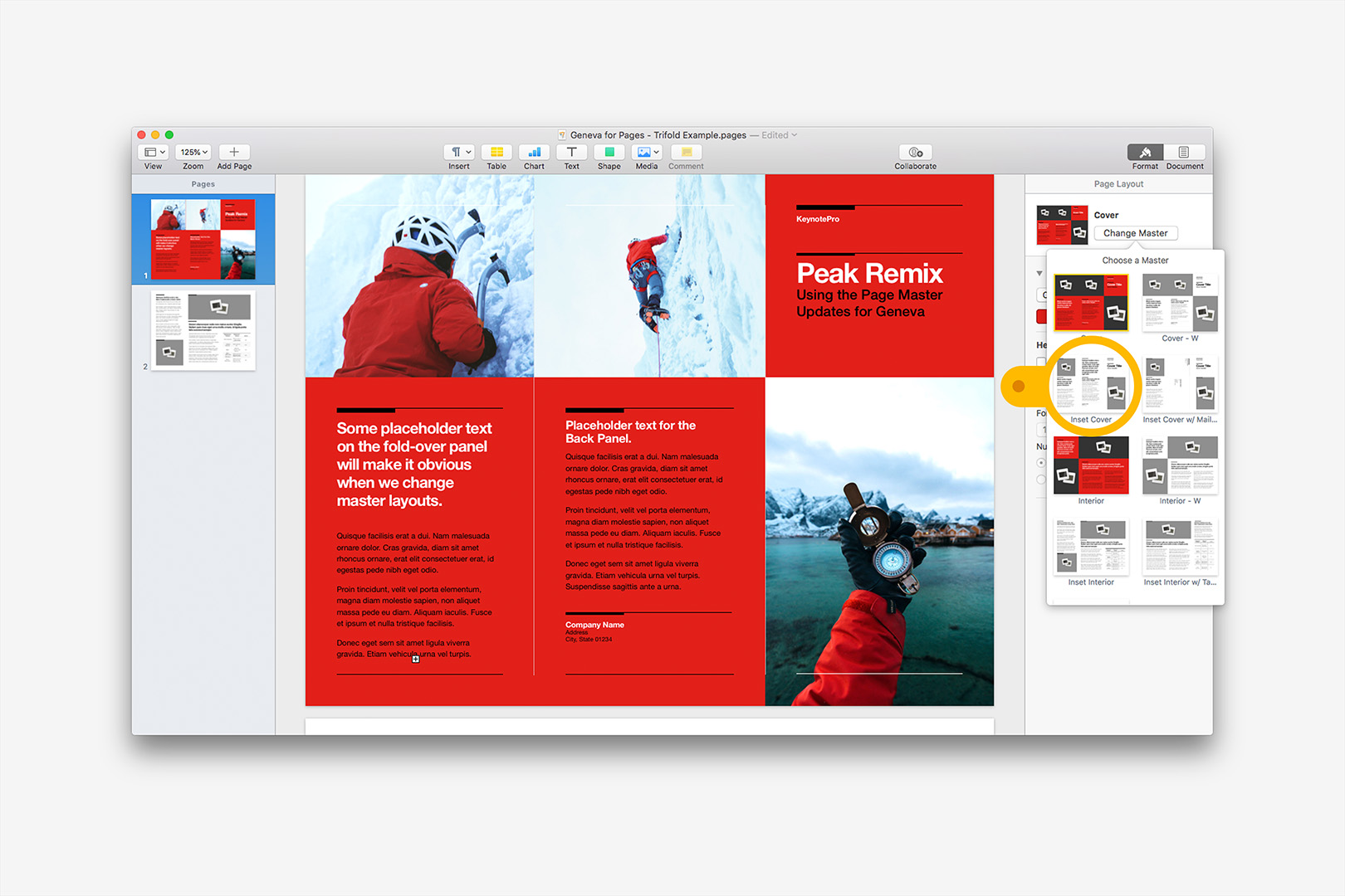
We're going to change to the Inset Cover - notice the back-cover photo is not present on the new Master - we can anticipate it will be replaced.
As we might expect, then, we lose our back-cover photo in favor of the new Master's Callout Text object. But all of our other edits remain, adapting to the new Master:
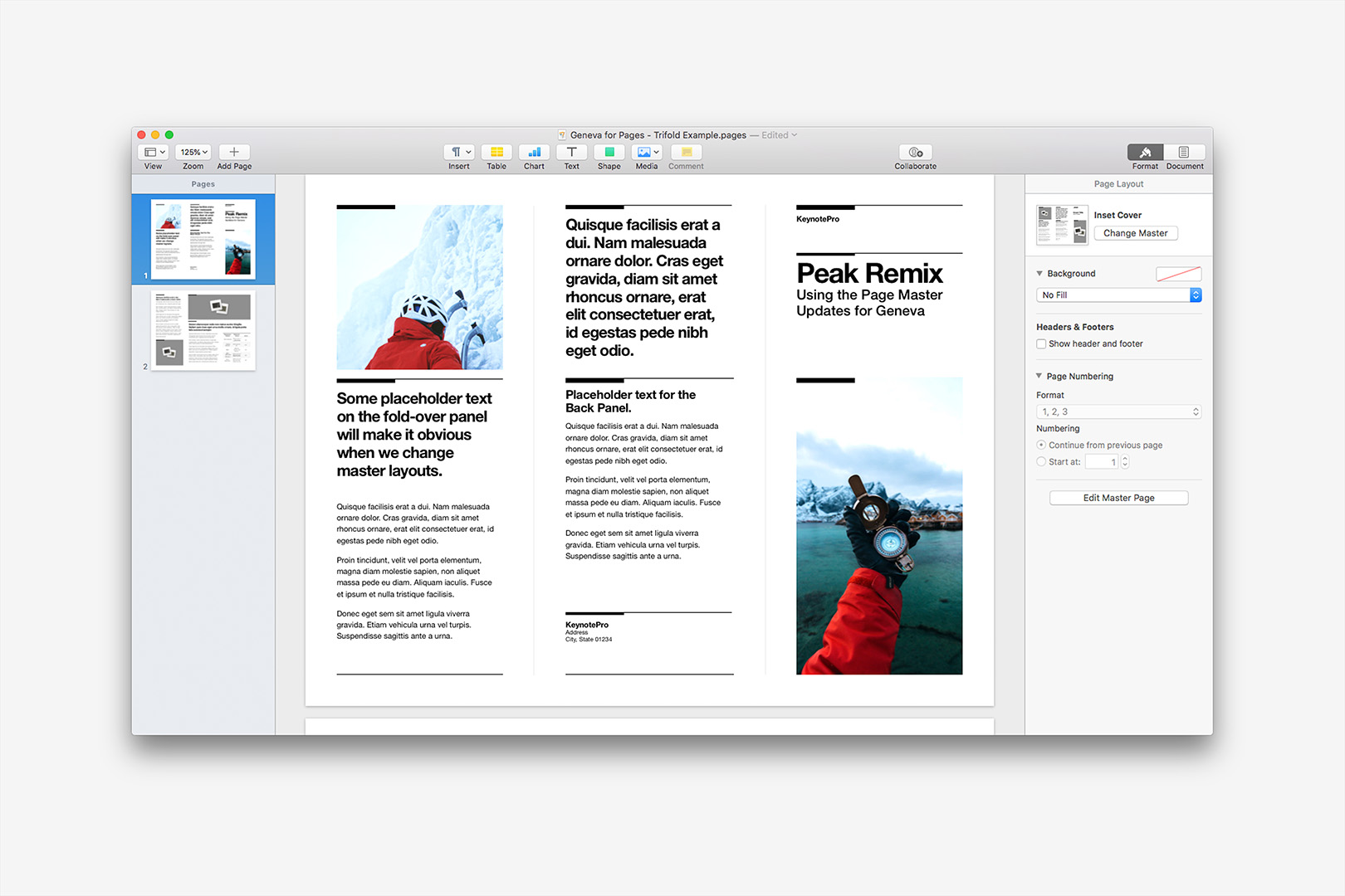
As we've changed Master styles, Pages intelligently adapts elements wherever they're mapped to each other.
Likewise, we can pivot from here to the "with Mailer" variation, but we'll discard any changes to the back cover copy altogether in the process:
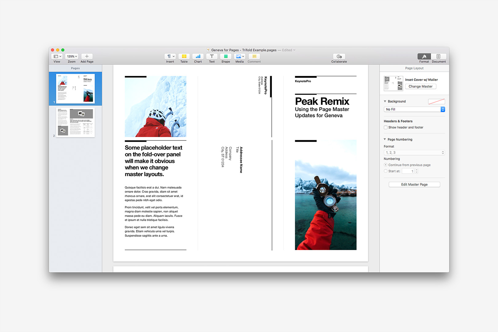
Changing to the Mailer variation discards our changes to the back cover entirely, replacing the panel's content with a Mailer construct.
This is a fairly simple example, but it hits the spectrum of everything you need to know to make the most of the new approach. We've started from a default template & completely transformed it, never growing past a basic 2-page document along the way. All of our updated Page Layout templates follow this basic model, so once you've got a feel for the process, you should be able to build up documents faster than ever before – as easily as putting a presentation together.
Moving Forward
As we've already noted, these updates are available today for Palo Alto NXT and Geneva for Pages, with Hyperion and Tribeca NXT for Pages coming shortly. Currently, these appear as stand-alone updaters - if you've updated to Pages 7, Sign In to download the updater file, and each of the included templates should trigger Pages to prompt you to Replace any Pages 5.x-6.x style templates you've already installed. As we transition to the new version of our website, Pages 7 will become our standard default in the core download, and we'll flip the 5.x-6.x versions out to the Supplemental download for anyone still needing them - but until then, you'll need to grab the Pages 7 updates separately and install those files over/instead of the corresponding templates in the original DMG.
The architecture change will perhaps be most pronounced in the mobile authoring space - you'll need Pages for iOS v4 or higher to use the Page Master enhancements (4.1 for Geneva, due to the Page Background color), but once you're up to date, the updated templates provide a far, far superior authoring experience to the prior Flat Architecture model on mobile, particularly on the more complex document types like Brochure or Newsletter. We've had to defer iOS Direct Install integration for our Pages Templates into the new website, but you can transfer the updated templates to your device now using the manual method we outline on the Direct Install page, provided you're running at least v4 of Pages for iOS.
A few of our Beta testers were quick to inquire about how this would impact the Proposal template in particular, which is currently a Word Processing-mode document - in Pages '09 you could Add Sections to Word Processing documents a-la the Page Master model, but we don't have that functionality at this time in Pages 7. We're going to be modeling a Page-Layout alternate version of the Proposal (and potentially other WP templates) in the near future & will update this page as we have more information on availability - the current wave of updates only replaces the existing Page Layout templates. And while this functionality is currently exposed in relation to Books in Apple's built-in templates, these updated Templates are not intended/suitable for eBook export (if only because they aren't the expected size) - we'll address Book-specific templates at some point in the near future.
Once Tribeca NXT and Hyperion are wrapped, we'll start pushing forward with new Template Systems (yes, we do hear you) and variations adopting the new model as our default format. Much more to come on this front - we'll update this page as appropriate with any new information as it becomes available. Update: That's a wrap, Hyperion and Tribeca NXT updates are live, and we're finished with the initial transition.
