Better Native Photo Blends:
Using Keynote's Image Adjustment Tools to Improve Image Blends Natively.
Image Blends are one of the best ways to make a photo feel "integrated" with the theme it's being used in, particularly if a theme's design is optimized for the approach. Our latest build of the Aurora themes - Aurora NXT - uses this technique extensively, as does last year's KeyStation NXT (to a differing degree). And when the photo you're blending is a good fit for the technique without any adjustment, it's a sort of magical, one-click experience.
All photos are not created equal, however, and basic Transparency mixes like the defaults set in Aurora NXT won't produce optimal results for every photo. We can jump to a tool like Photoshop to take advantage of more advanced Layer Blending options on difficult photos, where Screen or Multiply will often make quick work of this sort of thing. But you can work a surprising bit of magic natively in Keynote 6.x-9.x itself by diving deeper into the Image Adjustment Tools built into the app itself.
The Basics
We'll be using the standard Aurora NXT theme for these examples: if you don't have the Aurora NXT themes in your library, you can download a free slide-limited Trial Edition here to follow along with: Free Keynote Themes - Aurora NXT LE
Aurora NXT includes 4 relevant Image Styles to ballpark Subtle, Moderate and Intense blends, along with an override style to disable the blend altogether. The results are quick and fairly predictable on a deep, full-color image (an Unsplash image by Vero Photoart shown here):
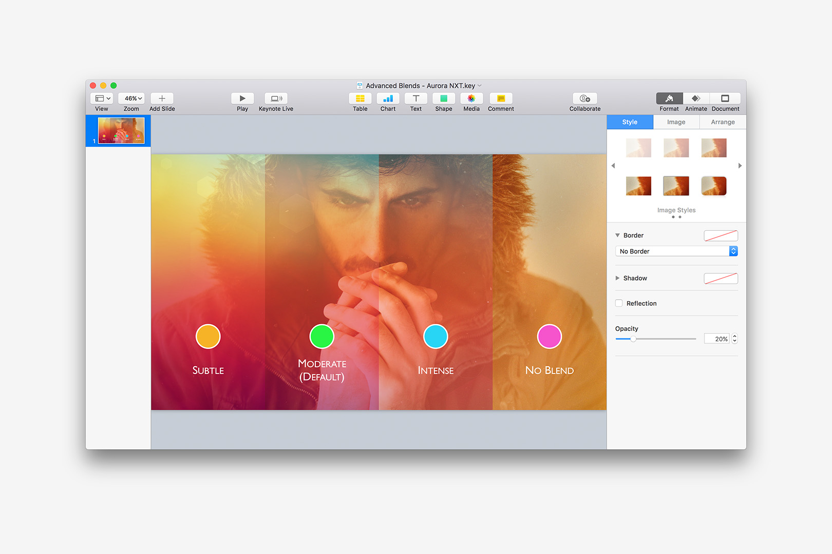
Default Blend Stops assigned via the Image Styles in Aurora NXT
In this case, the base image includes some deep yellows & reds and blends particularly well with the full-spectrum Aurora theme at each of the transparency "stops" defined in the base image styles. Likewise, deep blue & green photos will blend more readily in Aurora UV, as the colors are playing off the natural color ranges of the respective themes themselves.
There's not much to this basic technique: the styles correlate to different Transparency levels (the only Image Adjustment setting Keynote will hold on to when an Image Style is defined), which can be easily tweaked in the inspector to "dial in" a more pleasing transparency level if one of the defaults aren't quite right.
But some photos are more difficult to blend than others when you're relying only on Transparency, particularly if you're blending a darker photo with a more vibrant, colorful background (or a lighter studio shot with a darker, flat color a-la KeyStation NXT, for instance). Adjusting the Transparency can offer some level of improvement, but in more difficult compositions you'll want to go a few steps further and dive into Image Adjustments to achieve more pleasing results.
Image Adjustments
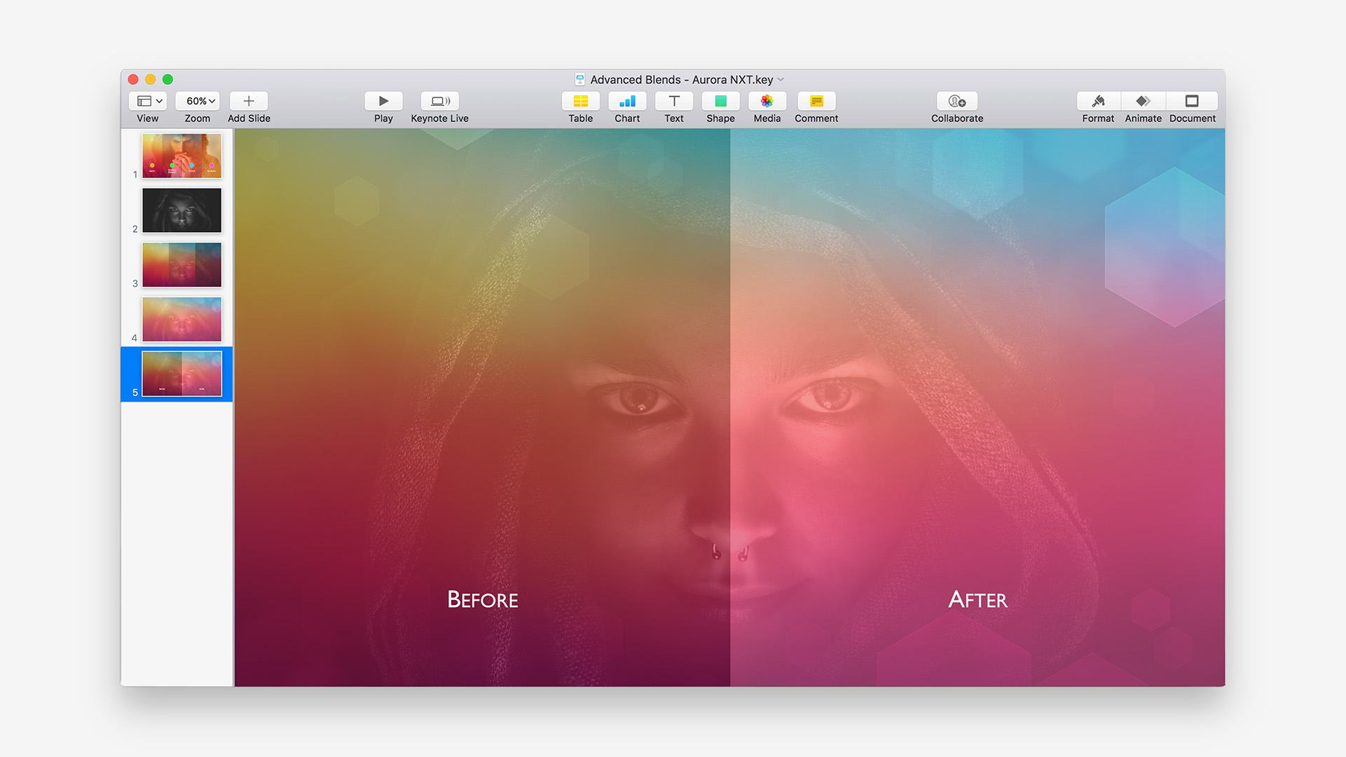
Let's have a look at a good example of the fundamental issue we're trying to solve, and the steps we can take to improve our Blend results. We're starting with a dark black & white image, a popular Unsplash image by Sebastian Unrau, shown here with no Blend/Transparency:
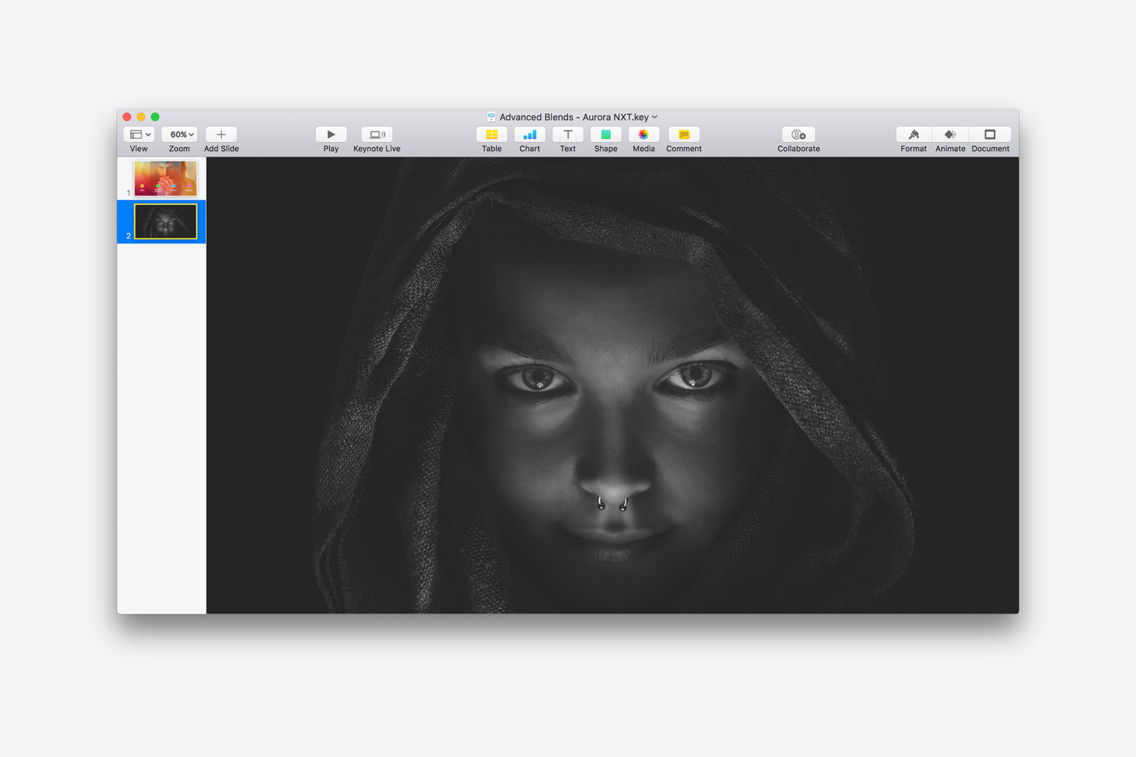
Dark, Black & White images can be difficult to Blend with color.
The lack of color and general dark nature of the photo produces somewhat "muddy" results on the Moderate or Intense stops, with the Subtle stop providing little to no detail:
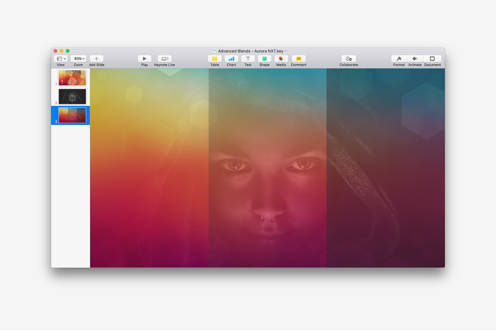
None of the default Transparency Stops provide ideal results.
Making this photo a great candidate for more advanced techniques. Let's settle in around the default Moderate style, which has an Opacity setting of 38% and gives us the better mix of transparency & detail of the 3 default options in this case. Select the photo, and click on Format > Image to expose the Image Inspector.
We'll start by clicking Enhance to let Keynote's image algorithms clarify the base exposure/saturation balance. In some cases, simple adjustments to the Exposure/Saturation settings on the inspector can go a long way - but in this case, Saturation isn't going to do anything for us given the Black & White source, and Exposure will simply act as a rudimentary Lighter/Darker control atop the Transparency. We'll click on the Adjustment Toggle to expose the more Advanced Image Adjustment settings:
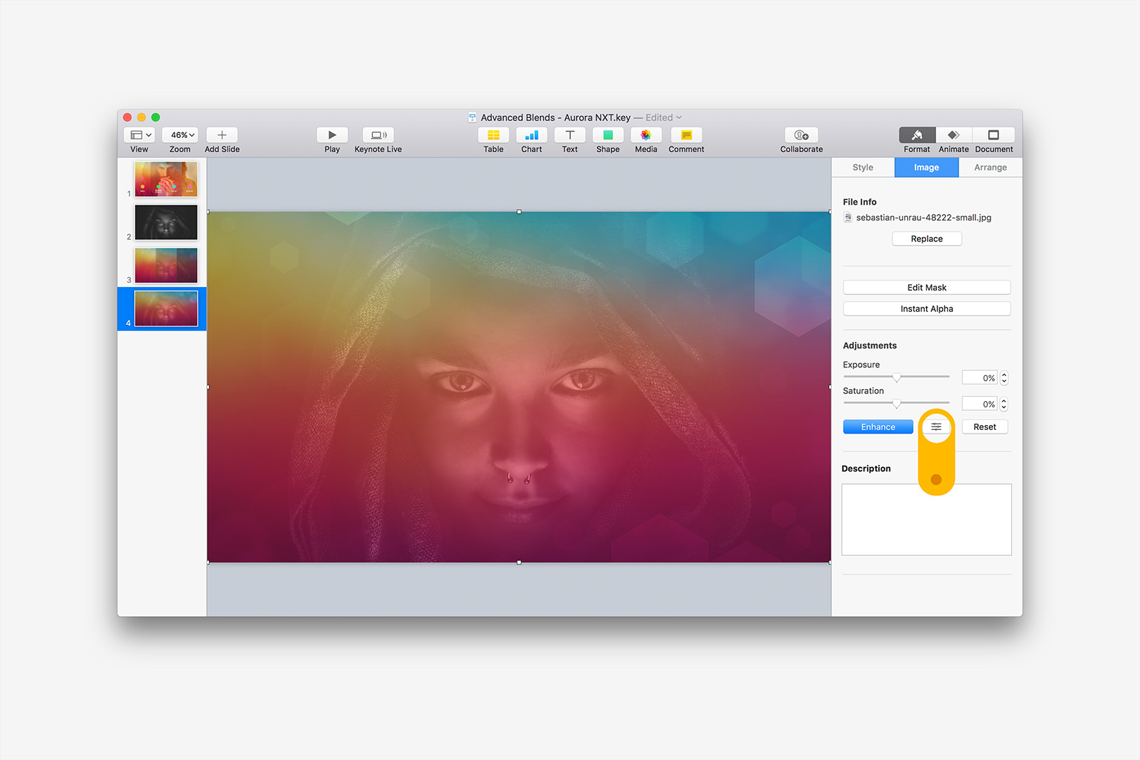
Enhance helps clarify the highlights - click the Toggle to open Advanced Options.
Adjusting Levels will do much of the heavy lifting in this case. Since we're trying to accommodate the darker nature of the source photo, adjusting the mid-range levels down toward Black (moving to the left) will clear up some of the muddiness right off. Adjust the slider so that the mid-range is to the left of the dominant spike:
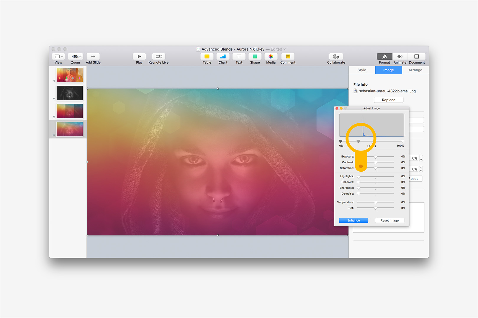
Adjust the Midrange Levels to compensate for the darkness of the source image.
Now we can adjust the Exposure to shape the Levels curve a bit more - bumped to 70% in this case. -70% adjustments to both Temperature and Tint will help in this case by adding a splash of duotone tint to the photo in a good range to complement the red-dominant background:
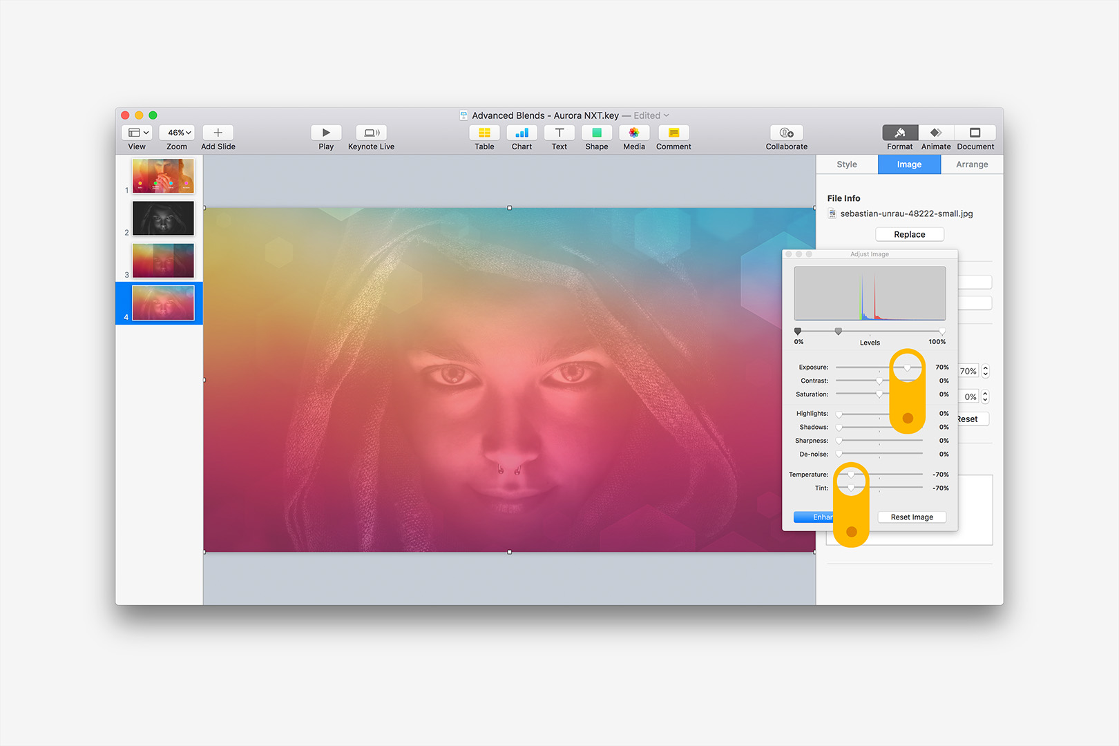
Adjust the Exposure, Temperature and Tint to dial in further.
We're very nearly there. We're going to make one final adjustment - adjust the Shadows slider to balance toward the highlights more:
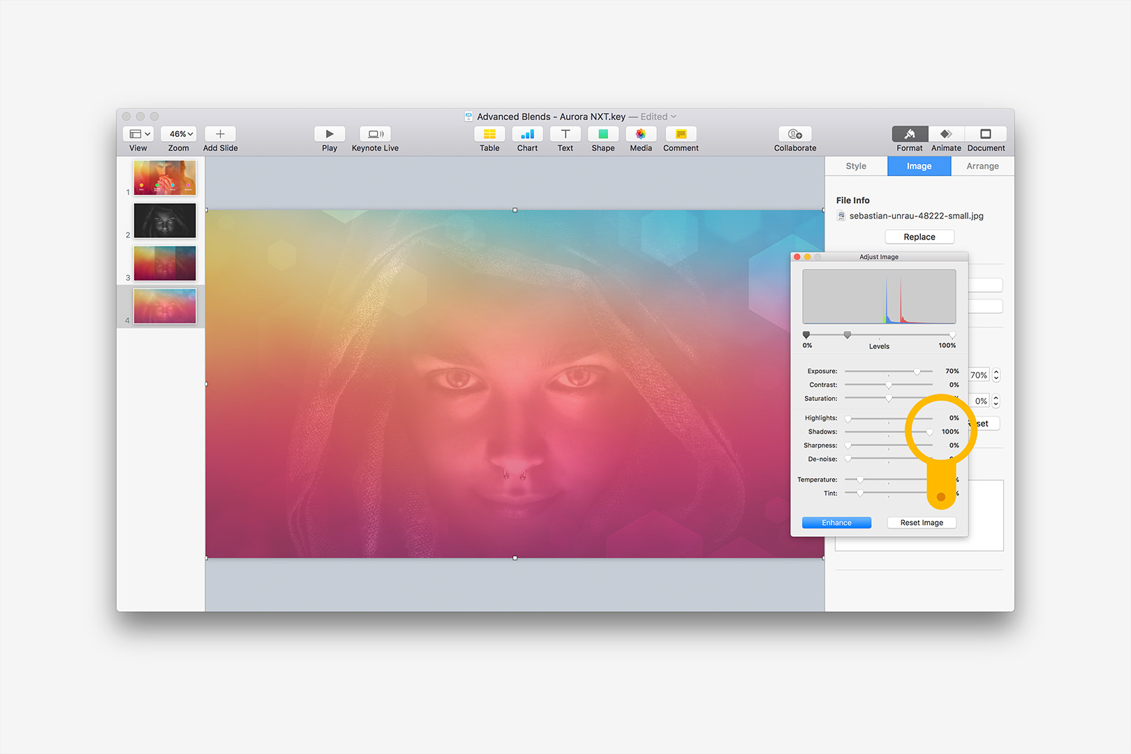
Adjust the Shadows slider to balance toward the highlights.
And we're done. Once you get the hang of what each adjustment does, you can effectively blend even problematic images in a few steps - and the results are a definite improvement from where we began with the default Transparency Blend:
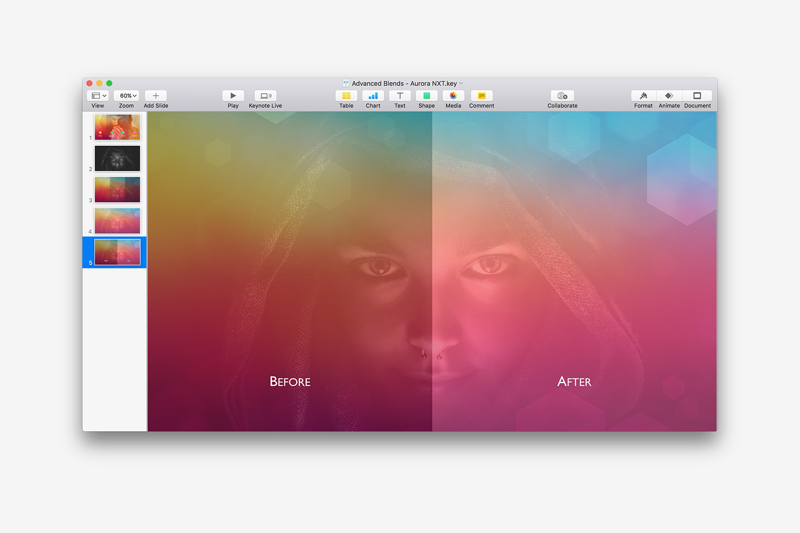
Before and After, showing the dramatic difference between Default and Adjusted states.
While these settings are a good approach for the specific problem posed by this type of image, you'll want to apply these principles in different ways depending on the nature of your source image. Lighter images blending with darker backgrounds, for instance, will tend to work better with higher midrange Levels, less Exposure and adjustments to the Highlights slider instead of the Shadows used here. Experiment a bit and use your best judgment according to the type of image you're blending and the background you're blending with.