Transforming the Fills Palette
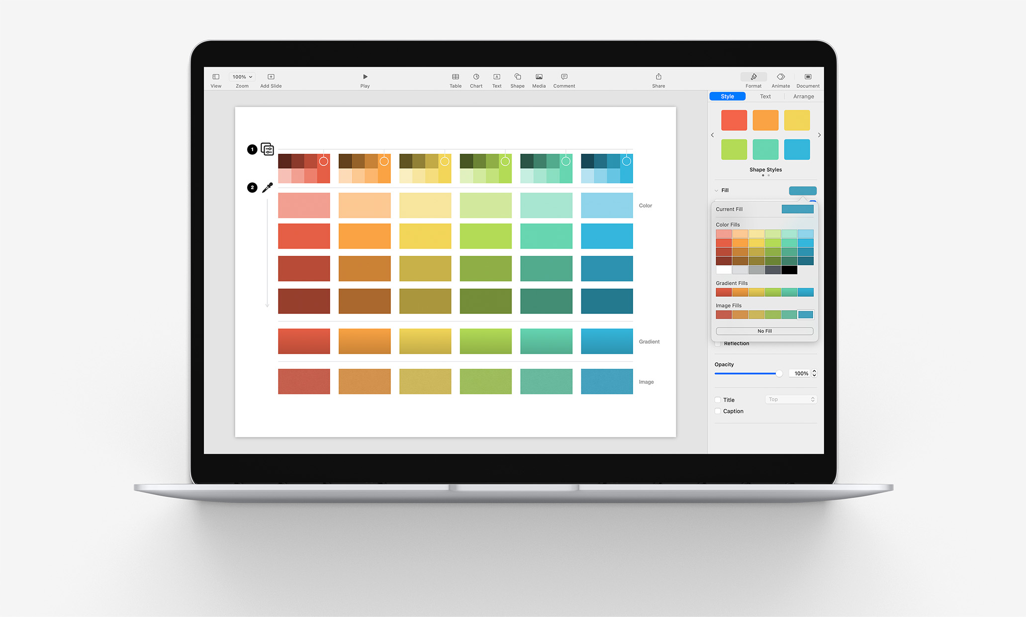
If you’re dialing in a fully-customized theme or template starter in Keynote or Pages, you can adapt your palette into the Color, Gradient and Image Fills Palette to make it easier to apply your color selections consistently throughout your file.
In previous tutorials, we've taken a look at re-defining Shape, Text, and other styles associated with a file's core Theme elements. If this is your first time delving into this sort of customization, our Make it Your Own tutorial provides a good bit of additional background information on the basics.
Here, though, we’re going to zoom in on one particular element of that process to better understand how you can integrate your accent colors into the Fills UI components, how the reference palette is structured, and how to make quick work of re-defining the entire palette through a custom provisioning model designed to streamline the process.
The Fills Palette
If we return to the My Custom Theme file we were working on in the Styles tutorial and select one of the shapes we used to proxy the Shape Style settings, you’ll see the Color Fills UI by hovering over the assigned color in the Style > Fill inspector and clicking the arrow to expand the palette:
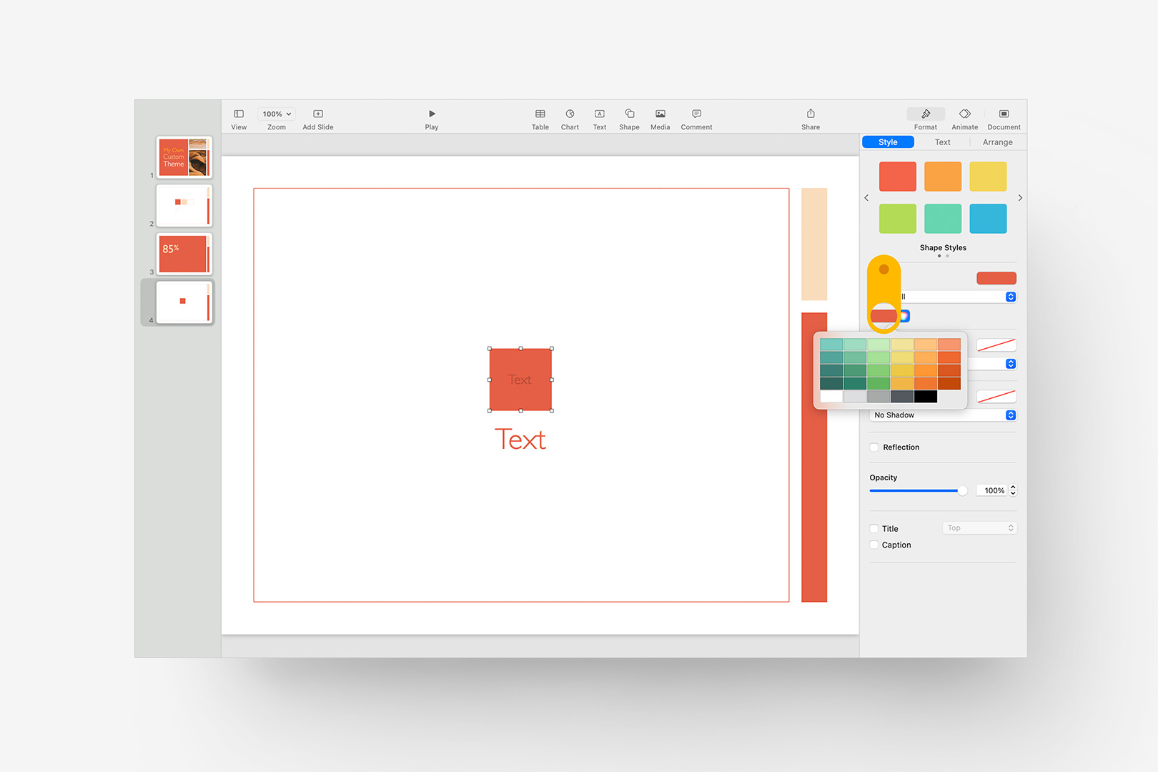
The Color Fills menu is exposed by clicking on the active Color Fill.
As the style is using a Color Fill in this case, only solid-color fills are shown in that menu – but you can access the extended Color, Gradient and Image Fills defined for the file by hovering the Fill preview shown right above and clicking the arrow to expand it:
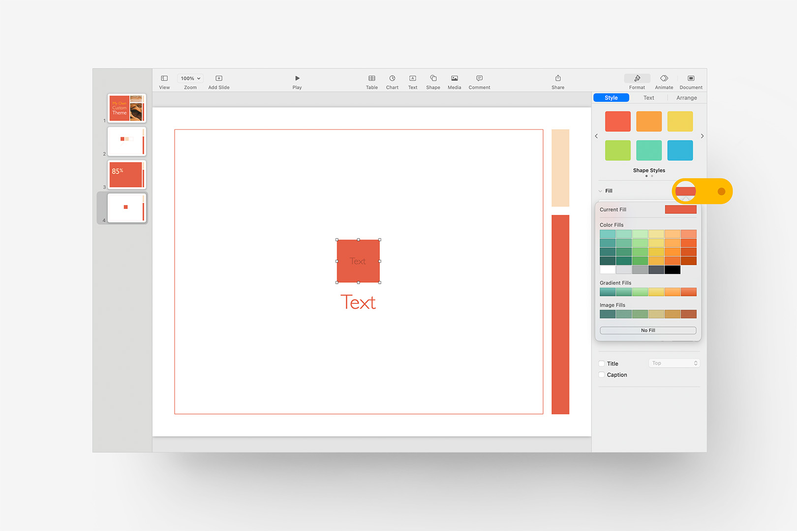
The expanded Color, Gradient, and Image Fills menu is exposed by clicking the parent-level preview.
The Color, Gradient, and Image fills are all still toned to the original palette we started with in this case (the original Comfrey palette from OM X), but you’ll notice we have a 4:6 grid of tints/shades of the original accent colors, plus another 5 gray-scale tints in the Color Fills section, with Gradient and Image Fills following the same color pattern below.
In Keynote, these aren't generated automatically – each of the rectangles in the palette can be re-styled using specific Color/Gradient/Image Fill settings via drag-replacement, and don’t inherit from any Shape or Line Style re-assignments you may have already updated – so you can exert a lot of control in terms of specific color assignments or how the palette is modeled as a result.
That said, because this isn't automated, you’ll need to go Fill-by-Fill to set this menu, so give yourself a few minutes to get it built in your working file.
A Provisioning Jumpstart
To make this process a bit easier, we’re going to use a Color Provisioning Starter slide, which is similar to a setup we use internally for branching the various color-driven themes into their different variants during production:
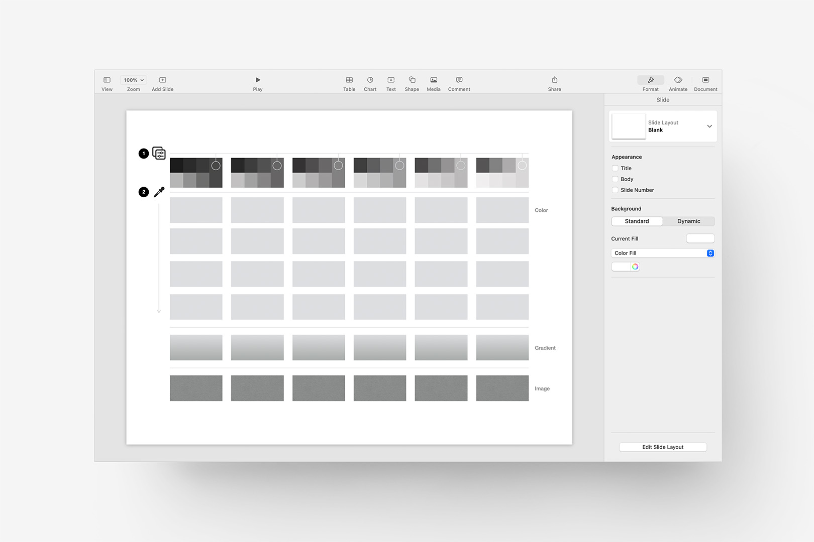
The downloadable Color Provisioning Starter slide is designed to make this easier.
This is a single-slide work file that you’ll be able to use as a Copy source for your working file when it’s time to define each of those palette items in the Fills menu, and can be downloaded here:
The file’s built around a Basic White slide – if you’re building toward a different base background color, you’ll want to also set the background color in the Starter to match your target background so you’re seeing everything in the proper context.
In Step 1, we’re going to set the highlighted root shapes to our updated Accent Colors: the pseudo-transparency objects in front of the root colors will give us easy sampling points to model our tints & shades around. If you already have specific tints defined as part of your branding guidelines, you can skip this step and map your existing colors to the 4:6 color grid proxies in Step 2.
If you've already defined Shape styles in your working file, you can Format > Copy Style from shapes in that file to Paste on the root shapes in the Step 1 row to keep things in sync – we’ll otherwise set the color values of the root shapes one-by-one via the color inspector. Here, I've pasted the Accent shade of the updated Persimmon color we were working with earlier (Shape Style 1 in the build file):
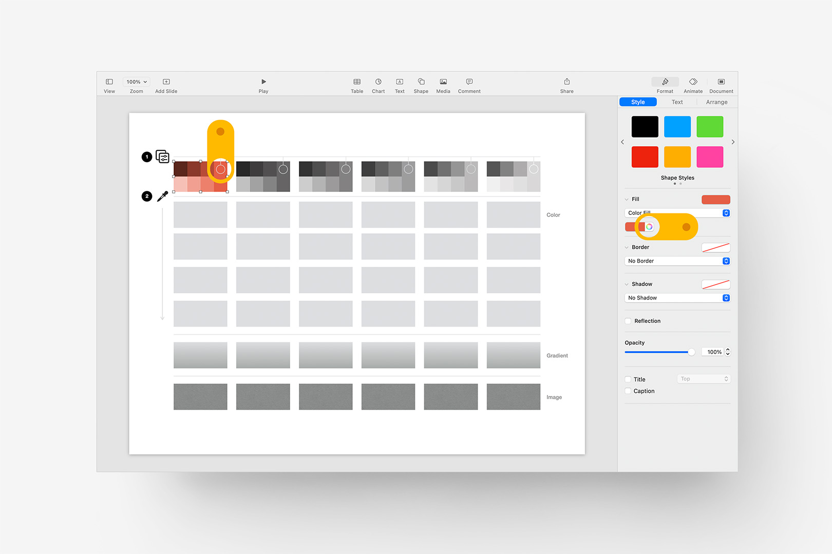
Set the first Root Color to your first Accent color to preview Shades and Tints.
And we immediately have a rough Shades/Tints baseline to start from on that color, which we can sample into the shapes below and dial in. We’ll eventually do the same for the five remaining accents, but for now, let’s walk out what we’re going to be doing around that first color.
The 4:6 grid of Tints and Shades can be structured however you like: we’re going to implement a Light > Dark step here, but we could just as easily lead with the primary Accent color above sub-shades below, etc. – it’s totally up to you.
Here, I’m going to include the root Accent in the palette, so I’ll set the rectangle in the second row to the same color, so that we can sample a lighter color above it in the menu:
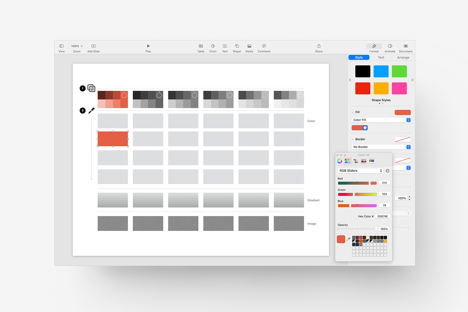
We're including the Root color in our Fills, spaced down to allow a Tint above.
Now, if we select the rectangle right above, click the color wheel to bring up the color inspector, and then the eyedropper tool from the inspector, we can sample from the bottom half of the chips cast in Row 1 to get an initial lighter Tint:
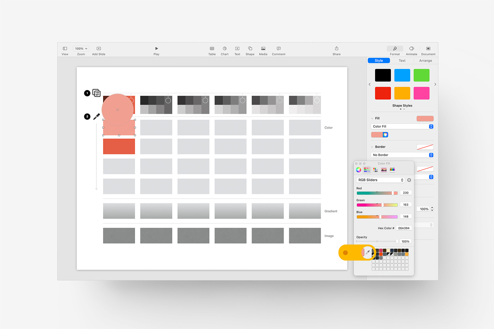
Sample a lighter Tint from the chips created in Step 1 into the row above.
Then, for the shapes below, we can select a couple of the darker Shades to complete the Color section of the column in exactly the same manner:
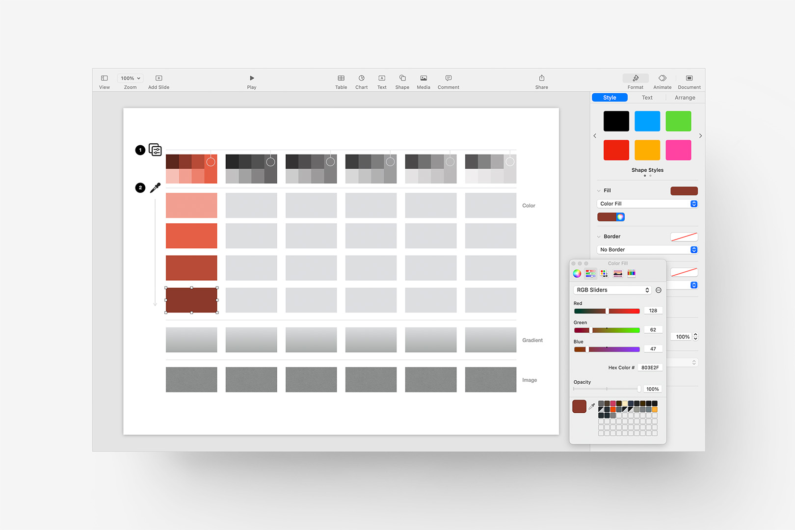
Sample two darker Shades into the rows below to round out the first column Colors.
We may yet adjust those colors in context of the neighboring accent column, but for now, we have our individual Color shades for the first column. Selecting the rectangle in the Gradient row, you’ll notice we’re doing much the same thing here, but with two colors to define as the Fill selector is set to Gradient Fill. I’m using the root color at top, with a darker shade sampled on the bottom:
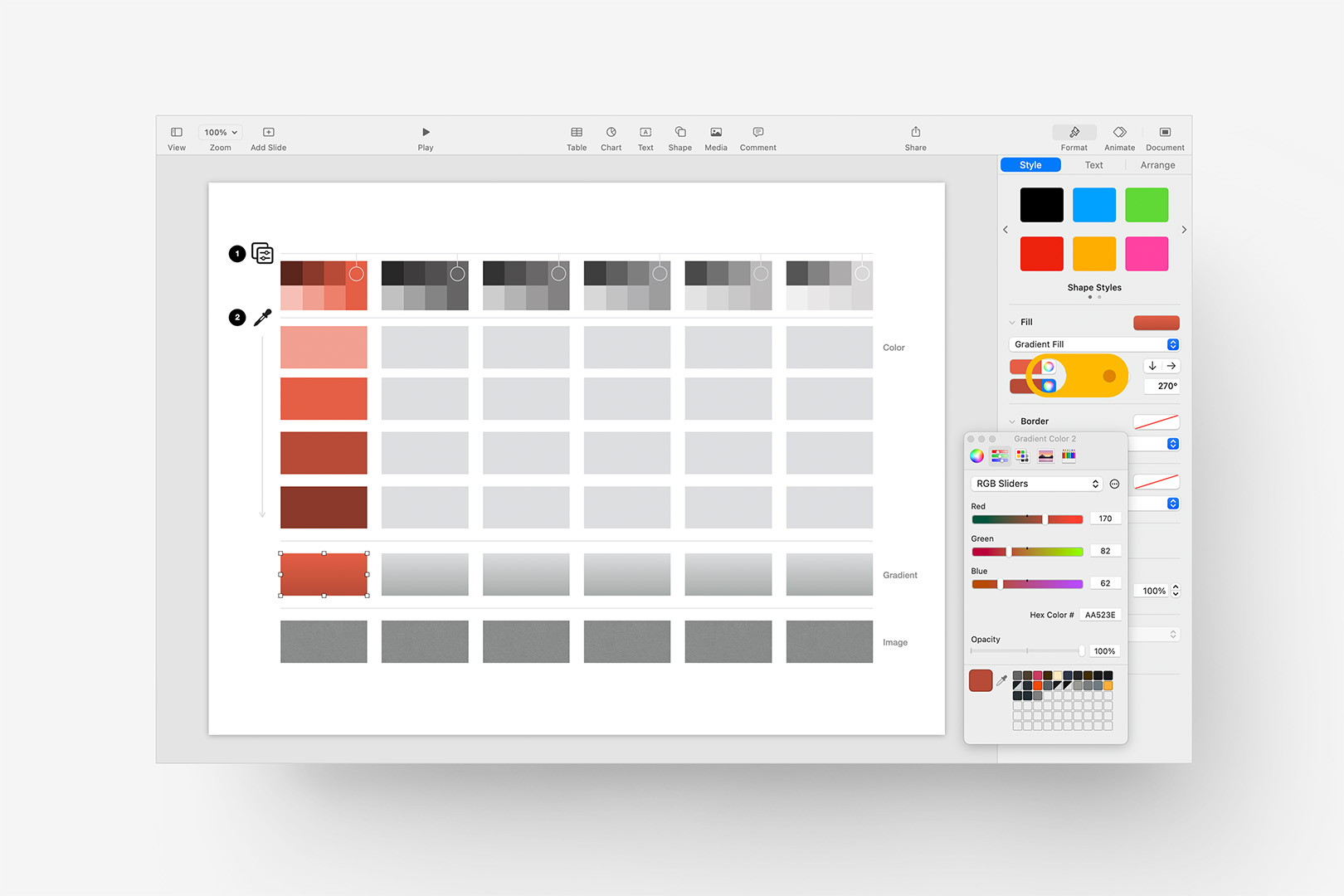
Sample two colors to create the associated Gradient in the row below.
And finally the Image Row. Here, you’ll notice this is an Advanced Image Fill (the default “paper” texture from OM X), set to Tile, which is Tinted with a transparent color. If we sample the root accent color, it will shift back to 100% Opacity at the bottom of the color inspector: we’ll need to pull the Opacity down (in the color inspector, *not* for the object itself) to find a good balance between texture and color. A little goes a long way here, depending on your texture/color combination – I’m going with 75% Opacity here to keep it as close as possible to the root color while still allowing a bit of the texture to show through:
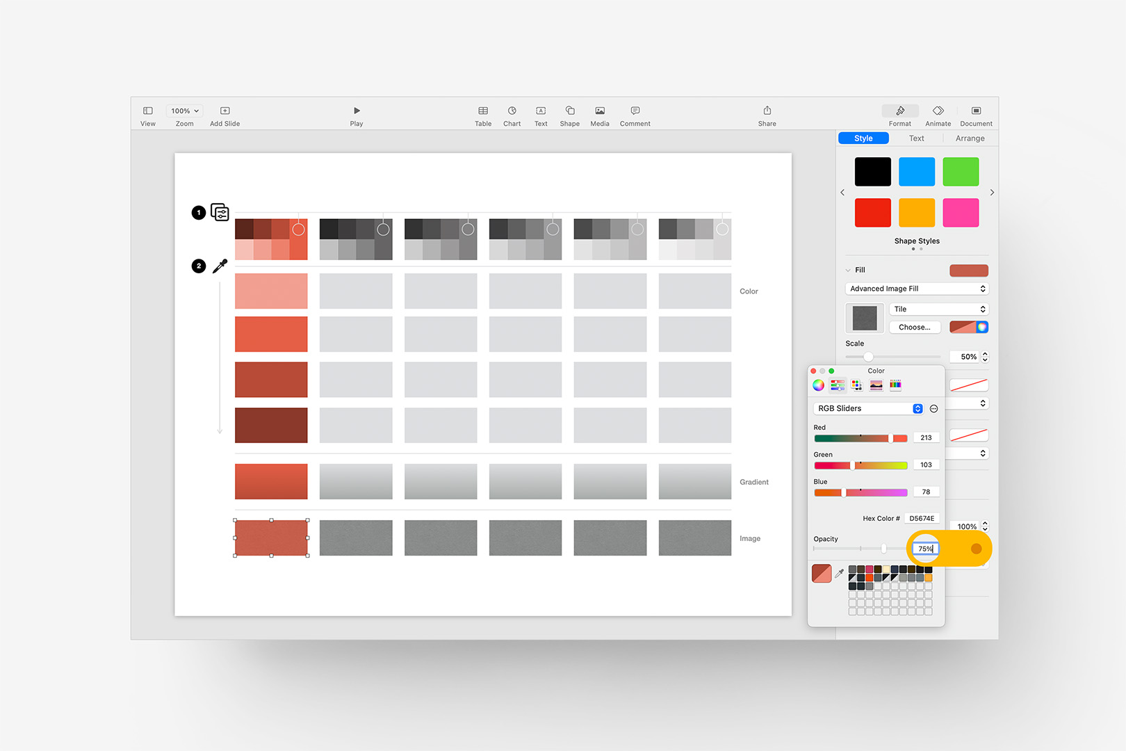
Set a mix color for the Image Fill and adjust the Opacity to blend.
Again, we may tweak any of these once we have a bit more of the palette modeled out – for now, we’re going to repeat those steps across the five remaining columns, just sampling in the same relative pattern of Light > Dark for each one and setting the same Gradient / Image options per color, which gives us the following:
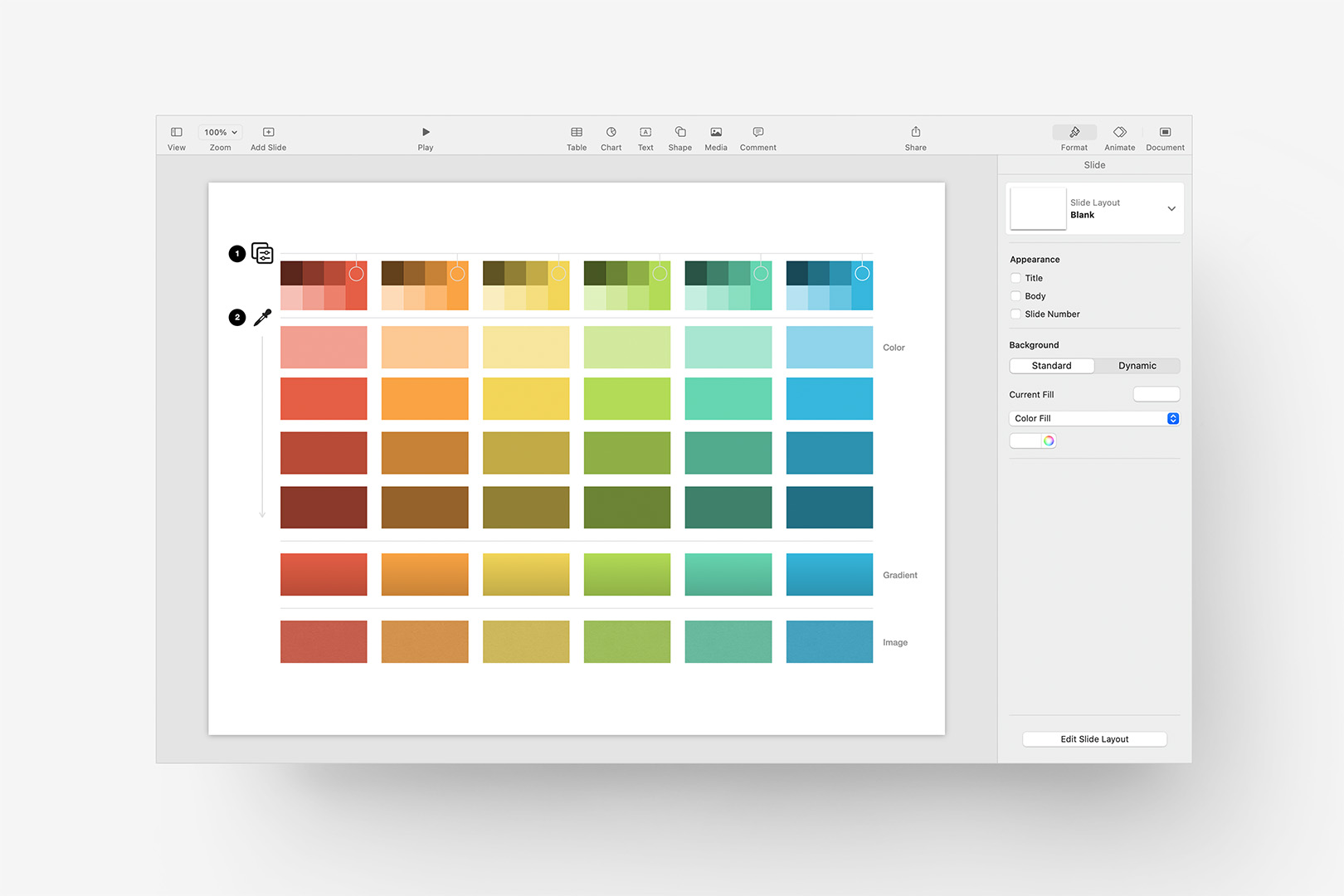
Repeat that process for the remaining 5 columns to build a full palette source.
Pretty good starting point – in a production setting, I’d tend bump the darkest Color row by 3-5% (via HSB adjustment, as we did before with the Accent colors) so it’s not such a harsh step, but this will work well enough to get us to the actual integration into the Fills Menu in the next step.
Redefining the Fills Menu
From here, we can drag-select all of the Color, Gradient, and Image rectangles on our Starter slide (everything below the number 2) and Copy: return to our working Custom Theme file from before, add a Blank (or White) slide, and Paste to bring the objects in. Ignore any Locked objects you happen to drag across on the Starter slide: they won’t be included in the Paste.
To replace the items in the Fills palette, we’re going to drag each item’s fill to the corresponding spot on the palette to Replace the existing fill with our new one. Select the first, lightest rectangle in the first column, expose the extended Fills palette, and Drag the Current Fill over to highlight and then replace the corresponding item in the palette:
Drag the applied fill to replace the equivalent object in the palette.
Repeat that for each of the rectangles on the slide, dragging the fill contents to the appropriate rectangle in the palette. Gradient Fills will only apply to the Gradient row, and likewise with Image Fills. We’re leaving the default Gray-scale objects untouched here (and generally), but if you’d like to specify custom values for those as well you can.
Once you’ve hit the last rectangle, your Fills palette should be completely in sync with your updated Accent colors in your build file:
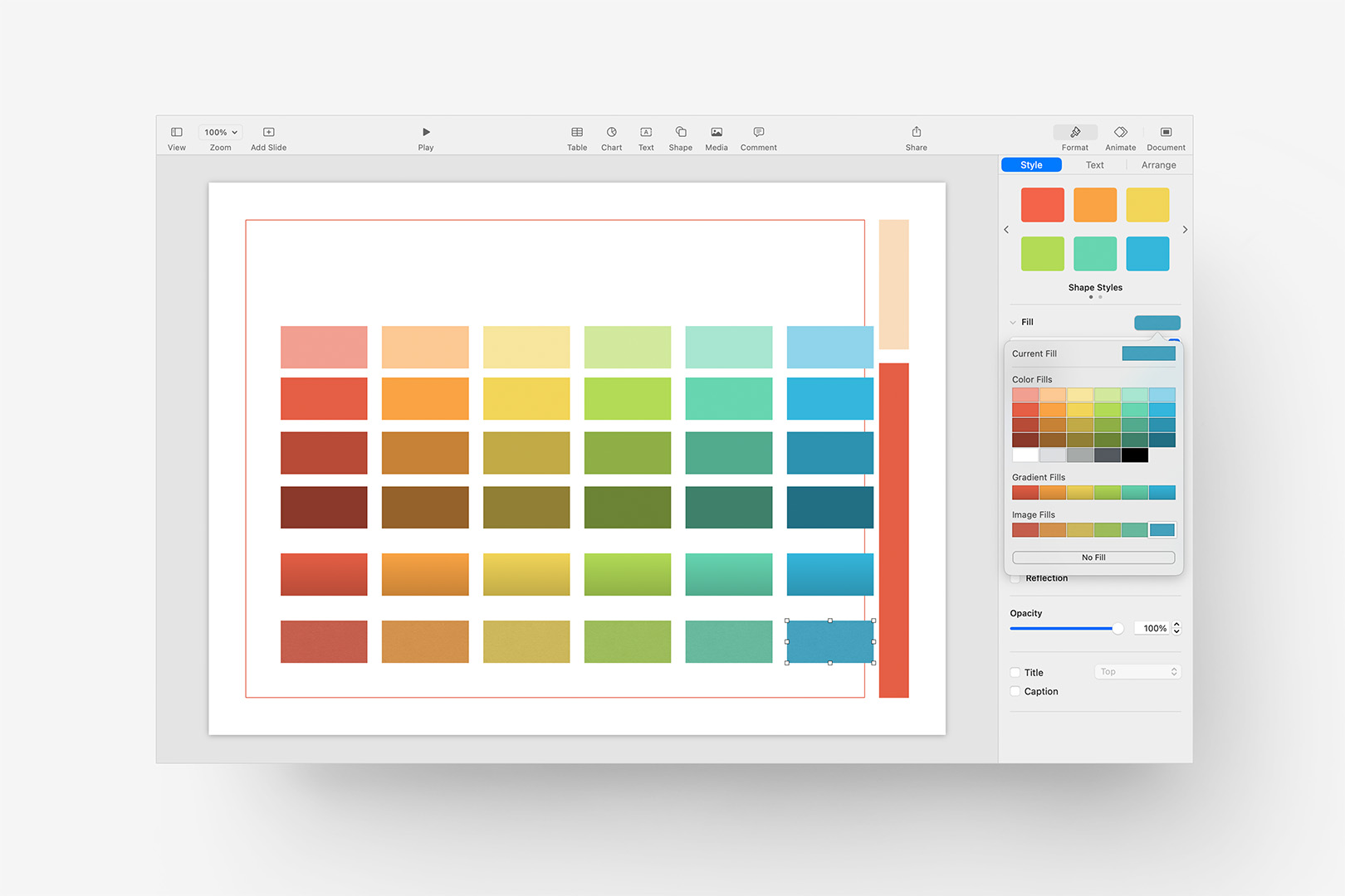
Repeat that for each of the proxy shapes to redefine the entire palette in your build file.
And you’re done. If you think you might make changes to the palette at some point in the future, you can save that slide with your primary build file – just bear in mind that your updates will only be available in new files generated from your updated theme or template (unless you re-apply the theme).
